 Last fiscal year the federal government spent $4 Trillion, or
about $11,554 for each man, woman and child in America..
Last fiscal year the federal government spent $4 Trillion, or
about $11,554 for each man, woman and child in America..Grandfather Economic Report series
| Home &
Contents | Summary | Feedback
| What's New | Eye-opener | Must See | E-mail
FEDERAL GOVERNMENT SPENDING - Full
Report |
Federal Spending is $12,239 per man,
woman and child
Social Spending up 17 Times Faster Than The Economy
- and, federal employee wages and
benefits are 2.3 times higher
than those in the private sector
This is the full Federal Spending Report, with 7
dramatic color charts
- - if you understand each, you have powerful knowledge
(The Grandfather Economic Report is a series of reports examining economic conditions facing families and youth, compared to prior generations. This is the chapter on Federal Government Spending. Separate chapters cover Federal Debt, Regulations, and State & Local Government Spending)
In THIS REPORT, we will first look at what elements control the federal budget - - and next from where came the explosive, unprecedented increases - - and then the larger picture, showing the economy is many, many times more federal spending-dependent than for prior generations - nearly all said increase attributed to consumptive social spending, a category not included by our founding forefather's 4 principal reasons for federal government. This has serious future economic and security challenges for our younger generation.
Below, in addition to new pictures, you will note several pictures that were shown in the summary page of this Federal Government Spending Report - - including more detailed discussion of each graphic.
QUICK LINKS > Where does the money go? - Cost per Person - Govt. Employees earn More - Trend Key Components - Defense vs. non-defense - Govt. Growth - Trust Fund Siphon
Following is a pie chart showing the
major spending components of a Federal Budget
- and its huge red cloud
We have seen in the Government Spending Report and in the Government Growth Report that the federal government has increased its spending at a rate much faster than growth of the economy (nearly twice as fast) since the end of World War II). Where does the spending go?
Last fiscal year the federal government spent $4 Trillion, or
about $11,554 for each man, woman and child in America..
The left chart displays this $4 Trillion as a pie chart, with each major spending component (slice of the pie) shown as a percent of the total.
1. The BIGGIE is that HUGE RED CLOUD in the chart called SOCIAL PROGRAM Spending, which consumes 66% of the budget. (To place this in perspective, in 1948 social spending was but 10% of the federal budget - - prior to the New Deal it was near zero).
2. Foreign aid is 1.3% of the budget, and therefore will not be discussed. (this consumed 10% of 1948 spending).
3. Interest (net) is a 5.7% slice, but cannot be discussed until there is a debt amortization plan to eliminate the debt principal balance end 2010 of $14 trillion (or, $43,925 per man, woman and child) owed both on treasury bills & bonds and the IOUs owed the trust funds. In 2008, 49% of the interest paid on 'debt held by the public' was paid to foreign entities, a dramatic increase compared to the past. (see Federal Government Debt Report). BTW - while all other government areas were rapidly increasing, the interest ratio in recent years has fallen - - as the federal government takes action to lower interest rates to suck income on savings of seniors into the banking sector to help subsidize debtors. (NOTE: 'Interest' of 5% of total spending used in this chart represents Net Interest of $185 billion; this excludes $179 billion additional interest owed the trust funds which was paid in non marketable IOUs instead of being paid in cash or in marketable securities; therefore adding net interest with trust fund interest gives gross interest in FY2006 of $406 billion, or 15% of spending, instead of the 9% ratio shown in the graphic - see graphic on chart on Gross Interest on the debt. This is an example of how paying IOUs to trust funds instead of cash for interest due allows the government to understate to the public total interest liabilities.
For example, if the federal government paid the trust funds in cash (instead of in IOUs) for the $179 billion in interest it owed the trust funds in 2006 the general government would have had to claim an even larger deficit).
4. Defense is next at 20% of the budget. From the Special Summary Report it is shown that national defense was the number one reason our founding forefathers gave for forming a federal government, yet it is allocated but 19% of the budget - - meaning 81% of federal spending is on other things mostly not included as reasons for forming a federal government. (see National Security Report)
5. 'Other' in the chart represents the balance of the government, which consumes 11% of the total for such items as FBI, Treasury, Interior, Justice, EPA, etc.
Take a look at the red slice representing social spending. It appears like a great cloud, growing to consume and squeeze out the balance of the budget. Remember: in 1948 the social spending slice was but 10% of the budget. Compare that to today's 62% share of federal government spending, which consumes 6 times more of the budget pie than in 1948.
(For those interested in breaking out that red cloud of 56% of spending consumed by social programs: social security 20.4%, Medicare 13.1%, health incl. Medicaid at 10.7%, and other income security like welfare was 10.8%).
Additionally - since the Federal Debt Report shows today's debt was caused by social spending, then the 5% share above for debt interest should rightfully be combined with the 56% social slice of the pie - bringing total effective social spending to 66% of the budget.
Some readers are shocked to note the above chart shows Foreign Aid is only 1% of federal spending - - some having previously thought it was a much larger part, which could be cut to solve most other problems like social security or eliminating the debt. While, of course, foreign aid could be cut, this chart shows that you would be playing with a very small part of spending that would not materially impact the big picture. We want to identify and concentrate on the BIGGIES, and their trends, compared to prior generations - - and leave others to play with the 1% areas.
Social spending is that 'biggie,' as the chart clearly shows.
AND- that does not include the over $1 trillion regulatory
compliance costs
imposed on the private sector by the federal government
Here's the Per Person Cost for Federal
Government Spending -
- which continues to climb.
You may have seen this chart elsewhere in the Grandfather Government Spending Report chapter.
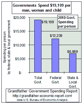 It is repeated here because it includes the per capita national
average for spending by the Federal Government - middle bar in the chart
- at $12,239 per person in 2010. This equates to $48,956 for a family
of four.
It is repeated here because it includes the per capita national
average for spending by the Federal Government - middle bar in the chart
- at $12,239 per person in 2010. This equates to $48,956 for a family
of four.
- and that does not count $6,869 in state & local government spending per person, as shown in the chart's right bar.
If today's federal spending ratio was equivalent to the spending ratio prior to1930 (at 3% of national income instead of today's 32%), then per capita spending by the Federal Government would be $1,166 today, instead of 10 times higher spending of $12,339 per person shown in the chart.
That excess spending today amounts to $11,173 per person, or $44,962 per family of 4.
If families could pay the significantly less taxes required to support the prior spending ratio, would that increase their living standards, saving rates and financial security? Of course !!
Are inner city streets safer today? Is today's education system better preparing the current generation to face the future, than the system of prior years prepared past generations to meet their challenges? Are fewer mothers required to work away from home than before? Are households experiencing lower debt ratios than the past and higher savings? Is Social Security safer? Is America less indebted to non-Americans. NO, to all !!
How do we justify this extra drain per family due to government? The author could not find any justification, since education quality is less today than before and less than foreign nations, the percentage of families without 2 parents is higher, real median family incomes are not rapidly climbing long-term as in the past, yet household debt ratios are climbing to record levels while personal savings rates are falling to record lows, Social Security's future is threatened while trade deficits soar to new records.
Federal Government Employees Earn Over Twice as much
as the Average Private Sector Employee
The closest thing to lifetime job security in
No wonder that Washington,
AND, that's not all !! The State & Local Government Spending Report shows not only are state & local government employees growing in numbers faster than general population growth, but they received 31% higher wages, 60% higher benefits and more job security than private sector workers.
Following is a more powerful chart - based on real spending data, using the 'cruel truth' of actual spending ratios (to size of the economy) over a long period of time, to eliminate distortions (such as inflation) and reveal long-term trends - which points the finger quite clearly to the culprit needing MAJOR attention.
-a dramatic picture clearly revealing the key CULPRIT
as SOCIAL SPENDING Explosion -
The next chart shows the trends of total federal spending as a share of the economy (measured by net national income) over the past 57 years (since the end of WW II), with total spending divided into 4 components: Defense, Social (sum Social Security, Medicare, Medicaid/health, welfare/income security), net Interest, and Other (the balance).
This chart tells a lot, and is one few have seen - - and, one social spenders do not want us to see. Its not difficult to understand. Just look for what goes up and what goes down - - and then challenge your friends with that knowledge. Pretty simple.
Question: What has caused the explosive growth of federal spending faster than the economy, as shown in the Government Spending Report?
Answer: 90% of the increase was due to consumptive social spending and 10% to interest - and the interest was also due to social spending, because government borrowed much of that social increase.
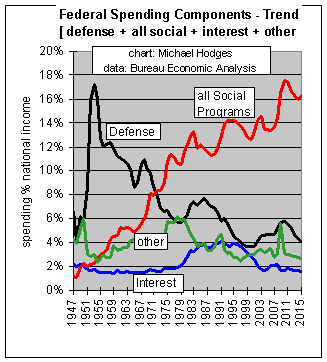 To identify the prime culprit, look to this chart for the component
rising the most.
To identify the prime culprit, look to this chart for the component
rising the most.
In the left chart > the long-term declining black trend line is defense
spending, currently 5.7% of the economy's national income. (National security
defense was the prime reason given by our founding forefathers for forming a federal
government)
Since the defense spending ratio experienced a multi-decade decline, as shown in the
chart, defense is not the culprit for the huge growth in government spending (until
the past several years and debt over the past many decades.
In fact, the savings from declining defense ratios of 12 points since Korea should have
been transferred back to the private sector, instead of being retained by the federal
government and spent on other stuff. Had this occurred, today's total federal government
spending would be 14% of the economy, instead of today's 26% ratio - - meaning total
federal government spending today would be 55% smaller than it is. Had this occurred, the
private sector's share of the economy would have expanded instead of contracting.
But - - as we will see below, defense savings were not released back to the private sector
but were retained by government and spent for a big culprit not intended by our nation's
founders.
The chart clearly shows the BIG CULPRIT (rising red line) has been SOCIAL SPENDING, now at 17% of national income - - which grew 17 times faster than the economy - - more than eating up every penny of the decline in defense spending ratios. This trend is unique in U.S. history and is the root-cause of many economic ills impacting government and our economy, including federal debt. Look CAREFULLY at the red social spending ratio curve - it rose straight up for 36 years and in 1983 stopped rising (at 13.3%) as if hitting a brick wall during the Reagan Era, dropped several points in the late 1980s and then soared upward to today's ratio (18.2%) well above that of the late 1980s. In fact, if today's social spending were at the 1988 ratio of 11.3% national income, instead of at 18.2%, today's social spending would be $816 billion less than is the case.
Camouflage?? This chart gives the appearance that increased spending on defense in the mid-1950's (Korea, Russian threats on Europe, etc.) was later used as a camouflage for the beginning of a major socialization expansion of America's government - as shown by the rising red line. As Korea, Vietnam and cold war defense ratios declined, instead of returning these savings to the free-market private sector as was done after World War II, from which the money had been extracted for necessary military purposes, many cried 'peace dividend' to justify government holding on to these defense savings and consuming same on a socialization expansion (note rising red line) - - as if it were free lottery money that government, not the private sector, had true ownership for. Now that defense has declined to well below its post WW II level the 'chickens are coming home to roost', because defense reductions will no longer camouflage social spending - unless defense is so cut as to possibly jeopardize the number one principle established by our founders as the reason for having a federal government > national security.
Additionally, if in the mid-1990s the proposed national healthcare plan had been implemented as an add-on 'big culprit' to the top of the above red line - - you can guess what this chart would look like by now. You get the picture.
The 'camouflage game is up' - or is it?
Interest (blue line) today of 1.7% national income (for net interest of $196 billion)) on the federal debt takes up about the same ratio compared to the left side of the chart - - due to record low manipulated interest rates vs. record high debt. As noted above, this ratio is for net interest and not gross interest that is due, as it excludes about $218 billion in interest owed various trust funds each year, but 'paid' with non-marketable IOUs (with no maturity date) instead of being paid with marketable securities. So, actual gross interest is twice as much at $414 billion which is closer to 4% of national income than the 1.9% shown in the chart. See Interest for details and long term graphic.
Other (green line) spending includes the departments of justice, interior, state (incl. foreign aid), treasury, etc., not further broken down in the chart (to reduce clutter) - but such consumes about the same 3-4% of the economy as right after WW II.
Who was it that blamed run-away government on defense spending? The chart clearly shows defense spending ratios fell dramatically. Who was it that blamed it on the 1980s? The chart clearly shows in that period social spending ratios were stopped dead in their track, for the first time in 4 decades, before rising again in the 1990s and afterwards.
As commentator Paul Harvey says, "And now you know the rest of the story."
Anyone looking at this chart cannot escape the clear signal of the key trend that must be reversed - - it's SOCIAL SPENDING! (the red line)
Why not let it really sink in? Let's go over that chart one more time. Looking only at both ends of the chart, the start being 1947 after post war disarmament and the end point to the right representing today:
1. Defense spending (black curve) has fallen steadily since the war, despite the cold war, and its ratio to economy size is below the 1947 level, as shown by the chart. (The Joint Chiefs of Staff started warning in 1995 when the defense ratio was about 4.6% that its budget would not cover costs of needed next-generation military hardware. Annual spending for military procurement has fallen to its lowest level in 50 years, in real terms. And, the retiring Chairman of the JCS warned (PBS News, Sept.1997) that America has a poor track record of identifying major national security threats. This chart proves they were not 'blowing smoke'.) It is possible that America reduced national defense below that which was available for prior generations to meet major, threatening surprises (such as WW II against two major nations), further covered in the National Security Report.
2. Interest (blue curve) is 1.7% of national income, about where it was in 1947. With manipulated record low interest rates as of 2003 interest can be reduced only if they reduce total debt - - today at a record $7.6 trillion, which includes about $3 trillion of debt owed to trust funds for surpluses siphoned-off for other spending. Interest charges are actually larger than shown if one adds in interest owed to the trust funds.
3. AND, the BIGGIE, Social spending ratio (red curve) has risen 18 times faster than the economy, over that period - - from 1% to above 18.2% of the economy - near the all-time high. (keep in mind this is just the increase in spending ratios of the federal portion of social spending, and does not include the additional dramatic increase in social spending ratios to economy size at the state & local government levels - each reducing the private sector's share of the economy).
Defense vs. non-defense Spending
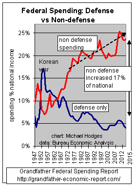 Here's another way to look at defense vs. the rest
of the budget.
Here's another way to look at defense vs. the rest
of the budget.
This chart compares defense spending (black) to the balance of government called 'non-defense' (red).
The red line, the non-defense part of federal spending, rose from 9% of the economy to the current level of about 26% of the economy's national income - which means this component expanded 2.9 times faster than the size increase of the total economy over the period shown. The early 1980s stopped this rise - but the trend during the past 20 years is still upward.
Note the early 1950's (Korean War period) shows defense spending was 17.2% of national income (black curve), and today its 5% of the economy's national income. That's a drop of 12.2 points. At that time, total federal spending was about 23% of the economy. If all of the decrease in defense had been a pure cut, then today's total federal spending would be but 10% of the economy (about where it was just before WW II), instead of today's 32% of the economy - - which is triple. Instead of a 'peace dividend' of 12 points from reductions in defense being returned to the private sector via tax cuts to citizens, this graphic proves that it was retained by government for social engineering and spent on social consumptive spending programs. (one could wonder if this had been returned to citizens, instead of retained by government, what the impact would have been on private savings to generate private pension programs - - instead of today's situation with problems outlined in the Social Security Report.
We can see from the chart that this reluctance to reduce total spending since the war as defense was reduced, and therefore return to the private sector that share of the economy 'borrowed' to meet wartime needs, instead all plus more was retained by government and consumed by run-away social spending.
Social spending ratios (which can no longer be camouflaged by defense reductions) must be planned to a downward slope. A political challenge considering the number of beneficiaries of such spending, but of vital necessity if we are to be equitable to our younger generation. Few would disagree that today's young families are paying a significantly higher % of their income for payroll taxes and debt claims on their future for social spending than did their grandparents, AND they will never realize social security and Medicare buying power benefits anywhere near today's retirees.
The above 2 charts clearly show plummeting defense ratios, as if the federal government should not primarily be in the national security business, but in the social business instead. This does not make our nation stronger, or assure most of the federal government is concentrating on national defense - - the number 1 reason our founding forefathers formed a federal government.
This departure (changing from maximizing defense with almost no social intent, to maximizing social and minimizing defense) raises very serious questions addressed in the National Security Report - - of which all citizens should be aware. Clearly, over time social forces have driven the federal government into areas not intended by the framers of our Constitution, thereby both weakening their intent and making more citizens more dependent on government power than on themselves.
It would have been the intent of our founders that whenever national security challenges needed more resources, then they would be transferred temporarily from the private sector - - afterwards these resources would be fully released back to the private sector - - but never retained for purposes not intended. Following their principles, if America today could operate fully secure from a national security standpoint with today's defense spending ratio (about 5% of national income in the above chart) and without social, then today's federal government total spending would be but 10% of the economy's national income instead of 150% higher at 26% of the economy. That would amount to federal spending of about $1.1 trillion, instead of today's spending total of $2.8 Trillion, a cut of $1.7 trillion equivalent to $5,686 per man, woman and child.
Few would doubt that small and limited government was our founders' intent, except in time of national security emergencies. And most would think our founders were pretty wise. We have traveled afar.
This is a powerful finding that deserves more attention.
TRUST IN GOVERNMENT FALLS AS SOCIAL SPENDING RISES
The Trust in Government Report, a chart of long-term polling data, shows citizen trust in government falls once social spending rises above 5% national income, as first occurred in mid-1960s (per above chart) - - this ratio today is nearly 3 times higher. The level of trust in government in the mid 1960s was 100% higher than today's - and today's social spending ratios are 3 times higher than before. The above chart shows social spending (red line) stopped rising in the early 1980s, to which trust in government surged - - only to fall back later as social spending ratios again climbed.
TAKE ANOTHER LOOK AT THE CHART ABOVE TO BE SURE YOU UNDERSTAND IT
IF YOU DO, YOU UNDERSTAND A POINT MOST AMERICANS DO NOT KNOW
CLICK THIS TO SEE IT ONE MORE TIME
FEDERAL SPENDING GROWTH
IN PERSPECTIVE
The left chart shows total federal spending ($4 trillion) 28% as a share of the total economy (measured by national income) - growing from 3% of the economic pie prior to the New Deal (1929), to 28% of today's economy. As stated before: had we reduced total government by an amount equivalent to the actual defense spending ratio reductions following World War II, today's federal spending ratio would have been about where it was just prior to WW II (13% per the middle bar) - - instead of the 28% ratio in the chart's right bar. We chose, instead, to eat up all defense reductions PLUS much more via massive social spending - - much of same financed by debt. Rather than return those savings to the private sector, where they could be properly and efficiently invested for the future of all generations, all was consumed (plus added debt) - - forever lost to future generations. Who was it that said we are a nation of small government with a predominant free-private sector? Well, we used to be - - but, no longer. Does this impact the future economics and freedom of our younger generation. You bet. |
Summarizing: the federal share of the economic pie increased nearly 1,000%. To help place this in an even bigger picture, the left-hand chart demonstrates how combined federal AND state & local government spending has consumed more and more of the total economic pie over time. The total economic pie is broken down into 3 sectors: the Private Sector (blue), the Federal Government Sector (red), and State & Local Government Sector (yellow).
In the first chart the federal (red) portion was 3% of the economy, 13% in the 2nd chart and 28% in the 3rd chart. This means: over this period of time, 25% of the economy was transferred to the federal government sector from the private sector - - because government spending increased eight times faster than growth of the entire economy. |
We have seen in the Government Spending Report a chart showing the year-by-year trends of the above pie charts.
There we noted that right after World War II our leaders reduced government spending to its pre war ratios. In other words, in the past, following completion of a war, the so called 'peace dividend' was returned to the private sector from which it had been 'borrowed' for the war effort.
A clean effort was taken by our nation's leaders in those days to maintain the balance between the government and private sectors (at about 80% private, 20% government), only upsetting that balance temporarily in times of war.
The intent of our nation's founding forefathers is clear. Alexander Hamilton, in the Federalist Papers (#7), called for the 'progressive extinguishment of debt after a war', 'discharging the public debt', warned against 'the reluctance with which men commonly part with money that supply immediate wants,' and his further warning that 'some are less impressed with the discharging of public debt', and 'some have an indifference, if not a repugnance, to the payment of debt.'
They never intended the federal government to be involved in social spending consumption, let alone debt arising from same. This is shown in Federalist #23, where the principles for forming a federal government were clearly defined as but 4 areas: the common defense against foreign attack, preservation of internal convulsions (civil wars, etc.), the regulation of commerce with other nations and between states, and the intercourse of political and commercial affairs with foreign countries. I don't see any social spending in that intent, do you?
Wise men, those framers of our nation's constitution. Would they be shocked today?
But, starting in the 1950's the expansion of government began in earnest to consume more and more of the economy. The charts clearly show the build up in defense spending for Korea and Vietnam was not returned to the private sector when completed, as in the past.
A new socialization concept was born. Instead of re-paying the 'peace dividend' back to the private sector (from which it had been 'borrowed', as before) government leaders decided to claim that 'dividend' for consumptive social spending under government control - - effectively saying, 'the heck with the free-market private sector - - more government is best.' Government-controlled consumption was preferred over free market investment for the future benefit of our nation. The 80-20 balance was disrupted for good.
Over time, like a type of cancer, this concept has eaten into the very heart and soul of our nation and its family values. As a result, today America is many times more a socialistic nation than ever before in its history.
For additional history, see the Road to Serfdom and Legacy report.
GAMES:
SIPHON AND SPEND TRUST FUNDS, UNDERSTATE DEFICITS
 While politicians claim they want
to save Social Security, because its in trouble, the well know that they are a part of the
fact that its surpluses are siphoned off to support 'off budget' spending on
non-pension stuff. When they say they want to 'lock the box' they are not telling you that
that box is empty - - not a penny of marketable assets it it to support future retirees.
While politicians claim they want
to save Social Security, because its in trouble, the well know that they are a part of the
fact that its surpluses are siphoned off to support 'off budget' spending on
non-pension stuff. When they say they want to 'lock the box' they are not telling you that
that box is empty - - not a penny of marketable assets it it to support future retirees.
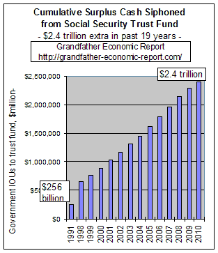
Left is one of the graphics from the Siphon-off Trust Fund Report.
To date workers, via their pay roll tax deductions, have paid more than so far needed by the government to cover current senior citizen social security payments. Those extra payments by workers over the years amounted to an extra $2.4 trillion that was intended to create a surplus of marketable assets in the trust fund.
What did the federal government due with that huge paid-in surplus? Answer: they siphoned off every penny and spent it on other stuff. This graphic shows that the total siphoned-off to date totals $2.4 Trillion, which is only covered by non-marketable, non-registered internal IOUs. This means every single cash penny paid in is gone - gone - gone.
The use of trust fund surpluses to support non-trust fund spending allows the government to actually understate the deficit and creates the illusion to the public of a smaller deficit than is the case. Such not only places the trust funds at the risk of future debt issuance & political pressure, but by understating the budget deficit the public is less aware of spending and thereby places less political pressure on government to reduce spending.
Consider reviewing the two other chapters about trust funds, including data trend pictures > Trust Funds and the Social Security Report.
AUTHOR'S COMMENT
Had our leaders, after Korea, returned the economy to its 80-20 balance (as done by previous leaders following wars), would there have ever been the disaster of a Vietnam including its long-term impact on our nation in so many negative ways? If we had returned to this balance after the Korean war there can be no doubt that there would have been zero camouflage under which to launch massive socialization of government. If we had not expanded social spending many times faster than the economy would the typical American family have a higher standard of living today, than it does - - especially recognizing that at first real median family incomes were rising dramatically - - only to stagnate for the last 3 decades? Would there have been the massive buildup of the welfare state, creating so many dependents of working families? And, would we have created so much debt to pass on to the backs of our children and grandchildren, money that was consumed and is gone forever, money that had to be borrowed more and more from abroad because America's own savings were inadequate? Would we have so distorted the original concept of social security as to eventually place families at greater risk several generations later?
What would be required today to return our nation to the 80-20 balance?
History shows socialization produces an eventual failure in terms of freedom and economics, wherever it has been tried. We are witnessing the looming trillions of debt for social security, Medicare and Medicaid - - which can only be borrowed from abroad or significantly cut. With the economy so socialized, with nearly 50% of same today dependent on government spending (at federal plus state/local levels), the built-in resistance to rebuild America's economic base is a true challenge. The manipulations of government leaders has caused this dependency. Like a drug addict, it is difficult for citizens to 'kick this habit' on their own - - and politicians consider touching the 'third rail' is a career-buster for them.
Which leaders are up to that challenge? Can you name a few?
CONCLUSION:
In the end, the real losers are our youth - - - from childhood to adulthood. Nearly everyone understands that families (and later our youth, themselves) reduce their own living standards because they pay more for benefits for others (that they will never see themselves) than the beneficiaries contributed. If we recognize this why do we allow it to continue? This scam transfer must be reversed.
FINAL COMMENT:
What is a politician to do? (the ones that are truly honorable and with a pure conscious, and who insist on fairness to young families and our next generation).
They are out of money to cover political rhetoric to keep their careers going. The early 1990s experience the 2 largest tax increases in history to raise more money - and still the debt exploded, and family incomes did not improve from that, and the recent social security report shows the problem for that and Medicare is still in deep trouble. They can no longer suck much more from defense as camouflage, without endangering national security for our youth (peace today cannot be guaranteed anymore than it could have been after World War I, and out of the blue came WW II). They cannot add more debt on top of our record level which is near the highest ratio in 4 decades, and twice the level of just 15 years ago - as shown in the Federal Govt. Debt Report. They can no longer 'hope' for rapid economic growth to bail them out, without significantly expanding the private sector share of the economy - - which can only occur by reducing the share consumed by government.
WHAT COMES NEXT ?
All of the above is about the drain on our economy by federal government spending expanding at rates much faster than the economy. The next web page addresses the tremendous negative impact on the private sector by the very rapid expansion of the state & local government sector - - - which is the next 'shoe to drop,' as that sector has expanded its own headcount by 12 MILLION bureaucrats faster than general population growth - as reported in the State & Local Government Spending Report (link below).
SHOULD WE DO SOMETHING ABOUT THIS ?
The action required is clear !
UNKNOWN TO MOST
You have just read the report on Federal government spending. But, while all eyes are on Washington few are paying attention to what is happening with state & local government spending. Take a look at the equally dramatic companion State & Local Government Report with several eye-opening pictures - you will find each man, woman and child is carrying 3 times more state & local government employees, than ever before - - 12 million in excess. Look at just 2 pictures.
Or, you might want to return to the summary page of the Federal Government Spending Report or one or more of the above QUICK LINKS > Where does the money go? - Cost per Person - Govt. Employees earn More - Trend Key Components - Defense vs. non-defense - Govt. Growth - Trust Fund Siphon
Or, go to the HOME Page & table of contents of the Grandfather Economic Report - a collection of reports showing the economic threats facing families and their children, compared to prior generations.
| Home & Contents | Summary | Feedback | What's New | Link Index | Eye-opener | Must See |
Inputs and suggestions welcome: Michael Hodges via E-mail
This is the bottom of the Grandfather Federal Spending Report at https://grandfather-economic-report.com/fed_budget.htm
Copyright © 1997-2016 Michael W. Hodges. The Grandfather Economic Report series is the intellectual property of its author; all rights reserved under Copyright Conventions. Permission to redistribute all or part of this series for non commercial purposes is granted by the author, provided the associated web page address (URL) is included and full credit given to the Grandfather Economic Report and the author, Michael Hodges. Notice appreciated via email.
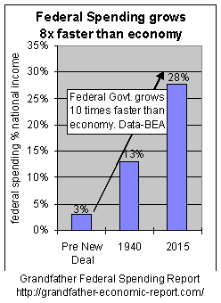 Today's economy is Ten (10) TIMES more federal
government-spending-dependent, compared to prior generations.
Today's economy is Ten (10) TIMES more federal
government-spending-dependent, compared to prior generations. 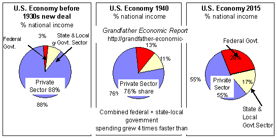 WHAT HAPPENS TO THE BLUE SLICE OF THE PIE
BELOW - did it get bigger or smaller, from left to right?
WHAT HAPPENS TO THE BLUE SLICE OF THE PIE
BELOW - did it get bigger or smaller, from left to right?