| Home & Contents | Summary | Feedback | What's New | Link Index | Eye-opener | Must See |
America's Total Debt Report - page 1
$ 57 Trillion - - and soaring
- household, business, financial and government sectors -
by Michael Hodges - email
updated April 2011
- a chapter of the Grandfather Economic Reports -
|
America has become more debt-dependent - - than ever before
with total debt of $57 trillion, or $185,065 per man, woman and child
and each added dollar of new debt produces less increased national income
The Grandfather Economic Reports (https://grandfather-economic-report.com/) is a series of picture reports of threats to the economic future of families and their children, compared to prior generations. You may have read the summary page of America's Total Debt trends. This page is page 1 of the full report of this America Debt Report chapter. Welcome. We hope your visit will find useful information to help you and your loved ones.
You may have previously viewed the historic pictures in the Federal Government Debt Report, which covers just the federal govt. debt of $14 Trillion, or $40,065 per person 2010. This chapter covers all U.S. debt, called America's Total Debt (defined as the sum of all recognized debt of federal, state & local governments, international, private households, business and domestic financial sectors, including federal debt to trust funds - but excludes the huge contingent liabilities of social security, government pensions, Medicare and other government off-budget items).
America Debt Total is now $57 Trillion. This page tells the story with 11 pictures.
BIG PICTURE - - DEBT RATIOS - - DEBT PER PERSON - - EXCESS DEBT
DIMINISHED DEBT PRODUCTIVITY
MAJOR COMPONENTS of TOTAL DEBT REVEAL the CULPRITS
HOUSEHOLD DEBT - - DEBT SUMMARY TABLE
(graphics on household, business, financial sector, government and international debt from link bottom of page)
BIG PICTURE - $57 TRILLION IN DEBT, and rising rapidly
and this excludes contingent liabilities such as social security, government pensions and Medicare. The economy is 2-3 times more debt-dependent - with at least $36 Trillion DEBT EXCESS - - compared to the 1950-1970s
 The next 2 charts will show: first the debt in current dollars 1957 vs. today, and then adjusted for inflation in 2009 dollars. The next 2 charts will show: first the debt in current dollars 1957 vs. today, and then adjusted for inflation in 2009 dollars.
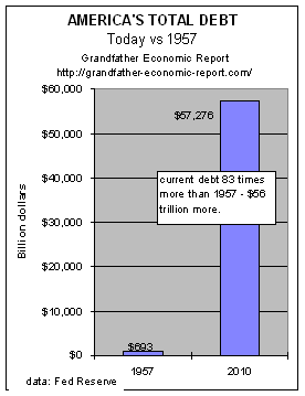
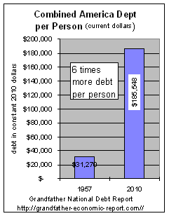
This chart compares total American debt today vs. 1957 in actual dollars.
Total American Debt is defined as all U.S. debt (federal and state & local governments, international, and private debt, incl. household, business and financial sector).
The chart shows the debt in 1957 was $693 billion (the left bar in the chart) - - or about $4,000 per capita
Today's debt has grown above $57 trillion (the right bar in the chart)- - 81 times higher - - to $185,065 per man, woman and child - or $740,260 per family of 4.
81% ($44 trillion) of today's debt was created since 1990.
|
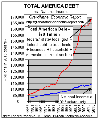 Here's the representative chart you saw on the previous summary page. Which line goes up faster, the red debt line or the blue economy size line?
This is A SCARY CHART - showing 4 decade trends of America's total debt (the red line, reaching $57 trillion) vs. growth of the economy a measured by net national income (blue line), adjusted for inflation in today's dollars.
America's Total Debt is here defined as all U.S. debt (sum debt of federal and state & local governments, international, and private debt, incl. household, business and financial sector, including federal debt to trust funds).
Note from 1957 to the early 1970s each curve approximately doubled - meaning about the same ratio of debt was supporting national income growth, despite paying on old WW II debt and covering Korean and Vietnam wars.
Had the economy become less debt dependent after that we would have expected debt to slow down. But, instead, it took off.
In just the 1990s real debt increased more than two times faster than growth of the total economy - - despite zero cold wars.
Other charts show the driving culprits were not only federal government debt ratios (which stopped falling in early 1970s and reversed strongly to the upside - growing 2x the economy) - but, not to be left out, other main culprits were accelerating household debt (growing nearly twice the rate of the economy, and domestic financial sector debt growth (at rates 4 times faster than general economic growth).
This chart clearly shows the accelerating reliance on debt to drive economic growth in the past 2 decades, compared to prior periods.
 DEBT RATIOS
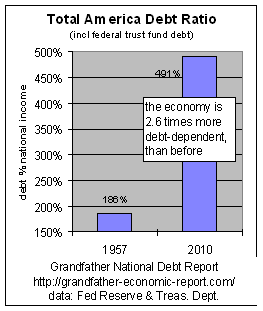
America's Total Debt today restated as a percentage of the economy is twice that of 1957, when we were dealing with debt left over from World War II plus the Korean War.
This chart shows the above total (government + private) debt as a ratio to the size of the economy in 1957 vs. today - - with the size of the economy measured by national income.
If total debt in America had not grown faster than the economy then the two bars on the chart would be the same height. But they are not the same height, because the debt ratio to economy size in that period increased over two times faster than growth of the economy - - indicating more than a 100% increase in debt dependence - - as it jumped from 186% of national income to a 491% debt ratio in 2010 per this chart.
Stated another way, if 2010 debt had been at the 1957 debt ratio then 2010's debt would have been $21 trillion, not $57 trillion - - indicating excess debt in America today of $36 trillion. (note - if this chart were plotted as debt % GDP, instead of debt % national income, the curve would look near identical to this chart)
Stated differently, in 1957 there was $1.86 in debt for each dollar of national income, but today there is $4.91 of debt for each dollar of national income. It also means that this extra $3.05 per dollar of debt produced zilch relative national income.This chart implies today's economy has 164% higher debt load in relation to economy size, as was the 1957 economy. Not only is this ratio difference very large, but the 1957 economy was still paying off World War II debt (and carrying parts of the Korean war). Restated - it took twice as much debt per dollar of national income in today as was required in 1957. There can be little doubt (from this chart) that our economy is significantly more debt-dependent than ever before - - and that the economy can have a major negative impact should interest rates rise significantly or the economy slow down.
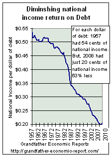
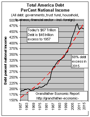 The chart at the left looks at debt ratios to economy size for all in-between years: 1957 to now.
If the years after 1957 required no more debt per dollar of national income, then the black curve in the chart would have remained flat - at the 186% level. But, as the years went on, especially after the late 1960s, it took more debt each year than the year before to produce a dollar of national income.
By 2009 Total America debt reached a historic peace-time record at 491% of national income - - 163% more than the share of economy that was debt laden in 1957. This picture makes quite clear that today's economy is over 163% more debt dependent (leveraged) than before.
Restated - - in 1957 a dollar of debt produced 54 cents of national income; but today's dollar of debt only produced 20cents of national income - or 63% less economic growth per added dollar of debt.
The black line is our data. The red dashed line is the exponential trend line. Note in the more recent years, not only has the black line increased at a faster rate, but it is now growing at a rate above the red exponential trend line.
(Note: this chart is a ratio of debt to national income per year, as recommended by Nobel Laureate Dr. Milton Friedman to use national income by its original definition as the economy size base instead of GDP. For those thinking in terms of GDP, the 2010 debt ratio to GDP was 393%, with the same historic slope as this chart)
 DEBT PER MAN, WOMAN AND CHILD
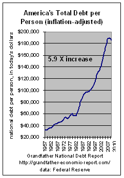
Snap Shot - - today vs. 1957 America's Total Debt restated as inflation-adjusted per person - - 6 times too much.
This chart shows total total debt allocated on a per capita basis, adjusted for inflation. The left bar shows 1957 debt nation-wide (in today's dollars) was $31,279 per man, woman and child, in 2010 dollars.
If debt per person were only adjusted for inflation over the 53 year period, the right bar (2010) should have remained the same size as the left bar (1957) at $31,279 per capita.
BUT- the right bar shows 2010 debt was $186,548 per man, woman and child - - 6 times higher per capita than in 1957.
Adjusted for inflation, this data shows inflation-adjusted total debt load per person increased $154,278 - - equivalent to an increase of $617,112 per family of 4.
 Year to year 1957 to today -
This chart shows the full year to year trend of the above chart's total American debt
(adjusted for inflation) on a per person basis, with all years shown.
Per capita real debt has increased from $31,770 in 1957 to $185,548 today - - 5.9 times more debt per person, adjusted for inflation.
Note the very steep upward thrust of the curve for more recent years - -
- - as if current debt trends are up faster than a rocket boost from Cape Kennedy.
Note: all debt data is from the Federal Reserve, except data for the federal government portion of the total is from the Dept. of Debt at the Treasury Dept.
which also takes into account federal debt owed to the trust funds.
National income data is from the Bureau of Economic Analysis.
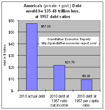 EXCESS AMERICAN DEBT is $35-48 Trillion (adjusted for inflation).
Let us calculate the excess debt today, compared to 1957 - - via 2 methods.
This chart looks at the $57 Trillion of total debt in America today (the left bar in the chart) and asks the following question > >
What would be the size of today's debt had the economy operated at the same debt ratios (to national income and per capita, adjusted for inflation) today as it did in 1957?
The chart's middle bar displays the excess based on % national income method: 2010 debt would have been $21.7 Trillion if the economy and been no more debt-dependent than it was at the 186% debt ratio to national income of 1957.
But, actual debt was $57 Trillion - - more than 163% as much. The difference between the two bars is an Excess Debt in 2010 of $36 Trillion ($57 less $21). This excess alone is equivalent to $116,883 per man, woman and child - - in excess debt load - - or $467,532 excess debt load per family of 4.
The chart's right-hand bar displays the answer for per capita debt excess: today's debt would have been $9.28 Trillion if today's debt per capita had been the same per capita ratio as 1957 - - both in constant 2008 dollars. But, it was $57 Trillion, or 6.1 times more.
The difference using per capita measurements indicates 2010's excess debt was approx. $48 Trillion ($57 less $9) too much. That's an excess of $155,844 per man, woman and child in excess debt load - - or $623,377 per family of four excess load.
SUMMARY: this chart shows that total debt in America in 2010 was excess (compared to prior debt ratios) of $35 and $48 Trillion too much - - or $116,883 to $155,844 per person too much - - or $467,532 to $623,377 per family too much, depending on the ratio used.
AMERICA'S DIMINISHED DEBT PRODUCTIVITY
If America was more efficient in real productive employment of new debt
then less debt would be needed for each dollar of national income.
But - - the reverse is true. We are less productive regarding debt than ever before.
| Each dollar of economic growth requires more debt per dollar than before - now over twice as much |
and, the national income achieved per dollar of debt dropped 63% |
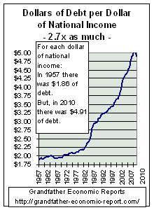 The left chart restates the above. The left chart restates the above.
It shows that in 1957 there was $1.86 of outstanding debt for each dollar of national income.
But, today's economy needs $4.91 in outstanding debt for each dollar of national income.
That's 164% more outstanding debt load per dollar of national income.
That extra $3.05 of debt produced zero national income.
|
 The left chart shows the reciprocal - - and the diminishing returns resulting from debt. The left chart shows the reciprocal - - and the diminishing returns resulting from debt.
It shows the declining amount of national income achieved by the economy for each added dollar of debt.
In 1957, 54 cents of national income resulted for each dollar of debt.
But, today only 20 cents of national income resulted per dollar of debt.
That's a 63% drop in national income per added dollar of debt.
|
| HOT - HOT > The left graphic above looks at total debt outstanding vs. national income at end of each year since 1957, which is the correct long-term approach. But, if we look just at the period 2000 to 2010 total debt increased $30 trillion, while National Income increased but $4 trillion (GDP $4.6 trillion). In that period it took $7.50 in new debt to produce one extra $1 of added national income. |
COMPONENTS OF AMERICA'S TOTAL DEBT
IDENTIFYING THE PRIME DEBT-GROWTH CULPRITS
- a most sobering and scary picture
The Prime Debt Culprits are:
Federal Government - Financial sector - Household sector - Business sector
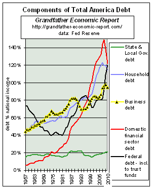 This is a very revealing chart, the past 53 years (1957-2010). It shows 5 major components of debt in America - the debt amount of each as a ratio to the size of the economy's national income.
The 5 lines include State & Local government, Household debt, Business Sector debt, Domestic Financial Sector debt and the total federal government debt. Not shown is international debt, which is covered in the International Trade Report.
We know from the above charts that total ratios are up exponentially. This chart identifies those components driving the upward trend in debt ratios in all government and private sectors.
Look for the lines that are rising - - like the red line (exploding financial sector debt), the blue line (rapid increases in Household debt ratios), the black line (Federal Government) and the yellow line (business sector). The fact these 4 lines rise means debt in these sectors increased significantly faster than the economy was growing. These are the driving force now threatening the American economy with sky-rocketing debt-dependence.
The most dramatic & scary is the soaring red line, which is Financial sector debt (today at 122% of national income, or $14.2 trillion) - a very scary trend until recent decline!!! Data is from the Federal Reserve.
(Although some financial sector debt might be included in other categories, most also agree the business debt category understates its own debt, as evidenced by off-balance sheet debts of the likes of Enron in the past and many, many more today such as Citigroup, JP Morgan, Dell, GE, etc.). Numerous areas of 'hidden' debt continually come to light - such the debt-freezing of markets in 2007/08, such as The Wall Street Journal reported on 7 Sept. 2007: "Though few investors realize it, banks such as Citigroup Inc. could find themselves burdened by affiliated investment vehicles that issue tens of billions of dollars in short-term debt known as commercial paper off their balance sheets. See more on financial sector debt.)
- As shown on the chart's red line, the financial sector's debt ratio zoomed from 5% of the economy's national income in 1957 to 149% of 2008's economy - a debt ratio growth rate 28 times faster than general economic growth. 2009 & 2010 produced first ever decline, to a 122% ratio.
- A separate chart on this component follows below, which shows its trend line is upward exponentially.
The next largest rapidly rising component is the blue line, or Household debt (today at 115% debt ratio, or $13.4 trillion) - dramatically up from 43% of national income at beginning of chart, nearly three times the prior ratio - meaning it, too, has increased much faster than general growth of the economy.
Household debt is made up of consumer debt plus mortgage debt. The Family Income Report shows real median family incomes stopped growing in 1970, and thereafter families tried to keep up by going deeper and deeper into debt ever since - at near 3x the rate of national economic growth - to an all-time high today. Consumer debt payments % disposable income are at historic highs. The Family Income Report cites the reason, with dramatic pictures.
The fact household debt ratios have reached historic highs during the so-called boom years of the 1990s proves that the economy was more driven by debt than anything else - - and households have excessive debt instead of reduced debt at end of an expansion period.
Next there is the black line, the Federal government sector debt ratios -
- We have seen this before. It was pointing downward 1950s to mid 1970s (see Federal Debt Report) - a period of strong real median family income growth, stopped dropping in 1974, oscillated, and then took off upward - under the pressure of consumptive social spending rising 12 times faster than the economy as reported in the Federal Spending Report (as family incomes ceased to climb).
- Today's federal debt of $14 trillion produces a debt ratio of 120%, triple early 1970s debt ratio, even though then the Vietnam war and the cold war were in process. The recent short down turn was due to record tax revenues, and a dramatic lowering of national security expense ratios to a near record low as a share of the economy - - but, now reversing to the upside as the reduced military is re-built with the Iraq war.
- Some of the reasons are in the Social Security Report, which shows how the general government dips into trust fund surpluses, siphons such off for non-pension spending (leaving behind a few worthless IOUs), and then does not account for such spending in the way the budget deficit is calculated. The same siphon and spend approach occurs in other trust funds, such as the federal employee pension trust fund. Together, $4.6 trillion has been siphoned from trust fund, with zero budget to reduce other general government spending to repay.
The business sector debt (yellow line) debt ratio is 95% (or $11.1 trillion of debt) which increased twice the speed of the economy (increasing from 44% of national income in 1957), doubling to a debt ratio and an all-time high.
The green line (debt of state & local governments) is the only component not rising long-term, although it jumped to 21.1% in 2010 - significantly above the 2000 debt ratio of 14.9%. The State & Local Government Report proves spending and this sector's employee headcount continues to increase faster than population growth. This govt. sector needs major attention.
HOUSE-HOLD DEBT
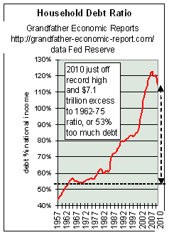 The left chart shows the trend of household debt as a share of national income from 1963 to present. If household debt were not growing faster than the economy's own growth then this chart would show a flat, horizontal line. But, the chart plot is straight up in recent years, meaning household debt is soaring faster than the economy.
Household debt is primarily made up of mortgage debt and credit (credit cards, auto loans, etc.). In 2009-2010 household debt declined by $463 billion (first decline ever) to $13.4 trillion, incl. $10.1 trillion mortgage debt and $2.4 trillion credit debt. The chart shows today's household debt ratio at 115%, soaring above the past, with the debt ratio triple that of 1985.
Note the left side of the chart for the first several years where the debt ratio did not increase, until the late 1970s.
It then started upward, slowly - and then upward like a rocket - to new all time highs today.
Debt has risen at rates much faster than growth of the economy, suggesting real equity is not the driving force of economic size. It is debt driven.
If today's household debt ratio (115% of net national income) had been the same as in the earlier years on this chart, the chart's curve would be horizontal instead of soaring upwards, and then today's household debt in dollars would have been $8.4 Trillion less than it was in 2010. In other words, 2010 household debt would have been $5 Trillion - - not the $13.4 Trillion which occurred.
This shows that the economy is more leveraged by household debt than ever before. And, households are even more at the mercy of credit and mortgage interest rates than ever before.Mortgages > As stated above, 2010 mortgage debt was $10.1 Trillion (75%) of the $13.4 Trillion total household debt. In March 2008 (per following link) "FBR's Miller estimates that $11 trillion of outstanding U.S. mortgage debt is supported with roughly $587 billion of equity. That was a huge leverage ratio of 19 to one." Keep in mind that ratio was quoted at a time housing prices started falling dramatically, meaning the supporting equity ratio is also further declining. See also equity in all homes nation-wide fell to the lowest home equity ratio in history even before prices recently started their dramatic plunge. http://www.marketwatch.com/news/story/mortgage-market-needs-1-trillion/story.aspx?guid=%7B359B5377-39DB-4C8B-9178-C45726A45272%7D
Auto loans > In addition to soaring home equity mortgages which consume owner stakes in their homes, according to USA Today (2/16/04) the average automobile loan today is for 63 months, with some going as high as 80 months, compared with an average of less than 48 months five years ago - - and about 24 months in the 1950s. In 1997, banks financed an average 89% of a new vehicle's price. Last year, it was 101% since consumers borrowed to cover the amount they were upside down on their trade-in. And get this…40% of all trade-ins involve upside-down car loans. (this author recalls when he entered the workforce in the late 1950s normal down payment was on-third cash for a car, with 18 month financing for the balance. Quite a contrast to current times.)
Credit Cards > A massive 42% of Americans are making just minimum payments or no payments on their credit card balances, according to the Cambridge Consumer Credit Index in March 2004. Of those respondents surveyed with revolving balances on their credit cards, 39% made only the minimum payment due and 3% made no payments at all last month. Another 39% paid less than half the balance owed but more than the minimum, while 19% paid more than half their balances. In 2003, the average credit-card debt of US households with at least one card was $9,205, up from $2,966 in 1990, according to the research firm CardWeb.com - - that's 310% higher. The same firm said, "About 51 million households carry credit-card debt at an average balance of nearly $12,000." (http://www.hillnews.com/thehill/export/TheHill/News/Frontpage/031005/creditcard.html) - - that totals $612 billion in total debt for those households.
Student Loans > October 2007. The average debt load for graduate students in all fields nationwide ballooned by 150 percent to $37,600 in 2004 from 1994 levels, as undergraduate tuition borrowings shot up 108 percent to an average of $19,200. There can be no doubt that the main force driving soaring college costs is none other than > soaring student loan debt. As more and more debt is offered to more and more students their debt load soars, and that debt-based purchasing beyond incomes and savings drives tuition costs higher and higher, assuring even more debt in the future. What happened to the 'good old days', before student loans were so massively marketed, when most serious students worked their way through school and therefor graduated DEBT-FREE and the lack of debt-pushed paying led to lower college costs for all??? http://www.dallasnews.com/sharedcontent/dws/bus/stories/DN-studentloan_28bus.ART.State.Edition1.35bcf31.html
Soaring International Debt
"Foreign interests have more control over the US economy than Americans, leaving the country in a state that is financially imprudent. More and more of our debt is held by foreign countries – some of which are our allies and some are not. The huge holdings of American government debt by countries such as China and Saudi Arabia could leave a powerful financial weapon in the hands of countries that may be hostile to US corporate and diplomatic interests.” David Walker, the US comptroller general. 23 July 2007
Dramatic data trend graphics on International Debt
NOTE TO READER > More household debt graphics and info, including color data trend graphics on business and the financial sector and government sector - and, exploding debt owed to foreigners - on the next page, from link bottom of this page.
WHAT IS TO HAPPEN TO THE YOUNGER GENERATION AND FAMILIES?
How can such debt trends be sustained - - considering the Grandfather Family Income Report shows 2 ½ decades of stagnant real median incomes for families, as income of full-time working males has fallen for more than a decade?
The Tax Report shows citizens work 3 times longer to pay all taxes each year - - which depresses family spending options leading to increased household debt to make up.
The State & Local Government Spending Report shows they have added employees at a rate faster than growth of the nation's population, with a new record high last year. Most citizens have learned that each working person today supports more seniors than ever before, but few know they also carry on each of their backs 3 times more state & local government employees per head than before.
Additionally, if families are consuming their home equity (while prior generations saved theirs) yet the Grandfather Social Security Report shows these families can expect much less in pension benefits when they retire than their elders - - how can this be sustained?
And from where comes family funds to support higher education for the children of younger families - - especially considering college cost inflation and degradation in high school output quality, as covered in the Grandfather Education Report? Tremendous increases in inflation-adjusted public spending per student, while test scores compared to other nations place the USA at the bottom of the heap, waste and drain of individual and national resources. Net result: families and students take on more college debt than ever before.
Further, said generation faces global competition for their living standards more so than any generation in U.S. history against many competitors better educated than they as shown in the International Education Report.
AND - - America, that used to be the biggest creditor on earth is now the biggest international debtor with exploding trade deficits, as shown in the Grandfather Foreign Trade Report,
AS debt soars America's energy infrastructure has deteriorated and especially its independence regarding petroleum and natural gas, as covered in the well-documented Energy Report with extensive graphics of production vs. consumption vs. imports vs. reserves.
NOTE
A summary of ALL DEBT BY CATEGORY is in the
DEBT SUMMARY TABLE
CONCLUSIONS
- As America began to 'invent' new reasons for larger government than defined by its founding forefathers as the 4 principle purposes of government, government spending increased faster than economic growth, primarily fueled by zooming social program spending, much caused by Social Security & Medicare - and the share of the economic pie remaining to the private sector was reduced. Government spending ratios increased for the federal government, and state & local government spending increased faster than the economy and its employee head-counts faster than the population. As of today, the federal government spending ratio has reached 25% of national income - representing 10 times more growth in government spending than growth in the economy since1930. And, state & local government spending now consumes 15% of the economy, three times higher than after the 2nd world war.
- National productivity and savings started a long down-trend and by 1970 real family incomes stopped rising and stagnated - as earnings of full-time males declined, singling the end of the on-wage earner family as more mothers were sucked into the workforce (away from their children) trying to help make up the difference - as each working person had to support more seniors and more state & local government employees than ever before - -and what we used to know as 'family values' begin to decline.
- Education Productivity (relationship of output quality to per student real spending) started a long-term slide in the 1960s, dropping 71% over the next 3 decades. Helped by changing measurement criteria, this 'rate' has improved somewhat in last 2 years.
- As a result of such government expansion, government entities increased mandated regulations on the private sector, at accelerating regulatory compliance cost loads on the economy and its productivity and savings. Today's compliance costs consume 16% of the total national income.
- Following the above, inflation rates jumped - - and today are still higher than during the period of strong family income growth when inflation was measured by more stringent methods.
- The nation's Trade Balance went steadily negative starting in then 1970s - and today America is the world's largest debtor nation - - with increasing deficits each year to a new all-time record deficit today.
- And, the International Value of the U.S. dollar may again be threatened by exploding trade deficits, as it was before.
- The graphics in this America's Debt Report prove that the nation, trying to maintain and expand consumption (instead of producing real goods and savings) begin to go more and more into debt, in relation to the size of the economy. Federal Government Debt ratios, after falling since World War II stopped falling and then soared to the highest peace-time ratio in history. Families, trying to keep up under the squeeze in the economy and of education quality, went more and more into debt, causing Household debt ratio (charts above) to grow twice as fast as the economy since the mid 1970s when family incomes stagnated - and are rising exponentially as of today.
- Debt of the Financial Sector (charts next page) accelerated, now expanding exponentially to the highest ratios in history.
- And - - America's debt productivity, less and less national income per added dollar of new debt outstanding, has significantly deteriorated.
- As debt soars in America citizen voter turnout deteriorates, as does trust in government and family confidence in their future.
America, that used to derive strong family incomes and values from producing real goods and savings, even with one bread earner per family, has moved to a fully consumptive society financed by ever increasing ratios of debt at private and government levels, with nil savings - - with debt ratios reaching new records - - with each added dollar of debt producing diminishing amounts of national income.
AMERICA HAS BECOME LESS A FAMILY-BASED, FRUGAL AND PRODUCTIVE SOCIETY WITH SMALL GOVERNMENT - - AND MORE A CONSUMPTIVE, PERMISSIVE, DEBT-DEPENDENT AND GOVERNMENT-DEPENDENT SOCIETY THAN EVER - - A BECOMING QUITE DIFFERENT THAN THAT ENVISIONED BY ITS FOUNDING FORE-FATHERS. WE ARE AT A CROSS-ROAD. OUR YOUNG GENERATION FACES EXTREMELY SIGNIFICANT CHALLENGES IN THIS REGARD - - AND MAY BE LESS PREPARED TO MEET THE APPARENT FUTURE THAN ANY PRIOR GENERATION IN RECENT HISTORY
America may experience a crisis of economic un-sustainability.
But - will citizens fight back from the grass-roots to retake her proud heritage of the past. Will leaders come forth that do not scream: growth-growth-debt-debt? There is much to be done, because there is much at stake.
The purpose of the Grandfather Economic Reports is to increase public awareness
of major threats facing today's families and youth - compared to prior generations.
KNOWLEDGE IS POWER - IF YOU HAVE IT
WARNING
> page 2 >
DON'T MISS MORE DEBT GRAPHICS - Click This to page #2
which tells the rest of this horrid debt story >
- - for graphics on household, government, and financial sector debt
PLUS soaring external U.S. debt owed foreign interests
Plus 'a cause of America's debt explosion' -

(at http://mhodges701.home.comcast.net/debt-nat-b.htm )
Or - Return to the starter summary page of the America's Total Debt Report.
Or - Return to the HOME PAGE OF THE GRANDFATHER ECONOMIC REPORT and sub report contents - - or to the specific chapter called the Grandfather Federal Government Debt Report.
TOP
| Home & Contents | Summary | Feedback | What's New | Link Index | Eye-opener | Must See |
Copyright © 1997-2011 Michael W. Hodges. The Grandfather Economic Report series is the intellectual property of its author; all rights reserved under Copyright Conventions. Permission to redistribute all or part of this series for non commercial purposes is granted by the author, provided the associated web page address is included and full credit given to the Grandfather Economic Report (including its home page web address https://grandfather-economic-report.com/) and the author, Michael Hodges. Notice appreciated via email.