
89% EROSION OF PURCHASING POWER - AND CONTINUING
Grandfather Economic
Report series
| Home
& Contents | Summary | Feedback
| What's New | Link Index
| Eye-opener | Must See
|
Inflation ReportBy Michael Hodges - email |
INFLATION - WHO SAYS IT'S DEAD?
89% EROSION OF PURCHASING POWER - AND CONTINUING
- a dollar in 1950 will buy only 11 cents worth of goods today, 89% less than before -
Inflation in my adult years increased average prices 1,000% or more -
example 1: a postage stamp in the 1950s cost 3 cents; today's cost is 42 cents - 1,300%
inflation;
example 2: a gallon of 90 Octane full-service gasoline cost 18 cents before; today it is
$3.80 for self-service - 2,111 % inflation;
example 3: a house in 1959 cost $14,100; today's median price is $169,000 - 1,100%
inflation;
example 4: a dental crown used to cost $40; today it's $1,100 - 2,750% inflation;
example 5: an ice cream cone in 1950 cost 5 cents; today its $2.50 - 4,900% inflation;
example 6: monthly government Medicare insurance premiums paid by seniors was $5.30 in
1970; its now $96.40 - 1,889% inflation; (and up 70% past 5 years)
example: several generations ago a person worked 1.4 months per year to pay for
government; he now works 5 months.
And in the past, one wage-earner families lived well and built savings with minimal
debt, many paying off their home and college-educating children without loans. How about
today?
Few citizens know that a few years ago government changed how they measure and report inflation, as if that would stop it - - but families know better when they pay their bills for food, medical costs, energy, property taxes, insurance and try to buy a house.
Is inflation a threat to society? Consider these famous quotes:
"There is no subtler, no surer means of overturning the existing basis of
society than to debauch the currency. The process engages all the hidden forces of
economic law on the side of destruction, and does it in a manner which not one man in a
million is able to diagnose." Lord John Maynard Keynes
(1883-1946), renowned British economist.
"Paper money eventually returns to its intrinsic value > > zero.” - Voltaire, 1778 philosopher
DEFINITION OF INFLATION:
Inflation is the loss of constant purchasing value of the dollar,
caused by an increase out of 'thin air' of the supply of money and debt creation by the
financial system, with all debt marked-to-market value.
10 graphic pictures help tell the story
(a picture is worth a thousand words)
This Inflation Report is a chapter of the Grandfather Economic Report series, showing serious economic and education trends facing today's families and youth, compared to prior generations.
Quick Links to sections this report
CPI Since 1800, Value of Dollar since
1950, For the Grandchildren, Annual
CPI, Revising CPI, What is
the CPI?, Foreign Comparison, Money Supply, Student Loan Debt,
House Inflation, Mortgage Interest
Rates, Commodity Index, Projected Inflation
Purchase Power, Different Inflation Measurements, Seniors Squeezed by Medicare Inflation, Bottom-line
- - a menu from 1950s
QUESTIONS:
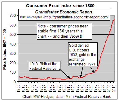
This chart is a real history lesson regarding inflation in America.
It plots the Consumer Price Index (CPI-U) from 1800 to today, a period of 210 years.
It shows stable consumer prices for 125 years.
And, thereafter, prices soared up, up and away.
For the first two-thirds of this chart the consumer price index oscillated at or below the 50 point price index mark, indicating relatively stable consumer prices and dollar purchasing power for nearly a century and a half.
Thus, 150 years of near nil inflation.
But in the past 50 years, especially after 1971, the consumer price index in this chart
took off - -
- - inflating prices more than 1,000 times higher.
Note: prior to 1913, a period of relatively stable prices, there was no Federal Reserve Bank. This chart calls into question the stated purpose of creating a Federal Reserve in 1913 where citizens were told this action would assure price stability. However, thereafter prices soared instead of becoming more stable. This chart appears to shout that > > the Federal Reserve was created for the purpose of generating inflation, and to thereby support a debt-driven national economy.
Additionally, the chart shows the points of rapid change of the prior lower inflation occurred in 1933 and in 1971 as the federal government waged major war on gold as a stable backing to the dollar - in the end elliminating all such backing. One could argue from this graphic it was the intent of the Federal Re3serve and the federal government to promote inflation, and thereby debt generation, unhindered by any restraint which bit by bit has destroyed its buying power - - as shown below.
The data source for this chart is from the Minneapolis Federal Reserve Bank, incl. data from the U.S. Bureau of Labor Statistics (link #12). (The chart denotes U.S. citizens for the first time ever were disallowed in 1933 (FDR) from exchanging dollars for gold; in 1971 (Nixon) foreigners were likewise disallowed and the dollar ceased being backed by any gold standard.)
With those soaring prices, let us now look at what happened to the purchasing power of a single dollar - - from 1950 to today > >
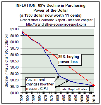 89%
Decline of a Dollar's Purchasing Value since 1950
89%
Decline of a Dollar's Purchasing Value since 1950
This chart shows an 89% reduction in the value of a dollar (its internal purchasing power) since 1950, where a dollar of 1950 is worth but 11.1 cents today - based on the consumer price index. Restated, an average cpi item costing $10 in 1950 costs $89 today.
Note in the chart: The accelerated fall of the domestic purchasing power of the dollar from 1965 to 1980 was due to higher annual inflation rates, which was a period when government social spending ratios were rising much faster than general economic growth.
As the chart shows, starting about 1981 and The Reagan Era, the decline of the purchasing power of a dollar started slowing dramatically - a significant rate of change in inflation compared to the prior several decades.
Now look to the right side of the chart, which shows an apparent slow-down in recent years. Actually this curve should point down faster after 1995, since in 1981 and 1995 the federal government changed the way their people measure the cost of living index by a cumulative 4.8% - - which otherwise would have placed the today's value of a 1950 dollar at 9 cents using the old criteria, not the 11 cents shown via the new criteria. (this is discussed further down this page).
For this chart, the average annual inflation rate since 1950 was about 4%. To some people 4% doesn't sound like a big number. However, compound 4% over 50+ years and the 1950 dollar is worth but 11 cents today - - as seen in the chart.
(Compound it out another 50 years into the future to 2056, when today's 15-year old will retire, and the value of today's dollar will be worth just 12 - - another 89% plunge - - bringing it to a value of just 1.5 cents when compared to the 1950 dollar.)
It takes $10,000 cash today to purchase that which $1,100 would purchase in 1950. And with higher combined federal & state/local tax rates today compared to then, it takes even more. Typical example: you need 42 cents as of 2008 to purchase the same stamp that cost just 3 cents in 1950 - - a 1,300% price increase - - and nobody dare claim any quality improvement for that increase.
Had annual rates not exceeded the approx. 1% average inflation rate of 1950-65 (see chart below) for the entire period shown it would take just $2,200 today (not $10,000) to be equivalent to the $1,100 of 1950 - meaning 78% fewer dollars to have the same buying power. No wonder many mothers were forced into the work-place to help make ends meet, as shown in the Family Income Report. If most of the men and women are today in the work-force to make ends meet, who else can a family send into the work-force during the next decades? Their children? And/or, just open up the southern borders even wider?
Who benefits from this performance? Answer: the financial sector and governments at all levels (and proponents of big government over families), as revenue streams are accelerated by both tax bracket creep, extending the caps for social security taxes, property taxes, and sales taxes. Inflation camouflaged government growth, as it expanded to consume and control a larger share of the economy.
And, government spending is mostly consumptive spending that adds inflation via increased demand of its employees and transfer recipients, without compensating productivity. Few deny that government is significantly less efficient and productive than the private sector. As it expanded its relative size, and as credit/debt soared, such contributed to more national inefficiency and therefore to a reduction in the purchasing value of a dollar.
Big Question: What is the reason for this horrendous erosion of the purchasing power of a
dollar?
Answer: The chart at the top of this page argues that the cause is due to
the creation of the Federal Reserve (in 1913), followed by the absence of a gold standard
(since 1933) to restrain this Federal Reserve, allowing the Federal Reserve's banking
system to create piles of new dollars and debt out of thin air. For proof of this answer,
see the following statements of Federal Reserve chairman Alan Greenspan >
"In the absence of the gold standard, there is no way to protect savings from confiscation through inflation. There is no safe store of value. The abandonment of the gold standard made it possible for welfare statists to use the banking system as a means to an unlimited expansion of credit (debt creation)" - Alan Greenspan (#8), 1966
"It was the case that the price level in 1929 was not much different, on net, from what it had been in 1800. But, in the two decades following the abandonment of the gold standard in 1933, the consumer price index in the United States nearly doubled. And, in the four decades after that, prices quintupled. Monetary policy, unleashed from the constraint of domestic gold convertibility, has allowed a persistent over issuance of money. As recently as a decade ago, central bankers, having witnessed more than a half-century of chronic inflation, appeared to confirm that a fiat currency was inherently subject to excess." - Chairman Alan Greenspan Before the Economic Club of New York, December 19, 2002 "Issues for Monetary Policy" (http://www.federalreserve.gov/boarddocs/speeches/2002/20021219/)Read that last quote again. It states there was zero inflation for 129 years from 1800 to 1929. But, once the gold standard was abandoned there was no restraint on the creation of money and debt out of thin air by the banking system - - and inflation soared, as shown by the charts above. Additionally, as the first chart shows, there was next to zero inflation for 113 years from 1800 to 1913 before the Federal Reserve was created. It appears government and the financial sector wanted inflation to replace stable prices (zero inflation), and the Federal Reserve was created and soon after the gold standard was eliminated to accomplish same.
"The first panacea for a mismanaged nation is inflation of the currency; the second is war. Both bring a temporary prosperity; both bring a permanent ruin. Both are the refuge of political and economic opportunists." - Ernest Hemingway
MONEY SUPPLY UP, UP AND AWAY
DRIVES INFLATION ALL THE WAY
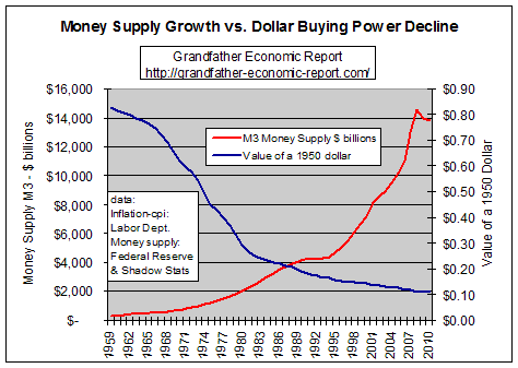 A warning -
MONEY SUPPLY explosion A warning -
MONEY SUPPLY explosioncreating loss of purchasing power of each dollar, plus exploding debt "Inflation is always and everywhere a monetary phenomenon. To control inflation, you need to control the money supply." Milton Friedman, Nobel Laureate in Economics. As money supply exploded 3,000% - - The dollar's purchasing power collapsed 85%, - - as proven by this chart. The left chart compares growth of the broad money supply M3 (red curve) with the the shrinking value of a dollar as determined by the cost of living index (cpi-all items) - blue curve. The rising red curve shows growth of the money supply since 1959, the value of which is shown on the left axis in billions of dollars - from $302 billion in 1959 to $11.5 trillion in 2006. ( M3 data: economagic.com). (the 'broad' money supply is defined by economists as the 'M3' of money, being the sum of all cash, checking and savings accounts, small and large time deposits and money market funds). The declining blue curve (taken from the chart at the top of this page) represents the falling buying value of a 1950 dollar, per the right axis shrinking from a value of 83 cents in 1959 to 11.1 cents in 2008 - representing 89% loss in purchasing power since 1959. (based on cpi data: table B-60, 2004 President's Economic Report). This chart certainly appears to validate Dr. Friedman's above statement > "Inflation is always and everywhere a monetary phenomenon. To control inflation, you need to control the money supply." |
 HOW ABOUT THIS ?
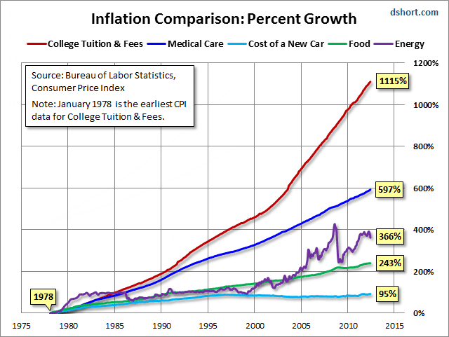
The left chart shows price increases since 1978-2012 for 5 components
First, look at the red line. That's a nice gift to our children and grandchildren - run away college tuition and fees - up 1,115%.
The blue line for Medical care is up 597%.
One might ask why are these two items, up so much faster price-wise than autos, food and engergy.
Suggested answer > both are not free-market items - both are manipulated by the federa government and the Federal Reserve to promote GDP driven by debt - more and more debt.
Example: government guaranteed subsidized student loans are by far the main ingredient driving college costs (just as cheap loans drove the housing bubble until it collapased). Student loans are now exceed credit card debt in the nation.
College tuition costs are not a part of the consumer price index,
which means government reported inflation understates inflation. And, despite all these
kids going to college because its so wasy to go into debt, it is estimated 4 our of 10
graduates, if working, are working in fields that do not require a college degree and
those workers lucky enough to have a full-time job earned 5.4% inflaton-adjusted less than
the year 2000 average income. So, today's young people not only have fewer REAL career job
opportunities, but unlike past generations they are up to their necks in debt - big time
!! Instead of coming out of school with a great education entering a great careeer with
zero debt they are saddled with debt before they even start - and what does this do to
their chance to finance their first home, compared to prior generations. No wonder so many
must not only delay buying their starter home, but many move back in with their parents.
Does this help them, or the housing market? Not a pretty picture. It all comes down to why
- and the why is quite clear - which is, the economy is driven by debt and this on going
soaring debt of college costs does so - but what a price. What a price.
(this chart is from Doug Short of Advisor
Perspectives in 2012)
Where has this taken us?
What are we leaving our children and grandchildren?
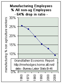
How about soaring debt ratios in all sectors, including the household sector, to new records each year (as proven by America Total Debt Report), to exploding federal debt (as proven by the Federal Govt. Debt Report), to soaring record trade deficits with surging asset transfers to foreign entities because America borrows to consume more than it produces (as proven by the International Trade Report), to plunging savings rates to historic lows (as proven by the savings chart), to long term stagnant inflation-adjusted median family incomes including declining real incomes of single household workers (as proven by the Family Income Report), to a 60% drop in the U.S. manufacturing base and its high salaries and benefits (as proven by the Manufacturing Report) causing more dependence on foreign entities, to a 74% loss in the foreign exchange value of the dollar (as proven by the Exchange Rate Report), to a loss of energy independence (as proven by the Energy Report), to the ticking time bomb for senior citizens regarding pensions and medical care (as proven by the Social Security Report), and, again, to an 89% loss of the internal purchasing power of the dollar due to generated inflation (as proven by the chart above). We can add to this ominous list the sagging quality of our education system and its lagging performance relative to foreign students and to our own past, including its own price inflation (as proven by the Education Report), our lagging life expectancy and health system quality at higher cost relative to other nations (as proven by the Health Care Report), and each year each worker must support more state & local government employees than ever before (as proven by the State & Local Government Spending Report), and finally - - the larger share of the economy consumed by government spending and the diminished share left to the private sector compared to the past (as proven by the Government Growth Report), including its impact on national security.
Everyone is invited to study the above and make their own list of impacts and consequences.
OTHER RELATED ISSUES - - Annual CPI, Revising CPI, What is the CPI?, Foreign Comparison, Money Supply, House Inflation, Mortgage Interest Rates, Commodity Index, Different Inflation Measurements, Bottom-line > >
Taxes: we know in 2000 the federal government raked in more tax revenue (as a share of the economy) in peace-time history. Additionally, the Social Security Report shows today's working people are paying five (5) times higher social security & Medicare tax rates than did most of today's retired people during their working days. Some don't think higher taxes are a form of inflation, but this author does.
How many private sector families were guaranteed automatic cost of living adjustments by law during this period? However, government employees and others receiving incomes from government receive COLAs, including seniors.
Who lost? Answer: those who were saving and those who were working without guaranteed inflation protection for their earnings and for their increased tax rates to federal, state & local governments. Children also lost, as 2 ½ decades of inflation-adjusted family income stagnation forced more mothers to the work-force and away from full-time up-bringing of their children which further increased government revenue. And, household debt exploded and savings plunged.
International: Inflation performance since 1970 has caused declines of up to 70% in our foreign purchasing power, and America became the largest debtor on earth with ballooning negative trade balances.
Another item: as inflation camouflaged government growth, the issuance of regulations exploded to consume 15% of the economy, productivity declined if measured by meaningful methods, and more non-teaching employees and social mandates were added to schools resulting in a 71% decline in the education quality/price index, further driving inflation. We have heard about 'grade inflation' in public schools, yet U.S. high school seniors come in last of all nations on The International Math and Science Tests. And, in addition to supporting more retired seniors per working person, each working individual also must support 3 times more state & local government employees than before. And total government spending has grown faster than the economy for a long time. All this drives inflation.
To make it more difficult for us to understand inflation, major changes in measurement criteria have been made - to make us 'feel' better. This decline follows the same trend as the decline in the share of our economy represented by the private sector, which was caused by the fact that combined federal and state & local government spending increased faster than the economy, and therefore made a greater and greater portion of the economic pie dependent upon and controlled by government.
Today it is reported inflation is "under control" if annual inflation rates are less than 4%. Why do we accept such a lowering of standards from the 1% or lower ratio achieved in the past?
Or - - how about a ZERO INFLATION GOAL as per the first chart in this chapter.
The following chart's black plot line shows the inflation rate each year since 1952, as measured by the Consumer Price Index. (using the same measurement method employed prior to 1995. The red curve represents govt.'s revised method, discussed below).
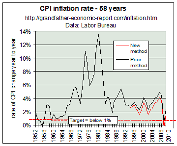 The first thing to note in this chart is today's
inflation rate is the highest in 16 years - and well above the
1952-1967 period. Why did media and government officials imply inflation is 'dead', saying
its the 'lowest in our life time'? Many citizens were misled by such erroneous
statements and their planning for the future suffered.
The first thing to note in this chart is today's
inflation rate is the highest in 16 years - and well above the
1952-1967 period. Why did media and government officials imply inflation is 'dead', saying
its the 'lowest in our life time'? Many citizens were misled by such erroneous
statements and their planning for the future suffered.
Look to the left end of the chart. For the period 1952-1965 the inflation rate averaged about 1% or less per year (the dashed red line). This low-inflation period produced strong inflation-adjusted family income growth. Therefore, we set the 1% level as our target - - noted by the dashed-red line on the chart. In the mid-1960's inflation rates began a dramatic rise, for the next 2 decades. Once inflation rates exceeded about 3% inflation-adjusted family incomes and savings rates ceased to grow, as seen in the Family Income Report - - just as today's incomes are not growing while family savings plummet. The Reagan Era of the early 1980's started excessive rates downward toward the 2% level. Since then, inflation rates were much higher than the 1% rate.
Computer price impact: Another item to keep in mind is the impact on the total CPI of rapidly declining computer prices. From 1987 to 1993 computer prices tracked the CPI, but then computer prices dropped much faster than did the over-all CPI. If you look at the CPI, excluding the computer component of the CPI, the non-computer CPI in 1997 was higher than in 1993 - 40% higher. To provide some numbers: in 1997 the CPI excluding computers was about 3.8%, or 1.5% above the total CPI for that year. So, huge declines in prices for computers, imported oil and other metals in the those 4 years effectively camouflaged the true underlying rate of inflation. But, these price declines cannot forever mask true inflation.
Additional concern regarding late 1990s data: It's a fact government changed how it measures inflation to make recent rates appear less threatening, and thereafter invented the song that 'inflation is dead' and claimed that this, together with productivity, improved U.S. competitiveness. That is a myth, since the trade deficit exploded and private sector debt exploded to new records in the last 7 years, indicating we have become increasingly less competitive, and we owe more and more to foreigners and other creditors?
May 2002 > the Wall Street Journal stated that Pat Jackman, an economist at the Bureau of Labor Statistics, admits the CPI Index may understate actual year-over-year price increases. See > Different Inflation Measurements near bottom of this page.
Additionally > The so-called slowing of inflation rates measured by traditional methods were not just due to changing how they measure the cost of living index in recent years. The unprecedented explosion of new debt creation, brought on by manipulated interest rates to historic lows, helped fuel something outside the cost of living index - - exploding asset bubbles in stocks and real estate. Of course these bubbles will not be sustained, just as the real estate bubble is rapidly deflating. Therefore, in recent years explosive debt creation has not all gone into prices of goods and services which are captured by the CPI, but much went into creating asset bubbles that cannot be sustained and are not so captured. As economist Steven Roach said Sept. 2002, "The transition from tight to easy money unleashed a massive asset bubble and concomitant excesses in the real economy - - that must be purged."
Did you know the import price index increased 21% in July 2008 from a year ago, the biggest year-over-year increase on record?
The STATISTICAL REVISIONISM AND WIZARDRY Report documents numerous changes in measurement criteria during the mid-1990s. When some say today's inflation is low, you have to ask 'compared to what' - since they now measure CPI in 'oranges' and then compare to 'apples' in the past. Changes are always in one direction - - which is to pump-up the data to make citizens 'feel better.'
Watch it - CPI measuring criteria has changed: The short red line at the right of the chart since 1995 reflects a new government measurement method now in process, which lowered the historical method up to 3/4%. For 1995 3.1% inflation was effectively reduced to 2.8% by the new method, for 1996 from 3.4% to 3%, for 1997 from 2.8% to 2.3% for 1998 from 2.2% to 1.6%, for 1999 from 3% to 2.2%, and for 2003 from 3.1% to 2.3%. (the new changes are per Business Week, 10/4/97, pg. 30: 'Since the start of 1995, Labor Dept. statisticians have 'quietly' modified their treatment of rents, hospital prices, drugs, and altered other sampling methods. This has lowered the published rate of consumer inflation by 0.2 to 0.5 of a percentage point - and, a change of 0.63 points will be applied in 1998 and 0.75 in 1999 and forward. But, the govt. is not going back to fix historic data in the same way (so reviewing today's quoted inflation rates vs. the past must be with care to develop historic comparisons). Therefore, part of the apparent lower inflation rate numbers reported today compared to the past are from changing the yardstick of measurement.' That's like moving in the baseball field fence and then declaring > from now on our home-run performance will be better.
"Looking at it from the government point of view, there’s a strong political motivation to understate the CPI. By understating, it keeps COLA adjustments down on entitlements, which are at this point the largest part of the government’s budget. And by understating CPI, the government can minimize the inflationary impact on things such as rents, which are indexed to CPI, or wages, pensions and a whole list of ancillary costs to artificially keep inflation rates down. Bottom-line: The published CPI understates the real inflation rate." Dec 2005 - Barry Bannister, respected commodity analyst.
2007 report > In 1983 the Bureau of Labor Statistics changed how they measure the housing component of the CPI, such as to make inflation appear less than it is. They revised the housing component to equivalent rent, instead of house prices, which dropped the CPI dramatically. See report on this.
INFLATION RATE IS AT LEAST 1% HIGHER AND GDP 1% LOWER
Bill Goss of PIMCO stated in October 2004, "The CPI as
calculated is definitely a con job foisted on an unwitting public by government
officials. The government says that if the quality of a product got better over the last
12 months that it didn’t really go up in price and in fact it may have actually gone
down! In 1998 the methodology was adopted for computers – surely the biggest step
backward in realistic inflation calculations. Since then, the BLS has expanded the concept
to include audio equipment, video equipment, washers/dryers, DVDs, refrigerators, and of
all things, college textbooks! (see poor quality textbooks). Today
no less than 46% of the weight of the U.S. CPI comes from products subject to hedonic
adjustments. PIMCO calculates that without them, and similarly disinflating substitution
biases, Greenspan’s favorite inflation measure, the PCE, would be between 0.5% and
1.1% higher each year since 1987. If the CPI is so low and therefore real wages in
the black, tell me why
(It should be pointed out that an over-stated CPI of 1% per year compounded for say 15 years produces a GDP that is 16% over-stated and Social Security monthly income 16% less to seniors than it should be. - calculation: M. Hodges)
Why did they do this? Answer: One could say if you don't like what you are paying then change the way you measure.
In this light, the Clinton administration and some congressional leaders decided to change how inflation is measured in order to reduce the annual cost-of-living adjustment pay-outs to recipients of social security and other programs, without saying that was their objective. Some might call this government fraud and theft in disguise.
The following chart shows how much social security recipients would have lost in earnings if the CPI had been revised for 1984-1996, producing a gap of $100 per month by 1996. That was one of their motivations to make the change, and thereby also produce more surpluses in the trust funds to support more spending on non pension stuff.
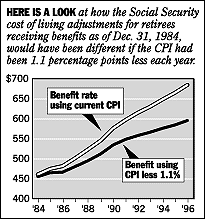 Now, project those
lines on the chart from 1996 forward into the future, and look how much future pensioners
will be penalized via the change that was finally introduced in 1996.
Now, project those
lines on the chart from 1996 forward into the future, and look how much future pensioners
will be penalized via the change that was finally introduced in 1996.
If that 'savings' would be put into the trust fund to shore it up for future retirees then some might better justify the reason for changing inflation measurement criteria. But it was not saved for the future, it was siphoned-off and spent.
Additionally, when one hears on T-V about inflation rates one needs to understand that much of the touted by the fact criteria for measuring the CPI is being revised each year - - without historical perspective.
This does not take into account inflation in housing and stocks. Hopefully, the above charts and discussion provide some perspective.
For more on this 'changing the rules' in measuring inflation, the impact on social security recipients, and what makes up the CPI - see the Cost of Living Debate article from the Washington Post (http://www.washingtonpost.com/wp-srv/business/longterm/cpi/cpi.htm)
INFLATION SHOULD NOT EXCEED 0.5%
On this new, adjusted basis, our 1% target on the chart should be reduced to perhaps 0.5%. So, if one day you hear inflation rates are averaging below 0.5% annually without again manipulating how they measure, then you might say "OK, that's more like that experienced by my grandfather in the 1950s when only one wage-earner per family was required to rapidly expand living standards and savings, with minimal debt - - and when most mothers could stay at home to give full-time attention to their children and their schools."
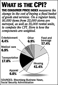 WHAT IS THE CPI (Cost of Living Index)? And -
WHAT IS IT NOT? WHAT IS THE CPI (Cost of Living Index)? And -
WHAT IS IT NOT? Here's what IS included in the official CPI. The left chart shows the components of the official consumer cost of living index, and the percentage each represents of the total CPI. Note food and housing account for 58% of the total. However, it must be pointed out that the housing component shown in this chart significantly understates housing, since this is based on rental price changes - - and does not account for the huge inflation in new and existing home prices, as discussed below. And, we have all heard it reported we pay more in taxes than we do for food and housing - - yet taxes are NOT included in the official CPI. Why not, you should ask. We know property taxes have not gone down, nor our sales taxes, nor federal taxes, nor
social security payroll taxes, nor excise taxes, nor _ _ _ . If they go up, which they do, or if they add more taxes at federal, state, or local government levels, which they do - - that is inflation that should be in the CPI, so individuals and families better understand total inflation - - not just a manipulated inflation index. Yet - - taxes are not included in the CPI computation, yet the cost of government is the largest component (43%) of the economy. Question: Why Not? This Inflation Report WILL NOT IGNORE that biggie!! Notice the large housing component of the CPI in this chart. As mentioned above, this component is understated and significantly distorts the CPI reported to the public. Right? Well, some years ago, the way the housing component is measured was changed. It no longer tracks the inflation in housing prices (note below charts showing huge increases in house price inflation). This component now only tracks what it calls the rental value of owner-occupied housing which moves much slower - - especially recently as record low interest rates manipulated by the Federal Reserve have driven more renters to become home owners which lowered rental prices due to lower rental demand as it also drove up house price inflation. This altered measure of housing has nothing to do with housing inflation, so the CPI housing component significantly understates true inflation. Why would government wish to understate the CPI? One reason is to fool workers and social security recipients into accepting lower cost of living adjustments. Another is to fool investors into thinking the economy is better than it is and to allow the government to pay lower interest rates on its mounting debt. Should such manipulation be allowed ?? |
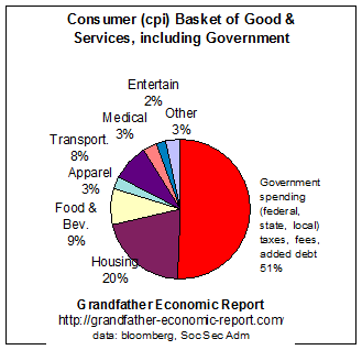 The next chart adds what is NOT included in the
official CPI. a missing element - government spending impacts shown by the red
slice, and adjusts the ratio of each of the original components accordingly.
The next chart adds what is NOT included in the
official CPI. a missing element - government spending impacts shown by the red
slice, and adjusts the ratio of each of the original components accordingly.
First, we notice from the chart that the red slice of the pie, 46% of the total pie,
is represented by that required to support all federal, state, and local government
spending.
Government is a real cost to each of us, just as food and housing are real costs to
each of us. Many will say one needs food & housing more than government - - especially
more than large government.
This 46% figure is from The Government Growth Report.
This 46% for government spending (% net national income), you will notice, is much more than the sum of the food, housing and clothing components which total 35% - - just as we have heard before. (BTW - the housing component is based on rents, not housing prices as should be the case)
Since we know government's taxes and regulations impact inflation, just as any other item faced by individuals and families, many continue to ask why is this not included in the official CPI calculation - -
especially since we know government tax revenue at all levels has been increasing at a
faster rate than both GDP and personal incomes. And, from where does that revenue
originate?
Answer: It all comes from individuals and families, because they pay all costs of
government, in one way or another, both direct and indirect. - - as reported in the Tax Report.
and, we know federal government spending has increased faster than general CPI inflation and even faster than growth of the entire economy. See the Federal Government Spending Report.
and, we know state and local government continues to increase their employee headcount faster than growth of the general population - - as shown in the State & Local Government Spending Report.
What percentage of households have experienced a reduction each year in their property taxes? Answer: that's not on anyone's radar screen. How many have seen their property taxes rise? Everyone! That's inflation, and must be included in the CPI. As reported in the Tax Report and according to Economy.com, since 1995 property taxes nationwide have jumped 48%, that’s 30% higher than inflation.
And, we know government employees write more regulations each year, which increases compliance costs to consumers (although much is 'hidden'), as shown in the Regulation Compliance Cost Report.
This regulation cost component is not shown in the 46% red slice of the above pie chart, but if it were shown it would add as much as 14% to the above government slice of the pie (since all compliance costs are not shown in say food costs), bringing that red slice to as much as 60% of the total pie - - and thereby reduce the remaining component slices (approximately) accordingly - - meaning, housing would become as low as 17% of the total, food 7%, etc.
In any case, the impact of complying with increased government regulations does impact inflation to consumers in a way that is not easily measured - - in fact government does not even budget compliance cost impacts before approving regulations, as such are in effect un-funded mandates imposed on the private sector.
NOW YOU KNOW - - at least a bit better - - that in addition to the 1990s' revision of the criteria for measuring the official CPI inflation rate, such as to minimize same as discussed in above articles, the official CPI does not even include the impact of government - - the largest cost item in the economy.
GUESS WHAT? - the above chart indicates that a way to reduce TOTAL inflation is to reduce the share of the economy controlled by government at all levels
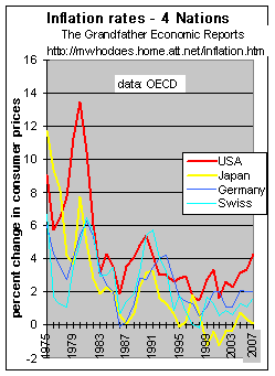
FOREIGN COMPARISONS INTERNATIONAL NOTE: U.S. future international competitiveness and living standards depend not just on our internal inflation rate, but how it compares to our major international competitors.
The left chart is according to data from the international Organization for Economic Cooperation & Development (OECD). The red line represents consumer price inflation in the USA - compared to several other nations. The USA continues to experience inflation rates higher than others, despite the U.S. revising its measuring method in 1995 to report 'lower' numbers. In June 2007 compared to a year before the U.S. inflation rate was 4.3% by its 'new' method shown in this chart. In this chart the other nations continue with their old, historic measurement method - such as the latest data point of 0.1% (Japan), 2% (Germany), and 1.6% (Swiss) - per The Economist 7/21/2007, pg. 93. These nations had consistently lower inflation rates than the U.S. during the past 2 decades, and continue to do so. U.S. costs continuely increase much faster than these tough competitors. In the 12 months to May 2007 Japan and Germany produced strong positive trade surpluses (combined of +$326 billion) whereas the US recorded a historic high negative trade deficit of $827 billion (Trade Report) - - that's a whopping relative $1.2 trillion U.S. negative trade difference. |
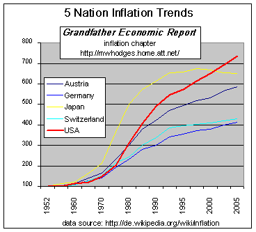 While its interesting to hear some
'brag' about today's lower inflation rates and making statements that 'inflation is dead',
one must always respond with the question: "Compared to What?" While its interesting to hear some
'brag' about today's lower inflation rates and making statements that 'inflation is dead',
one must always respond with the question: "Compared to What?" The left chart looks at longer term trends comparing cost of living index of 5 nations. Note the USA line is red, pointing upward faster relatiave to the others. To this observer it appears clear from these graphics that the USA needs much firmer action regarding inflation, as we need to be in the 0.5% rate range (incl. new housing prices) and with a slower cost of living index (less inflation) than international competitors - - instead of changing measurement criteria or leaving out of the measurement key components like food and energy - - which camouflages reality. data source: You may find basis and data for this CPI chart: (from german wikipedia, keyword "inflation" ) http://de.wikipedia.org/wiki/Inflation and http://de.wikipedia.org/wiki/Bild:Cpis.PNG |
ENERGY CHALLENGE
As recently as 1950 the U.S. was producing half the world's oil. Forty-eight years later, we don't produce half our own oil. Domestic production peaked in 1970, 30 years ago, and today we produce just 40% of the crude we consume. It is reported that within the next 5-15 years world oil production will peak, then decline. Perhaps international producers will prefer to maintain higher and higher prices to protect their diminishing supplies or limit they type of customer to whom they will sell based on geo-political agendas. (what are the energy implications for inflation, real family living standards, and national security looking forward, compared to past generations?). Energy-dependence - The Energy Report graphically shows declining oil production and reserves, and rapidly rising consumption of both oil and gas, as the U.S. has become more dependent on foreign oil and gas than ever before - - which has both economic, inflation, and national security implications.
| MONEY SUPPLY (incl. repeating the above chart) A warning
- MONEY SUPPLY explosion "Inflation is always and everywhere a monetary phenomenon. To control inflation, you need to control the money supply." Milton Friedman, Nobel Laureate in Economics. The dollar's purchasing power collapsed 89%, as the M3 money supply exploded 4,536% - - as proven by this chart. The left chart compares growth of the broad money supply M3 (red curve) with the the shrinking value of a a 1950 dollar as determined by the cost of living index (cpi-all items) - blue curve. The rising red curve shows growth of the money supply since 1959, the value of which is shown on the left axis in billions of dollars - from $302 billion in 1959 to $14 trillion in 2008. ( M3 data: economagic.com and http://www.nowandfutures.com./images/slides/m3b.html). (the 'broad' money supply is defined by economists as the 'M3' of money, being the sum of all cash, checking and savings accounts, small and large time deposits and money market funds). The declining blue curve (taken from the chart at the top of this page) represents the falling buying value of a 1950 dollar, per the right axis shrinking from a value of 83 cents in 1959 to 11.1 cents in 2008 - representing 89% loss in purchasing power since 1959. (based on cpi data: table B-60, 2004 President's Economic Report). This chart certainly appears to validate Dr. Friedman's above statement > "Inflation is always and everywhere a monetary phenomenon. To control inflation, you need to control the money supply." |
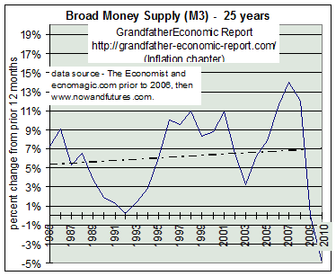 This chart records 23 years of the growth rate in the broad
measure of U.S. money supply creation. Note the recent
accelerating upward trend.
This chart records 23 years of the growth rate in the broad
measure of U.S. money supply creation. Note the recent
accelerating upward trend.
Although some claim the M3 money supply growth rate measure has less meaning in the late 1990s and 2000s since money is now also 'created' by non-bank entities, such as the GSEs (Fannie Mae and Freddie Mac), it is included here for interested visitors.
Note its fall from 1986 to 1992, which reduced previously very high inflation rates.
But, money supply exploded in the 1990s - as if 'powers-to-be' decided the best way to increase economic growth (at least for the short term) was to surge money (debt) creation, instead of real investment in infrastructure and manufacturing - - indicating trouble down stream. It is interesting that during this period of high money supply growth the definition of inflation's cost of living index (CPI) was changed to downplay inflation reporting (see below).
However, as mentioned above, non-bank entities such as the GSEs started creating money which may not slow up here. As a note, its interesting that the public does not understand the reason the Federal Reserve stopped publishing this M3 data in early 2006. Some believe the reason was because increases in this money supply foretell accelerating inflation and the Federal Reserve did not want to 'advertise' what is coming on that front. In any case, data after that date has been compiled by nowandfutures.com and is plotted here starting in 2006, showing a disturbing increase to nearly 20% annual rate - pointing to accelerating future inflation. "Composition of the U.S. Money Suppy" in July 2007 reported that since money suppply growth causes inflation and that current trends in money supply are such as to suggest real inflation, that experienced by real people, is 7-14% - - certainly no where near the bogus 2% reported by the government.
It is this author's view that total debt is the item to watch, not M3 money supply alone. That is the reason such an extensive chapter was created, called America's Total Debt Report (sum of private sector and government debt) - - which shows that each dollar increase in total debt (now near $50 trillion) is producing a diminishing change in national income - - and the debt of households exploded to the highest ratios in history.
This appears to mean that in order to sustain national income growth (for the time being) more and more new debt (money supply) must be created than ever before - - faster and faster. Sooner or later the 'chickens must come home to roost' regarding huge debt levels in all sectors of the economy.
The reader needs to understand that increases in the money supply are largely brought about by either printing more dollar bills, or by increases in more debt money injected into the economy, or a combination of both. Both eventually result in a combination of more imbalances in the economy, leading to inflation and/or economic contraction as well as devaluation of the U.S. dollar's international value.
'Boom bust cycles and their causes' - Explaining the Fed and money supply for those interested in more depth > "The major catalyst that sets in motion a boom-bust economic cycle is the monetary pumping and artificial lowering of interest rates by a central bank. A loose monetary stance by the central bank enables the diversion of resources away from wealth generating activities towards wealth consumption, thereby causing a depletion of the pool of funding." 'Monetary Policy', by Dr. Frank Shostak, PhD (email > FShostak@MANFINANCIAL.COM.AU).
More on the CPI and Cost of Living
Measurement Games
(although the following is now past history - it's repeated for reader info)
In the mid-1990s consideration was given to revising the cost of living index (CPI), such as the Boskin Commission Report of December 1996, which stated inflation rates might have been over-stated by 1.1%. Great care should have been exercised before jumping to revise any historic measurement criteria since that distorts comparison with the past, but especially since politicians were under the gun to revise economic imbalances by perhaps saying they never existed.
Example: the deficit might be eliminated at the expense of pensioners just by changing the CPI methods, since they were counting social security surpluses as if they belonged to the general government, which would take the 'heat' off politicians to make the hard general government spending reduction choices. Another example: politicians were unhappy facing continued long-term stagnation of inflation-adjusted family incomes, and if they could revise the way inflation was measured this might cause a miracle and make it appear family income pressure is less.
The exercise appeared aimed to revise CPI (which cuts COLAs) by a politically-accepted method produced by a commission established for this purpose, with the sole objective of increasing net revenues for spending on other programs - by a 'hidden' method which is effectively a Tax Increase.
Even the 'justifications' for CPI changes of the 'enhanced quality' or shopping approach arguments are very weak - there have always been so-called quality improvements and changes in shopping methods since the beginning of time.
Further, there should be clear legislation that all 'savings' resulting from CPI revisions must not be converted to other spending, but must be applied direct to principal payments on federal debt AND to tax cuts.
Such number-changing approaches, as the Boskin CPI study, offer political 'game-making' potential for politicians to further disguise spending and the deficit, as well as making the economy appear better than it actually is.
Further, even if one applies the Boskin 1.1% change to measuring family incomes (see Family Income Report), still the period prior to 1970 saw median family incomes grow a huge three times faster than after 1970. So, such CPI adjustments will not explain-away this major shift in family financial conditions. So, why play numbers games?
"We should be nervous about dealing with what are essentially political choices by fobbing them off on a technical revision," said Paul Krugman, an economist at the Massachusetts Institute of Technology - to the Washington Post.
[for June 1997 report (Labor Dept.: CPI Modestly Overstates Inflation) that disputes use of the Boskin commission report, and states at most the overstatement is 0.4%, and if medical costs are properly considered said overstatement may disappear - - see: http://www.yahoo.com/headlines/970608/business/stories/cpi_2.html . Also, see the Full Report on the CPI ]
Many economists and the Federal Reserve Board Chairman agree the new measurement criteria understates inflation.
Student loan debt: among the two-thirds of college students with loans, the average debt has jumped from $9,250 in 1993 to $19,200, a 58% increase after adjustment for inflation. Jan. 2007 at http://www.usatoday.com/money/perfi/college/2007-01-12-college-tuition-usat_x.htm
HOUSING PRICES - - 1,100% INFLATION SINCE 1959
The consumer cost of living index (CPI) does not include inflating housing prices.
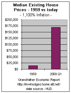 The left chart compares the median price of a single family home
today vs. 1959.
The left chart compares the median price of a single family home
today vs. 1959.
In 1959 my house cost $14,100 (see below*)
In 2009 Q1 the median price of an existing house was $169,000 (data:
http://www.realtor.org/research/research/metroprice)
This increase reflects 1,100% house inflation over that time period.
In the recent past 5 years house prices inflated significantly (driven by extremely low mortgage rates), only to decline rapidly in 2008-09.
If home prices were included in the cost of living index, which is not the case, its easy to understand how this index significantly understates inflation.
Coupling inflated home prices with mortgage rates well above 1959 rates, it's easy to 'feel' the pinch on young families today, and easier to understand why past generations could get by with one wage-earner per family while building home equity and savings, with but small debt. To realize a home most of today's families require both husband and wife in the workforce, leaving young children without a full-time mother - - and today's average household has the lowest rate of savings and the highest debt ratio in history.
This is a good example of what inflation does. One thing that has become much more dangerous for many, many families - - taking out home equity loans and thereby consuming their equity - - whereas in past generations many homeowners eventually became free and clear - - they saved their equity buildup to help provide a living cushion in later years.
*Comment: The author's first new home for his family in 1959, the top model ($14,100) of a neat, new subdivision of professional residents, was financed for 30 years at fixed annual 5 ¼% interest rate. Monthly payments including tax and insurance were $94/month, which consumed approximately 17% of take home pay from my first job as a young engineer. My wife was able to choose to stay out of the workforce, and be home with our small children. This new concrete block home had 3 bedrooms, 2 baths, family room, living room, dining area, utility room, and screened porch - - totaling about 2,100 sq. ft. under roof. Floors were finished terrazzo (a type of tile) - - today considered a high-price luxury, compared to today's unfinished floors for standard houses. Heating was central gas, the roof was barrow tile. Also included was a tile-roofed 2-car carport with cement drive and outside gas lamps; the lot size was about 100 X 150 sq. ft; (this was not a GI loan, which then required a smaller 4 ½% interest rate).
2004 Housing Inflation - only 15% of Households can Afford
April 8, 2004. SAN DIEGO – The percentage of San Diego households that could afford a median-priced home was 15 percent, down from 22 percent a year earlier, according to a real estate industry report released Thursday. The February housing affordability index compared with 16 percent in January, according to the California Association of Realtors. The median home price in San Diego in February was $479,540, said Mark Giberson of the CAR. Households would need to make $111,510 annually to be able to afford a median-priced home in San Diego in February, Giberson said. The sheer increase in home prices means that the minimum qualifying income for a loan to buy a home is going up faster than most household incomes," said Robert Kleinhenz, the association's deputy chief economist. "It's a tough situation for residents of San Diego County." Twenty-four percent of households statewide were able to purchase a median- priced home in February, down 6 percent from the same period a year ago, according to the report. The minimum household income needed to purchase a median-priced home at $394,300 in California in February was $91,690, according to the association. Signonsandiego News Services, 4/4/04
And, that is nothing !! In 2005 and 2006 housing prices further accelerated which dramatically further decreased affordability.
NOTE - - it was noted above that the cost of living inflation index (CPI) understates inflation because its housing component does not take into account house price inflation but instead uses rental value, which significantly understates inflation.
DESPITE SO CALLED HISTORICALLY LOW MORTGAGE INTEREST RATES, TODAY'S RATES ARE WELL ABOVE THOSE OF 1960 - - and bankers cut rates on mortgages significantly less than they cut rates on family savings - - a double squeeze.
The next chart shows the 30-year fixed (no points) home mortgage interest rate in June 2006 of 6.86% vs. 5.25% in 1960.
This means many young families were paying 28% more interest each and every month compared to families in 1960 on the same level mortgage. Several years ago mortgage rates were over 8%, meaning they were 57% higher than 1960. That's a huge impact - - especially when applied against the tremendous inflation in housing prices (see above).
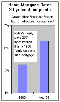 Recognizing stagnant inflation-adjusted incomes for the past 2 ½ decades,
higher mortgage rates coupled with inflated prices certainly negatively impact families -
- leading to nil savings, soaring debt and more mothers in the workforce than ever before.
Recognizing stagnant inflation-adjusted incomes for the past 2 ½ decades,
higher mortgage rates coupled with inflated prices certainly negatively impact families -
- leading to nil savings, soaring debt and more mothers in the workforce than ever before.
With the slow-down of the economy in recent years, and the tremendous pile-up of private sector debt to all-time records, the Federal Reserve slashed its federal funds interest rate to a record lows of but 0.5%, a total decrease of about 5.5 points.
Although that decrease depressed interest earned on family savings by at least that same 5.5 points, mortgage rates came down only about two points. And that so called mortgage 'low level' of 6.38% was still 22% above 1960 rates.
This is a good example of how 'powers-to-be' cut interest rates paid by banks to savers by 85% (from 6.5% to 1%), but only reduced mortgage rates by 25% (from 8% to 6%) in the face of roaring house price inflation resulting in huge mortgages- - all aimed to fuel income of the financial sector at the increasing expense of households. (Freddie Mac 30-year fixed rate mortgage)
For color graphics of comparative Tax Rates for Families, see Tax Report
For trends of family incomes, see Family Income Report
THE COMMODITY INDEX (crb) vs. COST OF LIVING INDEX (cpi) - - since 1950.
The rising red line is the inflation measure called the CPI, or cost of living index.
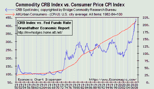 The blue line is the commodity research
bureau (CRB) price index for commodities.
The blue line is the commodity research
bureau (CRB) price index for commodities.
Note the huge disconnect in the early 1970s, which is the same period when median family incomes (inflation-adjusted) ceased to grow strongly as they did in prior periods - -
- - followed by surging debt ratios.
BTW- CRB data left scale this chart for 2004-2007 reached 439 points, indicating commodity inflation has soared 46% in the past 3 years. (The CPI 2004-2007 was up 12% - right scale of this chart)
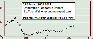 Left is an update of the commodity index
2008 to April 2011.
Left is an update of the commodity index
2008 to April 2011.
Additionally, some will argue inflation precipitated the decline in the U.S. manufacturing base, leading to the trend of ever increasing trade deficits as shown in the International Trade Report chapter and to rapidly increasing private sector and government debt ratios shown in America's Total Debt Report chapter.
And the real beginning of the long-term decline of international buying power of the dollar vs. the other major industrial competitors, shown graphically in the International Dollar Exchange Rate Report. And the significant challenge regarding energy shown in the Energy Report.
Threatening economic independence (as well as national security independence) of the USA relative to other foreign nations as we depend more on others for energy, commodities and financing debt.
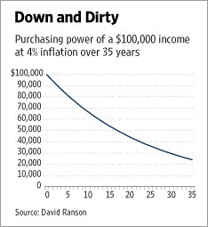 INFLATION IMPACT
ON PURCHASING POWER PROJECTED INFLATION IMPACT
ON PURCHASING POWER PROJECTEDThe accompanying graph shows how rapidly the purchasing power of income declines from an ongoing inflation of 4%. After nine years, an income of $100,000 is worth only $70,000. After 17 years its purchasing power has been cut in half, and after 30 years by about 70%. The cumulative loss of purchasing power if inflation persists above 4% is an awesome prospect that is surely going to be unacceptable. data source: Wall Street Journal 27 Feb. 2008, pg A17, by David Ranson |
DIFFERENT WAYS OF MEASURING INFLATION - 4% or 11.6% inflation rate - - take your pick.
Above we discussed the fact the federal government revised how they measure inflation, and continues to do so, in a way that significantly understates the consumer price index compared to past measurement methods - - without at the same time also showing comparative data points using the prior measurement methods.
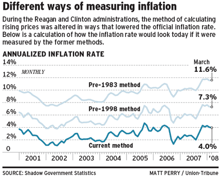 Note from this chart the March 2008
data point by the current govt. measuring method produced a 4% consumer cost of living
index inflation rate, compares to an 11.6% inflation rate if measured by the pre-1983
method.
Note from this chart the March 2008
data point by the current govt. measuring method produced a 4% consumer cost of living
index inflation rate, compares to an 11.6% inflation rate if measured by the pre-1983
method.
That's a huge 200% difference - and, most citizens from their own experience with living costs would agree with the prior measurement as more accurate to reality.
Why do you think the government chooses to understate its reporting of current cost of living price inflation by making it appear to be 66% less - - and not also provide reporting by prior methods?
And, what would be the impact on living standards of our seniors if their social
security incomes and bank saving incomes were increased accordingly, instead of showing
near nil inflation-related-adjustments? Additionally, how about the impact on families
trying to cope with the combination of prices, debt and job insecurity? chart
> April 30. 2008 > h
We understand that some may have it right in claiming the motive of government and the financial sector is to understate inflation so as to drive debt-based consumption (America Total Debt Report), which also drives trade deficits (International Trade Report), drives a devaluation of the U.S. dollar, drives a collapse of personal savings and drives stagnant to declining real family incomes (Family Income Report). In fact, hard data supporting evidence is contained in each of those linked reports. Check and see for yourself.
Seniors Squeezed by Soaring Medicare Premium Inflation
While some rightly worry that Social Security may not be there for future retirees, already today's seniors are being squeezed as Medicare premium deductions soar at a rate much faster than gross Social Security income.
Reported June 2008 > Since 1965, the year Medicare was created, the consumer price index has risen at a 4.5 percent annual rate. But the Medicare premium has inflated at an 8.4 percent rate over the same period. Worse, the gap appears to be growing. Between 2000 and 2008, the monthly Medicare premium grew from $45.40 to $96.40. That's a 9.9 percent annual rate of increase. It has been estimated that many a long-lived couple may need to reduce their retirement spending on nonmedical consumption by 13 percent to 26 percent to avoid sharp declines in purchasing power as they get older. http://www.chron.com/disp/story.mpl/business/5836900.html
SOME MORE FUN
- a typical lunch menu from the 1950s -
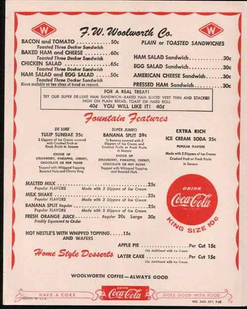 If the Federal Reserve had
achieved its mandate of maintaining a stable dollar,
If the Federal Reserve had
achieved its mandate of maintaining a stable dollar,
today you still would be paying these prices,
a period when family incomes increased faster than
inflation - -
with one-wage-earner families, too.
The fact it did not is proven by this menu - -
since prices increased more than 1,000 times since then.
(menu provided by Jim Sinclair, www.jsmineset.com)
3 IMPORTANT QUESTIONS
1. Is the U.S. a Free-Market Economy, or one manipulated via
central planning?
2. How can it be free if there is a federal reserve bank manipulating the money
supply and interest rates?
3. Should citizens trust government reporting of inflation data or rely
on it?
And the answer to #1 and #2 is > "To the extent that there is a central bank governing the amount of money in the system, that is not a free market," said former Federal Reserve Chairman Alan Greenspan said in September 2007 (on T-V to Jon Stewart)
And the answer to #3 is > May 14, 2008 - Former
Federal Reserve Chairman, Paul Volcker, said in testimony to the congressional Joint
Economic Committee in Washington, there's "a lot more inflation than
reflected in government figures."
http://www.bloomberg.com/apps/news?pid=20601068&sid=afuI201jKvwk&refer=economy
There you have the answer to our questions >
This is not a free market and citizens cannot trust reported data.
What will today's 12 cent dollar be worth when our grandchildren enter the work force? What will it be worth when they retire?
"In the absence of the gold standard, there is no way to protect savings from confiscation through inflation. There is no safe store of value. The financial policy of the welfare state requires that there be no way for the owners of wealth to protect themselves. Stripped of its academic jargon, the welfare state is nothing more than a mechanism by which governments confiscate the wealth of the productive members of a society to support a wide variety of welfare schemes. The abandonment of the gold standard made it possible for the welfare statists to use the banking system as a means to an unlimited expansion of credit (debt creation)." by Allan Greenspan (#8) in The Objectivist newsletter published in 1966, reprinted in Ayn Rand's Capitalism: The Unknown Ideal.
EXTERNAL LOSS OF BUYING POWER
How about some inflation fun?
Find out how much money you need today to equal the purchasing power of money in the past. Click the "Inflation Calculator." Up will pop the inflation calculator from the government's Bureau of Labor. As an example how it works, Enter the figure 1000 in the box, and then click the down arrow to enter the date: 1913. Then click "Calculate." You will see how much money, after taxes, you would need today to equal the purchasing power of $1,000 in 1913, the year of creation for the FED. The answer you will find is $18,585.86. Stated another way, this calculation shows that today it takes $18,585 to have the same buying power as just $1,000 in 1913. Isn't inflation fun? Now you can have fun with any number and year you choose to see what inflation has done.
The Nightmare German Hyper-Inflation of 1923-24 - The many parallels between 1919-24 Germany and present-day United States are cause for concern to many. This article explains events during this terrible hyper-inflationary period in Germany. (see article in our Links Page, item #19
The Masses wake up:
“But then, finally, the masses wake up. They become suddenly aware of the fact that inflation is a deliberate policy and will go on endlessly. A breakdown occurs."
Inflation works as long as the housewife thinks:
“I need a new frying pan badly. But prices are too high today; I shall wait until they drop again.” It comes to an abrupt end when people discover that the inflation will continue, that it causes the rise in prices, and that therefore prices will skyrocket infinitely. The critical stage begins when the housewife thinks: “I don’t need a new frying pan today; I may need one in a year or two. But I’ll buy it today because it will be much more expensive later.” Then the catastrophic end of the inflation is close. In its last stage the housewife thinks: “I don’t need another table; I shall never need one. But it’s wiser to buy a table than keep these scraps of paper that the government calls money, one minute longer.' - Ludwig von Mises - Theory of Money and Credit
I HOPE THIS REPORT HAS ENHANCED YOUR VIEW OF INFLATION
AND THAT IT HAS CAUSED DEEPER THOUGHT AS TO HOW TO PROTECT YOUR FUTURE
After you have reviewed the impact of the international loss of our dollar's value via the above, then read the brief companion reports below for a bigger picture:
Book mark this Inflation Report for future reference
Now to the HOME
Page Index
of the other chapters of the Grandfather Economic Reports
| Home & Contents | Summary | Feedback | What's New | Link Index | Eye-opener | Must See
Copyright © 1997-2011 Michael W. Hodges. The Grandfather Economic Report series is the intellectual property of its author; all rights reserved under Copyright Conventions. Permission to redistribute all or part of this series for non commercial purposes is granted by the author, provided the associated web page address is included and full credit given to the Grandfather Economic Report and the author, Michael Hodges. Notice appreciated via email.
 Hits - since reset
 The
The 