Grandfather Economic Report series
Home & Contents | Summary | Feedback
| What's New | Must
See | E-mail
QUESTION:
How much of our economy is controlled
by federal, state & local government ?
ANSWER:
$6.5 trillion, or 45% of our National Income
($20,719 per man, woman and child - or $82,876 per family of 4)
- the above control is by virtue of government spending
and, that does not count added economic control by
un-funded government-mandated regulatory compliance costs
of 14.9% of national income ($4,680 per person)
Therefore, government spending plus its mandated regulatory costs
means 60% of the economy is government-controlled,
amounting to $25,399 per person - incl. chiildren
I am concerned about the economic
future of our youth
This Government Spending report (sum federal plus state
& local government) is a chapter of the Grandfather Economic Report series,
revealing negative economic conditions facing families and their children, compared to
prior generations - - from debt to education to trade to national security.
The degree of Government Dominance of our Economy is Unknown to Many
- and, certainly was not intended by America's founding forefathers.
- here you will find 6 chart-pictures you have never seen -
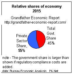 The left chart shows the total economy as a pie - divided into its 2
major components. The left chart shows the total economy as a pie - divided into its 2
major components. The red part shows that 45% of
the economy is dependent on spending of federal, state & local government - - (this compares to a 12% share when I was a
child). That 45% of national income sums to $6.5 trillion.
and the part left-over (the blue section) is the private sector, with only a 55% share (compared to an 88% share
previously, as to be seen below)
(Had a national healthcare program been implemented in the early 1990s the government
red slice above would have jumped to 55% of the nation's economic pie). (For prior year
pie charts as above, see Private Sector Report) |
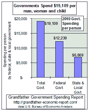 Last year combined spending by federal, state and
local government was over $6.5 trillion ($4.0 trillion federal govt.
spending and $2.5 trillion spending by state & local governments. Last year combined spending by federal, state and
local government was over $6.5 trillion ($4.0 trillion federal govt.
spending and $2.5 trillion spending by state & local governments.The left bar chart
above shows combined (federal + state + local) government spending was equivalent to
$19,109 per man, woman and child.
That's equivalent to $76,434 for a family of 4 - more than total
median family income.
Of the total spending, $12,229 per person was the federal portion and $6,869per person
was the portion for state & local governments.
(spending data source: Bureau of Economic Analysis, table B-82; population data:
Bureau of Census, table B-34) |
To support this spending, all earnings for 5.4 months was required from the average
worker. (see Tax Report).
AND - - in addition to government spending control of the economy we must add
government's un-funded regulatory compliance costs of $1.4 trillion imposed on the
economy, which represents 14.9% of national income or $5,636 per person. (see Regulatory Cost Compliance Report)
This brings total government control of the economy to $7
Trillion ($5.6 trillion spending and $1.4 trillion regulation costs), or 64% of the
economy's national income, or $25,166 per man, woman and child.
QUESTION
I s it fair to today's infants that they
will inherit an economy that is 10 times more
dependent upon the federal government PLUS 3 times more
dependent on state/local government spending, than my generation inherited?
This is not a pretty picture to bequeath
to the next generation.
Hello....My Name is Michael Hodges
As a new grandfather I decided to take time away from retirement hobbies to research
economic conditions facing my infant grandchildren, compared to that which my generation
faced when their age.
The findings made me concerned for their economic future and ashamed of the legacy
our generation is passing on to these youngsters. I want to share this with others.
Picture-charts depicting hard evidence are included with a historic perspective - - ('a
picture is worth 1,000 words') - - plus a few comments. You may have different opinions,
but I encourage you to look closely at the evidence, and carefully form your opinion - -
based on facts.
A Powerful Trend Chart You Have Never
Seen
- 82 year history of Government Growth -
< More government = less private sector
and, less individual freedom >
The total economy is made up of 2 basic components:
1) that portion dependent upon federal, state & local government spending (called
the government sector), and that part remaining - - called the private sector
(the part not dependent upon government spending,
2) and from which growth of national productivity, savings and real incomes depend).
The following chart shows a 80 year history of the trends of these components.
As the government spending sector increased faster than the economy,
the relative share remaining to the private sector has been steadily eroded - -
and, America is a much more socialistic, government-spending-dependent nation than ever
before.
Look carefully at this chart. Its quite easy to understand.
It tells a powerful story.
The next chart shows combined government (federal +
state & local) spending (the red rising line) has
grown faster than the total economy, from 12% consumption of national income to 49% today.
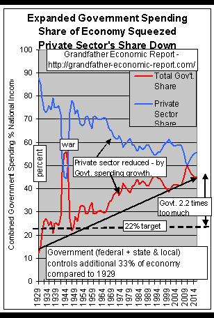 This means government now dominates/controls 4 times more of the
total economic pie than before. Had government grown at the same rate as the economy, that
red line would have been flat - - not rising 4 times faster than growth of the total
economy. (data - Bureau Econ. Analysis)
This means government now dominates/controls 4 times more of the
total economic pie than before. Had government grown at the same rate as the economy, that
red line would have been flat - - not rising 4 times faster than growth of the total
economy. (data - Bureau Econ. Analysis)
As a result, the residual share of the economy left to the pure Private Sector (the declining blue
line) has been squeezed down and down - from an 88% share of the economy to a
55% share. The capacity of the private sector to produce living standard growth has been diminished
over time due to government growing faster than the total economy. Had the private
sector share of the economy remained constant in its percentage of the economy, that blue
line would have stayed flat - - not dropping.
This move is grossly contrary to the wisdom of Thomas Jefferson: "Government
that governs least governs best."
Look at the red spending line at the left side of the chart. Note the spending jump in
the early 1930s, from a 12% share of the economy to a 22% level which was caused by the
New Deal social programs. To help provide some perspective, note the chart includes a
parallel black dash line called "22% Target" - - so one can follow how much more
spending ratios changed from that 'New Deal' jump.
From the chart for the early 1940s one can see the jump in spending ratios as about 33%
of the economy was transferred from the private sector to government World War II spending
activities. (at the time of WWII it was lucky for us that the private sector at the time
was about 78% of the economic pie, thereby providing the surge capacity for the shift of
the private sector to war-time production). Following WW II, the chart shows our leaders
returned government spending & private sector ratios to their pre-war levels - to the
'22% Target' level.
But, since then our nation accelerated along a socialization path mostly pushed by the
socialization leap called the 'Great Society' social program of the late 1960s, more
than doubling the government spending ratio to the 51% ratio level, thereby reducing
the private sector's share an additional 29 points.
Following a multi-year decline of 1.5 points 1980-88, the spending ratio jumped
about 3 points from 1988 to 1995. Much of the slight 'drop' in the spending ratio during
the past several years is a result of changes in measurement criteria for calculating
national income and inflation, which overstates national income and therefore understates
the spending ratio compared to the past.
Based on historic precedence, the chart suggests government spending share of
the economy should be lowered from the current level of 45% of national income- - first to
the 30% ratio achieved prior to the early 1960s - - and then, to the 20-22% spending (to
national income) ratio achieved before and after WW II.
How can the two lines on the above chart be reversed
- - by getting the government spending share going down, and the private sector share
moving upward? Or, is there anyone who believes government spending should grow to a
higher ratio of our economy to benefit our next generation?
Did America's founding fathers intend such
dominance by government in our economy?
I thought they intended small government.
Very few have seen the above chart,
although such data is readily available from the government's Bureau of Economic Analysis.
Take another look !!
Government Dependency Growth
Another study shows >
Government dependency (people
depending on government)
increased 4 times faster
than the general population since 1962,
and 2x the growth rate of the population above age 65.
William Beach, Heritage Foundation, 6/2005 (See this study as link # 26 on my Link Index)
The Trust in Government Report and the Voting-Turnout Report show citizen trust plummeted as government
expanded spending & power.
(The use of national income (not GDP) data based on historic definitions
was based on advice received from Nobel Laureate Milton Friedman, who insisted such is the
only true method for measuring economy size for above purposes, as further discussed at
bottom of the Government Expansion Report.)
The declining private sector would be even steeper relative to that shown in the
chart, if we had included increased regulatory compliance costs imposed on this sector by
a larger and larger government sector - - as such are really government-imposed costs.
Why? Because, whether government spends directly from its tax and borrowing revenue for
programs, or causes others to spend their money for programs mandated by government
regulations - - either approach is government sector-originated. (for pictures, see the Grandfather Regulation Cost Report).
Further, the rising government plots would be even steeper relative to the past
if we factored in the many basic services that are no longer performed by government
employees as in the past, such as trash collection and increased private sector security
spending.
Three simple pictures in the Grandfather
Government Expansion Report dramatize the above.
the Government Sector has Two (2)
Components:
(1) the federal government spending component
(2) the state/local government spending component
Let us look at each of those components >
| 1. Federal Government Spending soars:
|
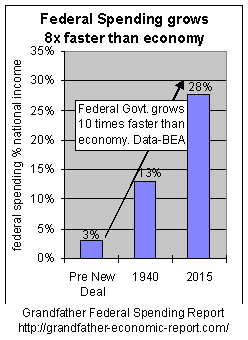 900% INCREASE IN FEDERAL SHARE OF THE TOTAL ECONOMIC PIE 900% INCREASE IN FEDERAL SHARE OF THE TOTAL ECONOMIC PIE The
left chart shows in the past 80 years federal government spending has grown from 3% of the
economy to 28% today - - a 900%
increase in its share - or growth 10 times faster than growth of the total economy.
Of course, any increase in government's share of national income must be extracted from
the private sector's share. Therefore, during the period represented by this graphic 28%
of the private sector share of the economy was extracted for federal government control.
(no anti-trust protection is apparent for the private sector on that move, was there?)
Note the 28% spending ratio today is more than double the ratio prior to World War II -
- yet today's defense spending portion is less than it was then.
So, increased government did not increase national security, which was the nations'
number on principle outlined by our nation's founders as the reason for forming a federal
government.
In fact all that added spending for other stuff may have diluted our capacity and focus
for national security, as shown in the National Security Report.
The so-called 'peace dividend' available after defense spending plummeted after the war
years, which should have been returned to the private sector from which it was 'borrowed'
for war-time, was not returned - - but was retained under centralized government control
and consumed on social programs - - an area not intended for federal government operations
by our nation's founders.
The Grandfather Federal Budget Report includes
color pictures showing where it goes and what happened. You may be surprised at that
presentation approach - - showing the culprit was social spending soared 14 times
faster than growth of the general economy. |
| 2. State & Local Government Spending and
employee counts soar: |
 While the federal sector was growing much faster than the nation's economy
the state & local government spending sector was not standing still, or becoming more
cost-efficient. While the federal sector was growing much faster than the nation's economy
the state & local government spending sector was not standing still, or becoming more
cost-efficient. It zoomed upward - - from a 6% share of the economy in 1947 to a 18%
share today - - growing nearly three times faster than
the economy. This 12 point growth of state & local government was extracted from the
private sector's share of the economy.
While the general national population was increasing 112% over that period the
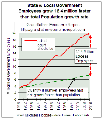
number of state & local government employees increased 503%.
The chart at the left shows the number of state & local government employees
growing faster than the population at large - a chart few have seen.
The upper rising curve (red) represents the actual
numbers, rising from 3.3 million in 1946 to 19.6 million employees today - 503% more.
The lower (dashed-green) plot shows the number of
employees would have grown only to 6.9 million by today had they not grown faster than the general population
increase.
There is a 12.4 million difference between the two
plots.
This means: if the number of state & local government employees had not grown
faster than the increase in the general population, there would be 12,409,000 fewer such
employees today.
12.4 million excess, together with their pensions and health insurance, is a huge number - - more than the entire population of most of our
states.
Post World War II there were 2.3 state & local government employees for every 100
citizens; today the ratio has reached an all-time high at 6.4 per 100 - - meaning more
than 4 extra govt. employees per 100 citizens.
We know each family today has to support more seniors per person than prior
generations.
Now we know that,
in addition to supporting more seniors,
families are also supporting more state & local government employees per person
than any prior generation
While many complain about the level of federal government spending relative to the
economy, few recognize the tremendous growth of the state & local government share of
the economy.
Trends in State & Local government spending ratios and head-counts are flagrantly
against the wisdom of Thomas Jefferson: "Government that governs least governs
best."
Visit the Grandfather State & Local Government
Spending Report for a more revealing presentation, with more data graphics. |
Who Will Resist Reversing These Trends ?
With such a large share of the economy dependent upon government spending,
the resistance against correcting the situation will be excessive - - from special
interest groups everywhere.
Many will just throw up their hands when it is recognized that a 55% cut in real
government spending is needed to return to the 22% spending ratio to the economy of 1947 -
- which would be still double the 12% ratio achieved in the past, and recommended by some
economists as a more appropriate level.
QUESTION - Did our nation's founding fathers
envision a situation whereby government spending would equate to nearly half our entire
economy during peace-time? I thought they designed for very
limited government. On top of this, did they envision burdening future
generations with debt for consumptive spending?
 DEBT means >
Much government growth has been borrowed
from the future,
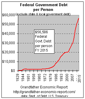
to the tune of $43,925 Debt Per Child (per
capita FY2010)
According to the Grandfather
Federal Government Debt Report we are talking about $14 Trillion of
Federal DEBT PRINCIPAL - - not little
'peanuts'. And, over half of the total federal debt was created in the 1990s.
Let's divide federal debt each year by our national population. That gives us debt per
person (or, per capita, or per child).
Here's a chart showing the build up of federal debt on a per child (per capita) basis.
(debt of $8.5 trillion divided by 305million population).
Debt is $43,925 per child - - even before
they enter kindergarten - - and rising quite nicely.
If a family has four children - - then, they share more than $175,700 of federal debt
to impact their future standards of living,
This $14 Trillion (end last fiscal year), or $43,925 per person, is just the published
part of the federal debt - not including $43 trillion in un-funded contingent liabilities
- - together pushing the total over $185,000 per child. (see Debt
Summary Table)
And, that debt could have been paid off - - but it was not -
How many times have we heard political 'smoke' excuses blaming the 1980's for
our debt? Hard data graphics in the Full Debt Report show declining debt-ratio trends stopped
declining a decade prior to the 80's. If the period prior to the 80's were 'loved' by
politicians, how come none have proposed spending cuts to return to the prior debt ratios,
which would require cutting the debt principal in half (a $4 Trillion cut)? Answer: None
!! Why not? Well, they tried historic tax increases in the 1990s - - but got more debt as
a result. In calendar year 2008 Treasury Dept. data shows federal debt increased $1.3
trillion (about $4,200 per man, woman and child). One could ask how the heck did they get
to claim a surpluses in past years while piling on more debt? Answer: they siphoned-off
all the surplus from trust funds and spent it on non-pension stuff, did not count that in
their budget, and then claimed they 'want to save social security first' as they drained
the trust fund - - all this is fully described in the very sobering Trust Fund Report.
Grandfathers understand 'political smoke: Its the spending, stupid !!
How has debt created by our generation supposed to help the living standards of our
next generation? We consume on credit, and they get to pay for it. Nice bequest !! Does
this make us proud ?? Not Me ! - - - Is it fair? NO !
For a full report on Federal debt, see the Grandfather Federal Government Debt Report
and the Debt Summary Table
SUMMARY
The charts in the individual reports of the Grandfather Economic Report Series show
once total government spending went above 32% of national income (it is now at 51%), and
once the ratio of debt to GDP stopped falling below 34% (it is now double that ratio) - -
the nation's real median family incomes ceased to grow, and the nation's balance of trade
went steadily negative. Considering delayed reactions, the period of danger was
probably entered in the mid 1960's - - and, it has not been reversed.
A minimum 50% reduction in debt principal and a 30% reduction in the government
spending ratios is suggested by this data - - with a final target suggested by these
charts as: elimination of debt and a 50% reduction in government spending ratios to the
level of 20-22% of national income - - with a goal to return the free-market private
sector to an 80% share of our economy. Our founding fore-fathers might have accepted an
80%-20% relationship between private sector and government, but certainly not our current
situation.
Leadership must prevail, for a change, in the interest of our nation's young - -
a very special interest group that did not create the problem, cannot vote
to influence outcomes that would impact their future - - and has no special lobby
organization. Politicians often speak of 'the children,' as if they really care. The
record shows otherwise.
CAN YOU HELP ?
Thank you for visiting this chapter in
our series of the Grandfather Economic
Reports
I hope it has been informative and useful. You are among the very few who have had a
chance to see these particular charts, and to therefore have a better understanding of
what part of our economy is made up of government spending dependence. Power is knowing
facts, as a proper base from which to form your own thoughts to help our young. You can
add just a bit more of that power by viewing the next short page. Our grandchildren would
appreciate your assistance. Contacting your congressional representative might help if you
are as concerned as we. Mailing a print-out of these pages might make a difference.
WHERE DO YOU GO FROM HERE? The following companion reports are
recommended in the order shown, each following the common theme of where we are compared
to prior generations - in color graphic form:
Government Expansion Report - - for a sequence of color pie
charts, showing the shrinkage of the private sector's relative share of the economic pie
at 3 key times.
Federal Government Spending Report - color graphics
showing the make-up of the federal budget, and the trends of each spending component -
revealing the culprit.
State & Local Government Spending Report -
showing the increased share of the economy consumed by state & local government, and
its excessive headcount increases much faster than general population growth.
Federal Government Debt Report - graphics showing the build-up
of debt and interest - - and why - - and who we owe it to.
Debt Summary
Table - summary of all debt, government plus private sector
Family Income Report - long-term graphic of median family
incomes - from growth with one-earner families to stagnation with both working.
Social Security Report - graphics showing inter-generational
differences - a major cause of economic squeeze on the young.
Trust Fund Report - government spends social security
trust fund surpluses on programs having zero to do with pensions.
Regulation Cost Report - economic impacts on government
vs. private sector from mandated regulatory compliance costs.
Health Care Report - showing more spending on health than
other nations with less quality to show for it.
National Security Report - - showing consequences resulting
from increased social spending in areas not envisioned by the nation's founders.
Citizen Voter Participation Report - graphic showing 36-year
down-trend of voting age citizens participating in the democratic process.
Other reports listed on home page
on taxes, international trade and exchange, education quality/costs, inflation,
productivity, and others.
And, a Summary Report followed by a Road
Traveled story developed from these report findings.
If you can't check out the above list
today, spare another minute before you leave?
See 3 Dramatic Pictures you
have never seen - and, won't forget
OR - - Return to Grandfather
Economic Report Home Page - the table of contents of all reports, showing each
economic threat facing young families and their children, compared to prior generations.
Exchange information and comments with - Michael Hodges by email
| Home
& Contents | Summary | 12
Questions | Feedback | What's
New | Link Index | Eye-opener
| Must See |
Go to the top
Copyright © 1997-2011 Michael W. Hodges.
This is bottom of page: https://grandfather-economic-report.com/mwhodges.htm
The Grandfather Economic Report series is the intellectual property of its author; all
rights reserved under Copyright Conventions. Permission to redistribute all or part of
this series for non commercial purposes is granted by the author, provided the associated
web page address is included and full credit given to the Grandfather Economic Report and
the author, Michael Hodges. Notice appreciated via email.