|
| Home & Contents | Summary | Feedback | What's New | Link Index | Eye-opener | Must See |
|
 Whereas the U.S. celebrates
longer life expectancy for its citizens than before,
Whereas the U.S. celebrates
longer life expectancy for its citizens than before,
U.S. citizens realize less life expectancy than citizens in 3 dozen other nations,
and the U.S. ranks only 37th in the world in quality health care -
yet nationally America spends 82% more per person on health care than others -
while U.S. federal and state governments spend more on health care than other governments.
(The Grandfather Economic Report is a series of mini-reports reviewing difficult economic conditions facing families and their children, compared to prior generations - - using color pictures with an easy-to-understand format- - a free public service resource on trends of family incomes, debt, social security, education, government (federal, state/local) spending, taxes, foreign trade & exchange, inflation, regulations, productivity, voter participation, trust in government and health care - - now vs. prior generations. Although there are so many great & positive things about America to celebrate, certain negative trends exist about which we need to become aware, so even more solutions and positives may occur. This is the Health Care chapter.
QUICK LINKS:
Life Expectancy - all citizens - For
Seniors-only - Lower Life Expectancy than Other Nations -
#37 in World in Quality Health Care - Newborn Mortality 2nd Worst -
Much higher Health Care Spending than Other Nations -
Disturbing Up-date - More
Specialists Produce Less Quality - Obesity - Looking
forward
We Celebrate improved LIFE EXPECTANCY - 54 year period, 1950-2004
This is a happy chart, showing improvements in life expectancy for both males and females
This chart is repeated from the author's Generational Celebration Report , the creation of which was recommended by Nobel laureate Milton Friedman. (That report covered 3 areas to celebrate over recent generations, including life-expectancy.) Before reviewing this chart, let's consider:
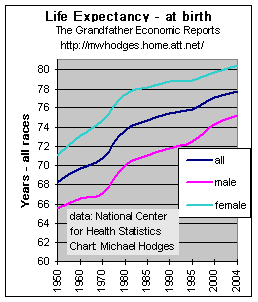 The black curve in the chart represents the over-all increase in
life expectancy at birth for both sexes in the past 54 years - - growing from 68.2 years
in 1950 to 77.8 years in 2004 - - an improvement of 9.6 years from 1950 to 2004.
That performance is something to celebrate. (White race was 78.3, black was 73.1)
The black curve in the chart represents the over-all increase in
life expectancy at birth for both sexes in the past 54 years - - growing from 68.2 years
in 1950 to 77.8 years in 2004 - - an improvement of 9.6 years from 1950 to 2004.
That performance is something to celebrate. (White race was 78.3, black was 73.1)
The over-all increase (black curve) in the 30 year period between 1950 and 1980 was 5.5 years (66 months) - or about 2.2 months per year. In the 24 year period from 1980 to 2004 a 4.1 year (49 months) increase occurred, although at a slower rate of 2 months per year. However, the difference in the past 24 years between males and females has been dramatic.
The green curve on the chart represents female life expectancy from birth and the pink curve represents life expectancy growth for males - both have increased. In the period 1950-80 female life expectancy increased 75.6 months, 43% faster than the 52.8 months for males. Thereafter male life expectancy increased 73% faster than females 1980-2004, as if 'magically' trying to narrow the gap.
In the more recent period, 1990-2004, male life expectancy increased 113% faster than female life expectancy - as male life expectancy increased 41 months in this 14 year period (from 71.8 to 75.2 years) while females increased just 19 months (from 78.8 to 80.4 years).
Considering that in the past much early female mortality was due to childbirth, and considering the supposed improvement in prenatal healthcare and education during the past several decades, and recognizing that today's young women are having fewer children, it is surprising that life-expectancy for women is slowing down compared to the past - - as shown by the chart.
While we celebrate increases for both sexes, and that males are growing faster than in the past, it is unknown to the author if this faster improvement since 1975 for males relative to females (and more pronounced after 1989) is a data problem, or is indicative of other causes.
The Family Income Report shows the life expectancy slowdown period for females was the same 2 ½ decade period when real median family incomes stopped growing and stagnated, as many woman left their children for daycare by others in order to enter the workforce to help keep family incomes from falling. That report contains a long-term graphic showing 64% of all married women with children below 6 years old are in the labor force - - a 6 times higher ratio than in the 1950s - - and, 76% with children age 6-17. Is it possible life-style changes for woman, as more must now be both breadwinner and homemaker compared to pre-1970s, influence such data? Perhaps those with more knowledge will contact me with other reasons potentially 'behind the data'.
Comments by Nobel laureate Milton Friedman: After reviewing this chart in the Celebration Report chapter of the Grandfather Economic Report series, a letter to the author from Dr. Friedman on February 24, 1998 contained: "Improved life expectancy is most surely the most important single improvement in decades, but its interesting to note from your chart that there has been a distinct slowdown in the rate of increase and the slowdown comes shortly after enactment of Medicare and Medicaid. I do not believe that is an accident." In July 1998 I wrote back and asked: "when you have a chance I would appreciate learning what you mean by the impact on these curves of Medicare and Medicaid."
On September 4, 1998 Dr. Friedman replied with the following: "With respect to my comment about Medicare and Medicaid, what I had in mind was that their passage marked the beginning of a far greater involvement of government in the whole area of medical care. The effect is to decrease the efficiency with which the resources employed in medical care are used. We do have continued discoveries and findings but probably at a slower pace. I do not know any other explanation as to why there should have been a slowdown in the rate of increase of the length of life since the 1970s as shown clearly in your diagram. It would be interesting to have another figure, showing what has happened to remaining life expectancy of individuals aged, say 40 or 50 (or 65 - author's). The figures showing length of life are strongly affected, particularly in the early decades of the 20th century, by infant and mother mortality. The improvement in length of life is much less striking if taken even from age 5 on than from birth.
I certainly commend you for the Grandfather Reports you have produced and for the imaginative way in which you have displayed data highly relevant to very important issues. Keep up the good work." (see A Tribute to Milton Friedman).
Based on that input, the author was able to add the following for seniors, and will add for ages 40 and 50 when available.
LIFE EXPECTANCY OF SENIORS
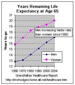 While the preceding chart shows life expectancy trends from birth
for all citizens,
While the preceding chart shows life expectancy trends from birth
for all citizens,
the left chart shows life expectancy of seniors when reaching age 65 at different periods.
The data shows in 1960 women (pink curve) at age 65 were expected to live an additional 16 years (to age 81), which by 2004 increased another 4 years to 20 years (to age 85).
The data shows men (black curve) reaching age 65 in 1960 were expected to live another 12.8 years (to age 78), whereas by 2004 increased another 4.3 years to 17.1 years (to age 82).
This chart also shows a steeper curve for men than for women after 1970. Source > page 25, CDC at http://www.cdc.gov/nchs/data/nvsr/nvsr53/nvsr53_15.pdf
For those interested in data for life expectancy from age 75 as of 2004 - - for men it was an additional 10.7 years (to age 86), up from 8.8 years as of 1980. For women it was an additional 12.8 years (to age 88), up from 11.5 years in 1980.
We know there is an Approaching Time-Bomb (see graphic in the Social Security Report) of the rising trend line starting 2005 of those age 65 and over ('baby boomers') increasing in numbers from 12% of the population to a 20% share over the following 20 years. This 67% increase in the senior-citizen proportion of the population, together with the increased life expectancy trends shown in the above chart, will place a major challenge on health care.
The above charts show our improvement in life expectancy, compared to our own past.
But - - how are we doing relative to other nations? See the next picture chart.
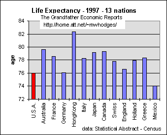 Despite past life-expectancy growth within the U.S. as shown in the first
chart, the left chart shows life-expectancy in the USA is less than most other advanced
nations. Data source: 2006 statistical
abstract, table # 1318 Despite past life-expectancy growth within the U.S. as shown in the first
chart, the left chart shows life-expectancy in the USA is less than most other advanced
nations. Data source: 2006 statistical
abstract, table # 1318 A 2006 study > "The U.S. health-care system is
doing poorly by virtually every measure. The U.S. ranks at the bottom among
industrialized countries for life expectancy both at birth and at age 60. It is
also last on infant mortality." Sept. 12, 2007 > "U.S. life expectancy was lower than the life span in more
than three dozen other countries. More bad news: The annual number of U.S. deaths rose
from 2004 to a depressing uptick after the figure had dropped by 50,000 from 2003 to 2004.
In 2005, the number of deaths increased by about that same amount." Life expectancy in the U.S. to a child born in 2005 was 77.9 years, according to the World Health Organization. Longevity in Europe ranges from 79.2 years in the Netherlands to 81.4 years in Switzerland. http://www.bloomberg.com/apps/news?pid=20601103&sid=auKPjdGB8wNs&refer=us Part of the reason for U.S. lower performance vs. Europe is that U.S. obesity and arthritus rates are nearly 3 times higher that in Europe. And, increased obesity produces increased arthritus (see below). |
Although we can be proud today's generation can celebrate the advancement in life expectancy for both sexes, compared to the past - Citizens of other nations are living longer than Americans. |
Let us call this a U.S. Health Care Gap Is this health care 'gap' caused by too little health care spending
relative to other nations? |
THE U.S. RANKS ONLY 37TH IN QUALITY HEALTH CARE
"The United States spends more per person on health care than any other country, yet in overall quality its care ranks 37th in the world," says a World Health Organization analysis. It concluded that France provides the globe's best health care, with Italy ranked 2nd. Japan won the distinction as having the world's healthiest people. 'While good at expensive, heroic care, Americans are poor at the low-cost preventive care that keeps Europeans healthy,' said Princeton University health economist Uwe Reinhardt. Measuring how long people live in good health - - not just how long they live - - the Japanese beat Americans by 4 ½ years - - yet Japan spends just $1,750 per person on health and France $2,100, compared to the stunning $3,724 spent by the U.S. The report said it doesn't endorse government-run insurance only, as countries with good mixes of private and public programs do well.
Of the 191-country ranking, here are the top 50:
by 2006 the situation appears even worse
A September 2006 study: "The U.S. health-care system is doing poorly by virtually every measure. The study gave the U.S. system low grades on outcomes, quality of care, access to care, and efficiency, compared to other industrialized nations or generally accepted standards of care. The U.S. ranks at the bottom among industrialized countries for life expectancy both at birth and at age 60. Yet the U.S. ranks 15th out of 19 countries in terms of the number of deaths that could have been prevented. It is also last on infant mortality. Only 17% of U.S. doctors use electronic medical records, compared with 80% in the top three countries. The poor grade is particularly discomfiting, the researchers note, because the U.S. spends more on medicine, by far, than any other country. Approximately 16% of the nation's gross domestic product is devoted to health care, compared with 10% or less in other industrialized nations. The authors concluded that, if the U.S. improved and standardized health-care performance and access, approximately 100,000 to 150,000 lives could be saved annually, along with $50 billion to $100 billion a year." (Source: the report, commissioned by the non-profit and non-partisan Commonwealth Fund - http://news.yahoo.com/s/bw/20060921/bs_bw/tc20060921053503)
United States has the second worst newborn mortality rate in the developed world
American babies are three times more likely to die in their first month as children born in Japan, and newborn mortality is 2.5 times higher in the United States than in Finland, Iceland or Norway, Save the Children researchers found. "The United States has more neonatologists and neonatal intensive care beds per person than Australia, Canada and the United Kingdom, but its newborn rate is higher than any of those countries," said the annual State of the World's Mothers report. Source: May 9, 2006 by Jeff Green of CNN. In a different September 2006 study reported above: "The U.S. is last on infant mortality."
DESPITE LOWER LIFE EXPECTANCY THAN OTHER NATIONS (above chart) THE US SPENDS MORE FOR HEALTH CARE (following charts) |
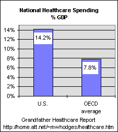 Despite lower life expectancy in the U.S. vs.
other nations as shown in the above chart - Despite lower life expectancy in the U.S. vs.
other nations as shown in the above chart - the left chart shows the U.S. spent 14.2% of its economy on healthcare compared to 7.8% average in other nations several years ago, although most others provide heath care to all citizens. Therefore, the U.S. consumes 82% more of its economy than other advanced nations, with less life-expectancy and coverage to show for it. This chart show the US vs. the average of other industrial nations. The next chart breaks it down into many of the OECD nations. Note - 2007 spending ratio was 16% of GDP, much higher than shown in this chart. (I do not yet have the OECD ratio for 2007 - see note below showing). |
DISTURBING 2007 UP-DATE
NOTE > to update the above chart and the next chart below, in 2007 healthcare spending increased to $2.2 trillion, or 16% of GDP - - significantly higher compared to the 14.2% ratio shown in the charts - - indicating healthcare costs continue to soar much faster than general economic growth.
An earlier report, in December 2005 the National Center for Health Statistics reported health care spending in the U.S. in 2003 increased to $1.7 trillion with health expenditures as a percentage of gross domestic product risng to 15.3 percent in 2003, up from 14.9 percent in 2002.
Additionally, the 2005 report states >' the march of medical progress in the USA has taken a worrisome turn: Half of Americans in the 55-to-64 age group _ including the oldest of the baby boomers _ have high blood pressure, and two in five are obese. That means they are in worse shape in some respects than Americans born a decade earlier were when they were that age.
The health of this large group of the near-elderly is of major concern to American taxpayers, because they are now becoming eligible for Medicare and Social Security. "What happens to this group is very important because it's going to affect every other group," said Amy Bernstein of the National Center for Health Statistics." Source: Reuters, AP writer Mike Stobbe 12/8/05
Health Care Spending by Nation
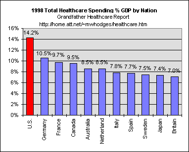 For
another view of international comparison, For
another view of international comparison, the left chart shows total health care spending by various nations. Note the U.S. spent 14.2% of its economy on healthcare at the date of this chart. The above update reports 2003 spending significantly higher at 15.3% of GDP. and the above reported 2007 report shows U.S. costs increased to 16% of GDP - - approximately 82% more than other OECD nations. Spending much more than nations covering all citizens via national health insurance. (Data Source: OECD data published The Economist magazine 10/24/98) |
GOVERNMENT VS. PRIVATE SECTOR HEALTH CARE SPENDING |
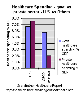 The left chart compares the U.S.
to the average of OECD nations in the government vs. private sector share of each economy
consumed for health care (source: The Economist 10/24/98). The left chart compares the U.S.
to the average of OECD nations in the government vs. private sector share of each economy
consumed for health care (source: The Economist 10/24/98). For the U.S., the blue bar in the chart shows government in the U.S. consumes 6.7% of its economy on health care vs. 5.8% by other industrial nations. This means, despite the government in the U.S. consuming 16% more of its economy for health care than the others, most of the others have ALL citizens covered by government health care with less government spending. Truly a remarkable chart. NOTE: In addition to the U.S. government spending (the blue bars) more on health care than many other nations which have better life expectancy, the U.S. private sector (brown bar) spends an additional 7.5% of the U.S. economy on health care. It was that 7.5% of the economy spent by the private sector which was potentially a target for government take-over with the failed 1993 National Health Care Plan proposed by the Clinton administration. Had same been approved by the Congress then the brown bar (private spending) may have dropped toward zero as the U.S. blue bar (government spending/control) could have zoomed to as much as 14.2% of the economy compared to 5.8% for other nations. - - with a possible result that U.S. government health care spending/control might then consume 145% more of its economy than other governments. Some might say this data suggests had had that 'plan' been implemented, the U.S. life expectancy gap vs. other nations might have increased. This data adds credence to some who have suggested the ill-fated national plan was partly motivated by other than health enhancement. |
The following chart breaks out the data for several nations
in the foregoing chart -
The maroon-color bars represent the share of each economy consumed by private-sector spending on healthcare. Certainly said charts do not suggest a need for more government spending on health care in the U.S., - - but perhaps less - - with significantly more efficiency. |
U.S. Spends 2x per person More on Health care
than Other Nations
Above is our data for U.S. health care spending % GDP vs. other nations. Below
regards comparison on a per capita basis.
October 2007 report - "Health-care spending on each person in the U.S. was $6,037, the highest in the world and 50 percent higher than Switzerland's $4,045, the most in Europe," said Kenneth Thorpe, Emory professor of health policy. Thorpe studied data from Austria, Denmark, France, Germany, Greece, Italy, the Netherlands, Spain, Sweden and Switzerland for 2004, the latest year for which comparative data was available. The lowest spending was Spain's $2,099, 35 percent of the U.S. medical bill.
April 15, 2005 – The New York Times (Paul Krugman): “In 2002, the latest year for which comparable data are available, the United States spent $5,267 on health care for each man, woman and child in the population. Of this, $2,364, or 45 percent, was government spending, mainly on Medicare and Medicaid. Canada spent $2,931 per person, of which $2,048 came from the government. France spent $2,736 per person, of which $2,080 was government spending. Amazing, isn’t it? U.S. health care is so expensive that our government spends more on health care than the governments of other advanced countries, even though the private sector pays a far higher share of the bills than anywhere else.”
More specialists = higher costs AND lower
health care quality in America -
wheras fewer specialists and more family doctors = higher quality and lower costs
BUT - the number of family doctors is falling, as specialists and their costs rise - reducing health quality.
"States in America that spend more on Medicare don't necessarily have better health care, according to a study. In fact, health care in those states may be less effective and lower in quality. The study found that New Hampshire, which had the highest overall quality ranking in America, spent the least at $4,863 per beneficiary, while Louisiana, which spent the most at $8,238 per beneficiary, had the lowest quality ranking. The pattern is likely due to state medical practice patterns, such as the use of intensive surgical procedures instead of drug treatments where both could be considered viable options, rather than the relative cost of medical treatments in a given state, said Katherine Baicker, lead author of the report in the peer-reviewed policy journal Health Affairs and assistant professor of economics at Dartmouth College in New Hampshire. The mix of specialists vs. general practitioners in a state had a direct link to cost and quality of care, the report said. Each additional general practitioner per 10,000 people increased the state's quality ranking and lowered spending by $684 per beneficiary. Additionally, each specialist per 10,000 people lowered a state's quality ranking and increased medical spending by $526 per beneficiary." Larry Lipman, Atlanta Journal-Constitution, 04/06/04
Just as the above reports that health care quality depends on general practitioners (not on specialists), the following report shows >
"Study predicts a family physician shortage. The number of U.S. medical graduates going into family medicine has been falling — by more than 50 percent from 1997 to 2005 — with many young doctors preferring specialties that pay better and offer more control over work hours." By CARLA K. JOHNSON, Associated Press Writer Sep 27, 2006
Taken together, these 2 studies indicate Americans can expect declining health care quality and continued increases in medical costs.
- OBESITY -
A MAJOR DRIVER OF POOR RELATIVE U.S. HEALTH PERFORMANCE
| 67% of adults are overweight of which 34% are obese.
Staggering numbers ! ! And, this issue is mostly about self-inflicted
life style choices. Note -
Obesity (body mass index > 30) is associated with significantly increased risk of diabetes mellitus, hypertension, dyslipidemia, certain forms of cancer, sleep apnea, and osteoarthritis. The risks of many medical complications increase with increasing body mass index, leading to premature mortality in obese persons. Adding the obese category with the over-weight category brings the 2006 data point to 67% obese or over-weight. (2003 data shows an increase to 66%; projected to 75% by 2015 reported by Reuters 9 Jan 2009). That's a huge percentage of the US population - - 77%. Not a good sign for future health and its costs. In 2006 obesity in the above chart increased to 34%, which is twice the rate in Europe. "Health policy makers can't rein in medical costs in the U.S. unless they reverse obesity trends," said lead Kenneth Thorpe, Emory professor of health policy - October 2007. In the U.S., 54 percent of patients older than 50 are diagnosed with the painful joint disease arthritis, compared with 21 percent in Europe. Arthritis can be caused by obesity, according to that study. A 2007 study states > "Obesity is more dangerous than smoking, reducing life expectancy 13 years compared to 10 years for smokers. We live in a consumer society which encourages us to eat. We have a sedentary lifestyle. Looking forward, the effects on the nation's health will be devastating." Of course economic growth in GDP feeds on the obese-fueling food and also feeds on programs and food you can buy to lose weight. Yet it appears the more of such the more obese or over-weight Americans become each and every year, which increases health care costs which also is included in economic growth calculations. A sorry state of an economy's growth, for sure. The USA Obesity rate for women is 35%, which is 7 times greater than the 5% rate in Japan and China, where one in 20 women is obese. This compares with one in 10 in the Netherlands (10%), one in four in Australia and seven in 10 in Tonga, according to a paper led by Boyd Swinburn and Gary Sacks of the WHO Collaborating Center for Obesity Prevention at Deakin University in Melbourne, Australia. Here's another economic impact to think about > "A relationship exists between the obesity epidemic and fuel consumption," said Sheldon H. Jacobson, a professor at the University of Illinois at Urbana-Champaign and a co-author of a recent study. The study showed Americans are spending more money on fuel these days in part because adult men and women on average are at least 24 pounds heavier than their counterparts were in 1960. The average man weighs 191 pounds, 25 more than in 1960. The average woman weighs 164 pounds, up from 140 in 1960 - 17% heavier than before. Collectively, today's automobiles are burning more gasoline to haul all that extra weight around -- about 1 billion gallons more annually, in fact, than they would if drivers weighed the same as they did in 1960. "If people decide as a nation to get healthier and lose weight and be fitter, not only will we have a healthier country but we're actually going to reduce our dependence on foreign oil, simply because we're going to be using less." |
Looking forward, all nations are faced with a crisis in their government-operated social security and health care programs - as seniors make up a larger and larger share of the population.
For related reports, see the Government Size Report showing how government has grown faster than the economy during my generation, the Social Security Report for long term graphics and the ticking time bomb, and the chart comparing other nations in the International Spending Report.
If you have items to add, you are invited to send me an email
Best regards & God Bless America, Michael Hodges - email
Thank you for your visit.
To increase your knowledge of other areas with difficult economic conditions being passed to our youth (and to view several graphics you have never seen), please Click this Link to the > >
Grandfather
Economic Report - home page
( https://grandfather-economic-report.com/)

KNOWLEDGE IS POWER - IF YOU SEEK AND FIND IT !!
| Home & Contents
| Summary | Feedback | What's New | Link Index | Eye-opener | Must See |
Copyright
© 1997-2012 Michael W. Hodges.
The Grandfather Economic Report series is the
intellectual property of its author; all rights reserved under Copyright Conventions.
Permission to redistribute all or part of this series for non commercial purposes is
granted by the author, provided the associated web page address (URL) is included and full
credit given to the Grandfather Economic Report and the author, Michael Hodges. Notice
appreciated via email.
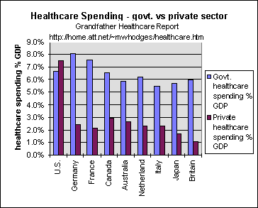 The blue bars represent the share of each economy
consumed by government spending on healthcare.
The blue bars represent the share of each economy
consumed by government spending on healthcare.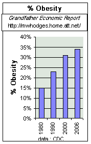 The left chart shows trends in obesity, with the percentage
of citizens 20-74 years old that are obese more than doubling to 34% of the population.
The left chart shows trends in obesity, with the percentage
of citizens 20-74 years old that are obese more than doubling to 34% of the population.