 - FAMILIES UNDER MORE PRESSURE - - instead of less
 Grandfather Economic Report series
| Home &
Contents | Summary | Feedback
| What's New | Eye-opener
| Must See |
Family Income Report |
(a chapter of The Grandfather Economic Report - a series of picture reports examining economic conditions facing families and youth, compared to prior generations)
- FAMILIES UNDER MORE PRESSURE - - instead of less
- DECADES OF LOW-GROWTH & STAGNANT MEDIAN FAMILY INCOMES (inflation-adjusted)
- FEWER FAMILIES THAN EVER BEFORE CAN MAKE IT WITHOUT MOTHER JOINING THE WORK-FORCE
- RECORD LOW SAVINGS, AND RECORD HIGH DEBT RATIOS
9 color pictures you have never seen tell the story - give them time to load - they are worth it !
Quick Links: Median Family Income, 94% Incomes Fall, Married Couples, Working Mothers, Male vs. Female Income, Family Savings, Household Debt, Home Equity, Family Income Distribution, Manufacturing Jobs, and Housing affordability.
QUESTIONS:
SUMMARY CONCLUSION:
It is the view of the author that family incomes are under pressure compared to the past because we have too much government with too much taxation & regulation, with a debt culture invested in socialized consumption instead of national productivity of goods, with too little 21st century technical education quality in our public schools and colleges - - to allow more of our citizens to effectively compete in the increasingly more competitive global economy. Families should not wait for government bureaucrats & politicians to 'save them' - they must reduce their debt, save more, and invest more of their own productive time in high-quality education. In other words, families must face the reality of the situation - - or suffer its consequences.
A picture is worth a thousand words - - dramatic color graphics follow that prove the problem.
A very important measure of the success of a society is an economy so structured as to provide steadily improving incomes, living standards, savings with reduced debt, and freedom for its citizens, which improves with each generation. All families want their children to have even more economic opportunities and freedom of choice and than they experienced - - certainly not less. This requires continuously increasing levels of inflation-adjusted net income and savings to families with less debt and less taxation, giving them the opportunity to steadily improve living standards and security savings, plus the choice for mother to remain at home to raise their children if they wish - and increased choice concerning education alternatives. What is the record of the U.S.? Read on - - -
Family Income Trends (inflation adjusted)
- rising rapidly for 23 years before 1970,
then complete stagnation for the next 4 decades -
(A 'family' is a group of 2 or more persons related by birth, marriage or adoption and residing together)
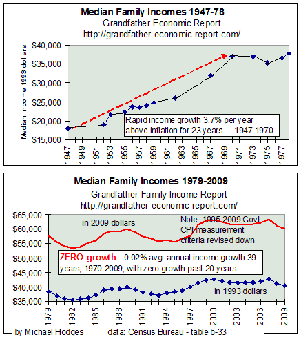 Are families getting 'ahead?' The first two charts show the
60-year trend of median family incomes (inflation-adjusted). Watch family incomes rapidly
rise for 23 years (1947-1970), then for the next 37 years incomes adjusted for inflation
level off, oscillate and stagnate, despite more mothers entering the workforce trying to
make up the squeeze.
Are families getting 'ahead?' The first two charts show the
60-year trend of median family incomes (inflation-adjusted). Watch family incomes rapidly
rise for 23 years (1947-1970), then for the next 37 years incomes adjusted for inflation
level off, oscillate and stagnate, despite more mothers entering the workforce trying to
make up the squeeze.
Look at the charts at the left. Don't be intimidated - I'll help you.
The top chart shows 1947-1970 rapidly rising for the 23 years of strong real (inflation-adjusted) median family income growth - - a nice, rising income trend (compounding 3.7% annually) - as inflation-adjusted incomes increased 106%, from $18,000 to $37,000 (in 1993 dollars). During this period later pictures in this report will prove family savings ratios were climbing and household debt ratios were steady to falling. Win-Win for families.
Note for 1970 that family income growth stopped rising, as if hitting a brick wall - - then oscillates without growth for 8 years through 1978.
Now look at the 2nd chart (1979-2009), showing the oscillating stagnant growth period of family income continues another 30 years to 2009. The total stagnant income period is 39 years in total (1970-2009), whether measured in constant 1993 dollars or in 2009 dollars.
The 2nd chart's blue data curve since 1979 (in 1993 dollars) can be compared to the above chart's 1970-1978 - showing next to nil growth. The red data curve from 1970-2009 expresses this in 2009 dollars. This computes real income compound growth for this 39 year period (1970-2009) of a measly 0.02% per year average, compared to 185 times faster income growth of 3.7% annually in the prior 23 years 1947-1970. [Note the data plots after 1995 for both data plots would be even lower had government not redefined downward how they measure and report inflation after 1995 - meaning even slower (or, even negative) growth for that period than the 0.02%/year shown.]
Taking both charts together one notes families wining for 23 years (1947-1970), then families nearly treading water for 39 years with nil income growth (1970-2009).
And, median household incomes in 2010 were 2.3% lower than in 2009, according to the U.S. Census Bureau report Sept. 2011. Therefore, regarding the above graphic we expect family income data yet to be plotted for 2010 will again be lower than before.
2008 > A study released in 2007 by the Brookings Institution and the Pew Charitable Trust found that the median income of men in their 30s fell 12% from 1974 to 2004 when adjusted for inflation. (4/28/08 http://www.latimes.com/business/la-me-generation27apr27,1,3327536.story )
2008 > Government data show the typical weekly salary of a worker with a bachelor's degree, adjusted for inflation, didn't rise in 2007 and was 1.7% below the 2001 level.
Universal Press for the Houston Chronicle reported 22 May 2005 > "According to the Department of Labor, average gross weekly earnings for private nonagricultural workers rose from $267.26 a week in 1982 to $536.17 a week in February 2005 — doubling in 23 years. The same figure, adjusted for the consumer price index for urban wage earners and clerical workers, otherwise known as CPI-W, rises from $267.26 to $276.95. That's a purchasing power gain of $9.69 over two decades. In today's money, it's about enough to go to a movie if you don't eat much. That's a total gain of 3.6 percent over the period, an annualized gain of 0.16 percent over half a working lifetime. In other words, the average worker has been going nowhere. In 13 of the 23 years, the average worker lost purchasing power." http://www.chron.com/cs/CDA/ssistory.mpl/business/3192150
The difference is even greater when we recognize that the data curves for 1995-2009 in the above chart are 'pumped-up' compared to prior years since the government revised how they measure inflation after 1995 compared to before. This made inflation-adjusted incomes shown on the chart after 1995 appear larger than had the prior measurement criteria been used. Without that 'pump-up', the income data for 1995-2009 would be much lower than shown - - further depressing the poor per year growth. (See the tell-all Inflation Report)
It is clear that median family's real income growth and ability to save was significantly degraded from 1970 to the present, compared to those prior to 1970. [even if one adjusts all 50 years to the Boskin Commission's possible adjustment of 1.1% less annual inflation, the period prior to 1970 experienced family income growth 3 times faster than after 1970. For more on the Boskin-CPI, see special CPI report].
Something had to give, and that something was more mothers had to go to work, leaving their children to daycare by others, family savings ratios fell and household debt ratios soared (2 charts below cover savings and debt)- - as families tried to keep up 'appearances' ('keeping up with the Jones') of improved living standards in the face of stagnant incomes. Lose-lose for families and their children.
Look again at the rising part of the 1st chart starting in 1947. Because family incomes grew much faster than inflation 1947-1969 it is simple to understand the reason most families required just one wage earner per family as sufficient for children to have choice of a full-time mother at home - - and to build family savings without increasing household debt ratios - - - - that is until 1970 when good income growth stopped as if hitting a brick wall.
Keep in mind an important point: the last 33 years above (1970-2003) of family income stagnation is for gross income, before tax. As you will see below, on an after-tax basis family incomes were falling due to increased tax rates at federal and state/local government levels. Lose-lose for families, compared to before.
Further, the charts make no distinction between families of federal, state and local government employees vs. private sector employees. Nearly all government employees have their incomes & health insurance protected from inflation, yet many private sector employees do not. And, as seen in the State & Local Government Report, employees of state & local governments were growing in numbers several times faster than growth of the general population - - and the total compensation of said government employees was growing at much faster rates than those in the private sector. If government employee-families were subtracted from the above chart, it is most likely that which remains (being families of non-government employees) would show a sharp decline 1970 to today - - instead of stagnant-no-growth as shown. Should families of government workers do better than other citizens who 'pay the freight' with taxes?
Keep also in mind that this chart includes the earnings of senior citizen families who now earn more than seniors of prior generations. Obviously 2 wage-earner families without children, where both are college graduates and both employed as professionals, on average earned much better than did families with children where only the high-school-educated father is employed. Additionally, "today 24% of all blacks (compared to 14% of whites) are employed by federal, state or local government - - and about half of black professional males and two-thirds of black professional females work for some arm of government." (October 1995 issue of American Enterprise, pg. 33). Certainly such affirmative action results have helped many blacks compared to the past since general government inflation-protected pay and benefits are above private sector norms, and state & local government employee counts have soared much faster than population growth. Additionally, what about all those income re-distribution 'poverty' programs in the past 2 decades? Such certainly did not lift median family incomes per above chart. Despite more 2-earner childless couples, more of the families with children having both parents working, the increased income of blacks, more receiving college education, poverty programs, etc. - the above chart shows the median family with and without children has not faired well concerning real income, savings and debt.
Median Household Incomes Fell in 94% of the States - 1999-2005.
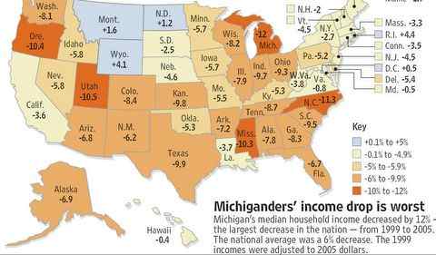 Left is a 2006 chart, showing the percentage decline in median household
incomes from 1999-2005.
Left is a 2006 chart, showing the percentage decline in median household
incomes from 1999-2005.
Nationwide incomes dropped 6%.
Note the dark orange colors showing those states where incomes dropped more than 10%.
Note also this chart shows that incomes fell in 94% of the states (47 of the 50 states) during that period. That's most conclusive.
Michigan's 12% was the worse, with incomes in some cities dropping as much as 24%.
Interestingly, this chart also shows incomes in Washington, D.C. actually gained, where reside maximum populations of federal government workers and private sector employees supporting them.
(chart source - 'Detroit Free Press'', John Flemming - 2006. Michigan data > http://www.freep.com/assets/static/pdf/2006/08/census0830.pdf)
It is apparent the more your household looked like the traditional family
(working father and stay-at-home mom with children),
the worse it fared economically since 1970.
Did economic pressure on families also negatively impact social values & family choices during recent decades?
Even married-couple families are under economic pressure,
The lower curve shows inflation-adjusted family incomes were stagnant to falling where the wives were not in the labor force, which reflects stagnant to falling real income of full-time working males during that period. That's a sharp departure from pre-1970 when wives could stay home and still family incomes rose twice as fast as inflation. Although this chart clearly shows the motivation factor for wives entering the work force more than ever before, still these working wives only increased their family incomes over that 25 year period only about 0.8% per year ahead of inflation. Even that increase is way below what families were doing with but one wage earner prior to 1970 (as seen in the chart at the top of this report). Additionally, this meager gain is even more meager when we recognize that today's average female has more 'education' than prior generations, plus have the capacity to earn more than pre-1970 woman. Of course, the lower curve shows a net decrease in income of families with non-working wives of about 0.2% per year below inflation. Its clear that even married-couple families are under pressure, compared to prior generations. What about if they have children? |
 A DRAMATIC IMPACT compared to when I was young
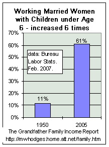
2-PARENT FAMILIES WITH CHILDREN UNDER 6 YEARS,
BUT WITHOUT FULL-TIME MOTHERS
The left chart shows two years: 1950 vs. 2005 - - for the percent of working married mothers with children under age 6. Note, we are talking about MARRIED mothers of infants.
A 6 times increase in the percentage - - from 11% in 1950 to 61% in 2005. (white - 58%, black = 65%) - data from Bureau of Labor Statistics Feb. 2007 http://www.bls.gov/opub/mlr/2007/02/art2full.pdf
Most likely, much of that surge was driven by money and the pressure on family incomes compared to 1950 - - much under pressure of falling real incomes of full-time working males (as shown in a later chart).
Certainly mothers matter to children and to their development, and are more important for their development than non-mothers. Or, don't they matter.
Therefore, children with full-time mothers must benefit much more than those warehoused most of the day away from mother - but as this chart shows, a higher percentage of children than ever before do not benefit from full-time mothers, even by married mothers who have more opportunity to be home.
Another piece of critical data: 76% of married working mothers with children age 6-17 were in the labor force in 1995. So, here too, huge percentages of married mothers are missing from their children in the prime years of education and discipline. This must impact the quality of education and respect. (data researched by Jack Taylor)
Families supported by one wage earner, another relevant statistic - - In 1950, 60% of married couple families had a single wage-earner, because income levels were sufficient. In 2000, only 10% of families had a single wage-earner.
Male Full-time workers - - 30 year Income Trends
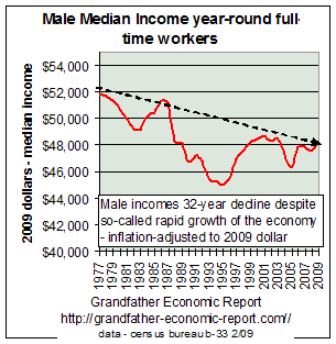 This chart shows the trends for the 30 years 1977-2007 of real
median incomes of full-time year-round male workers - adjusted for inflation in constant
2007 dollars.
This chart shows the trends for the 30 years 1977-2007 of real
median incomes of full-time year-round male workers - adjusted for inflation in constant
2007 dollars.
NOTE the long term wage decline of male workers (the red line).
Full-time working men lost ground for 3 decades - - despite having more education beyond high school. Declining real income of males certainly forced more mothers to the work-place to try and make up some of the loss - - leaving more children without the guidance and protection of a full-time mom.
The inflation-adjusted median income of females (full-time workers), after slowly rising for some years, has stagnated and fallen in the past 5 years according to the Labor Department.
The declining real incomes of males is one of the reasons we now hear that the 'one-wage earner family is dead.' But, as seen from the stagnant income line after 1970 shown in the chart top of this page, even with mothers leaving their children (to be raised by non-mothers) to join the workforce family incomes did not rise, and certainly not at the fast pace as experienced in 1947-70 when only dad was working.
According to MIT economist Lester Thurow (Economic Policy Institute symposium, 23 May 1997, Washington), most of the job growth in the last 30 years has been in the service sector. The number of hours worked by retail workers has fallen from slightly over 40 to 28. Retail wages, which were once comparable to those in manufacturing, have declined, and the retail sector shows negative productivity growth. The retail sector accounts for 74% of all part-time workers, including a large percentage of contingent workers. Thus not only have wages in the service sector declined, but workers in this sector have lost their benefits packages. Retail jobs account for 25% of job generation, says Thurow. The largest single industry in the country is currently the hospitality industry, another employer of part-time, benefit-less workers.
It will be seen in 2 charts to follow that during this latter period family rates of savings plunged, and consumer debt moved to historic highs.
On PBS Business News, 12/26/96, Dr. Lester Thurow of MIT reported: over the prior 22 years income was down 15% for males and 5% for females.
National Center for Policy Analysis- No. 178: Government employee compensation grew much faster than private sector wages in almost every state. The excess pay to public employees, the equivalent of a major income transfer program, has sharply inhibited growth. Richard Vedder, "Economic Impact of Government Spending: A 50-State Analysis,"
Although farm workers represent a small part of our work force, inflation-adjusted wage declines have been even more severe - 20-25%. Remember, the above chart is for gross family income, not disposable income. Philip Martin, economist at U. of California at Davis: "In the 1960's farmers often provided free housing for their workers. But, after new laws were passed 10 years ago regulating such housing, many farmers ceased to provide lodging - sending workers looking for rental housing plus transportation, causing an enormous drop in disposable income." 31 March 1997, N. Y. Times News Service - Sarasota Herald.
NOTE: If you wish, you can quickly take another comparative look at the main chart and then continue downward to more neat pictures
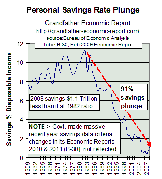 Rate of Personal Saving Plunges 91% - a record low in world
history - $1.1 trillion missing
Rate of Personal Saving Plunges 91% - a record low in world
history - $1.1 trillion missing
If families have less inflation-adjusted income, despite more mothers working, then family personal savings must suffer as a consequence - unless, of course, families reduce their consumption. But, families increased consumption spending and, to cover this, they reduced savings to historic lows and increased household debt to historic highs. Dangerous Trend !!!
The chart at the left shows a 49 year trend of that part of disposable income that has been saved - - called 'personal savings rate'.
Note: prior to 1970 the rate of personal savings was rising smartly - - as were family incomes per the first chart above - despite most families then having but one wage earner while also living without increasing debt ratios (chart below).
Then, family incomes stagnated - - and the saving ratio stopped rising as seen in the left chart - - then started falling rapidly - - plummeting since 1992. As of Summer 2007, an all-time record low!!
Also a record low for any leading global economic power in the modern history of the world, per economist Steven Roach Nov. 2006.
In 2008 consumer personal savings $250 billion less than 25 years ago when the population was much smaller. drew down savings by over $200 billion compared to the prior year, the biggest dip in savings since record-keeping began in 1929. $1.1 Trillion in savings missing in 2008 compared to had savings ratio been as 2 decades ago. (Realized capital gains/losses, if any, are not included, and may slightly mitigate this chart if one wishes to call such volatility savings. Nevertheless, the trend with and without is an all-time record low - (see http://www.bea.gov/scb/pdf/2007/02%20February/0207_saving.pdf)
Many now gamble in the stock market, with their own homes and via state lotteries instead of exercising the self-discipline of saving past rates of their incomes. Is this a responsible way to develop a reliable cushion for one's future and protect the national economy long-term, while at the same time pensions look shakier? The bursting stock market bubble in 2000 should attest to the folly of putting too many eggs in one basket to cover lack of savings and exploding private sector debt.
How can such huge reductions impact family economics, security and values - - especially with the future of social security/Medicare at risk?
Certainly 100% lower rates of savings plus higher rates of household debt fuel more national consumption, GDP and imports. But what are the future family consequences? - - especially as the nation is realizing its largest international current account (trade) deficits in history, as seen in the International Trade Report)
"Americans have not saved so little since the depression of the 1930s - they have been on a spending binge, well beyond growth of their incomes" - The Economist magazine. (As a comparison, German citizens saved 10.6% of their incomes in 2005 - up from 9.2% 5 years ago - Deutsche Welle, Feb. 2006 - and Germany has a huge positive trade balance).
Inadequate financial cushions
'As a result of low household savings, a substantial fraction of Americans live without an adequate financial cushion. In 1995 the median value of household financial assets was a mere $9,950. By 1997, well into the stock market boom, nearly 40 percent of all baby boomers had less than $10,000 saved for retirement. Indeed, 60 percent of families have so little in the way of financial reserve that they can only sustain their lifestyles for about a month if they lose their jobs. The next richest 20 percent can only hold out for three and a half months. One-third of families whose heads were college-educated did no saving. A new consumerism has led to a kind of mass "overspending" within the middle class. Things have been getting worse for more than twenty years.' (see The Over-spent Americans in Family section of the Links Page).
You cannot count on daddy & mummy bailing out your own lack of retirement savings
Those over-consuming and not saving for their own retirement, but counting on
inheriting a windfall from their parents to make up the short-fall should think again:
"According to economists Jagadeesh Gokhale and Laurence Kotlikoff, in a commentary
for the Federal Reserve Bank of Cleveland, the actual worth of this windfall has been
wildly exaggerated. Assets and resources of the elder generation exist all right, but the
economists have identified several factors that will shrink future bequests. Since World
War II the amount of resources possessed by older generations has become increasingly
annuitized. That is, private defined-benefit pension plans, Social Security and
Medicare--to name the biggies--provide an income flow to seniors that ceases when they
die. In 1960, among males over 65 years, approximately 16% of their financial resources
were annuitized; in 1990, that figure had grown to 41%--it is likely higher today. (And
you can't look to mom, either. For women over 65, the erosion is more severe: In 1960,
about 18% of resources were annuitized, in 1990, 50% were.)
Additionally, older people are spending down their economic resources much faster than
their predecessors. In 1960, retirees consumed from 6% to 7% of their financial resources
a year; in 1990, that had doubled to 12% to 14%. Plus, of course, people are living
longer, so that boomer parents will have even more time to spend down their assets. And,
finally, the desire to leave money for the next generation seems to be getting weaker.
And, fewer elderly people now live with their children. The bequest ethic might be fading
either because of the increased cost of independent living assumed by the elderly or--as
the economists suggest politely--because older parents are responding strategically to
their children's unwillingness to house them in their old age." (author note: an
additional reason for the fading bequest ethic might be that more parents see their adult
children spending and borrowing beyond their incomes with little attention to meaningful
savings - - a living ethic at odds with practices of their parent's generation.)
Source: Inherit the Wind, Jan. 1, 2001 - The Wall Street Journal Editorial
Page at http://www.opinionjournal.com/editorial/feature.html?id=80000397
CONSUMER DEBT AND HOUSEHOLD DEBT |
| "The consumer balance sheet is stretched. Payments on consumer debt (mortgage loans, credit cards, and car loans or leases) are at an all-time high, as a percentage of disposable income." Robert Rands, The Vanguard Group, Wellington Management. |
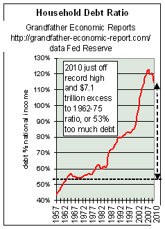 The left chart, from America's Total
Debt Report, shows household debt as a share of national income from 1957 to today. The left chart, from America's Total
Debt Report, shows household debt as a share of national income from 1957 to today.Note the left side of the chart - - showing the household debt ratio in the 1960s and early 1970s held steady at about 53% of national income - which means household debt was not growing faster than growth of the total economy. We recall from the above charts that prior to 1970 family incomes were rising - but thereafter growth stopped for the following 25+ years. The left chart shows thereafter the debt ratio started upward, slowly - then exploded like a rocket - to today's historic record high debt ratios at 123% of national income (or $13.8 trillion - a debt increase of 100% since 2000). As household debt ratios increased 90% faster than growth of the economy since the late 1960s when real median family incomes stopped rising, such suggests real equity & savings have not been the driving force of so-called economic growth - - it has been debt driven. This is an indicator of how families try to maintain their apparent living standards and consumption ("keeping up with the Jones' with nil income growth to do so). They compensate for stagnant incomes by rapidly draining savings and rapidly expanding debt - - credit cards and later the more dangerous form of credit for consumption being home equity loan financing of household consumption. At the same time that families face less social security/Medicare and company benefits when they retire (than their elders), and more and more head toward their golden years more and more in debt with lower home equity and real savings (than their elders). If today's debt ratio had been the same as in the 1960s, then today's debt in dollars would have been $7.2 Trillion less than it is. In other words, 2007 household debt would have been $5.4 Trillion, not the $13.8 Trillion that did occur. That's a HUGE DIFFERENCE !! This shows that the economy is more leveraged by household debt than ever before. And, households are even more at the mercy of credit availability and interest rates. This chart may understate the rising debt impact on families, since it shows debt ratios for all households - - including seniors. If senior households were removed most likely the upward slope of family-only debt ratios would appear even steeper.
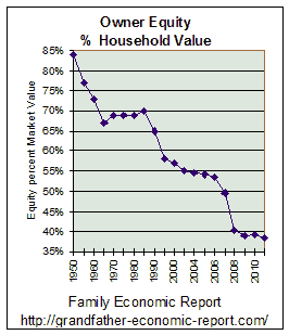
The left chart shows owners' equity as a percent of household real estate values fell to a postwar low, despite rising prices and a much higher ratio of working mothers compared to before. This suggests that a lot of folks were consuming a lot of the equity in their houses. Historic data from Federal Reserve flow-of-funds report December 2011. Record high household debt ratios, record low savings rates - - and, now this chart of record low home equity ratios. A most disturbing picture. This chart would look even more ominous if the 34% of homeowners who own their homes free and clear, primarily seniors, were excluded from the data. The key here is the trend - - most negative. For more on debt, see household section of AMERICA'S TOTAL DEBT REPORT |
| Living beyond ones means has become too often the norm, for which government
practices set the example. The example of old, 'keeping up with the Jones', is not
only alive and well but, as indicated, a revolution of rising expectations has
accelerated appetites for consumption - - perhaps more than ever before. Many
families, especially those with children, may need to re-think their priorities concerning
consumption appetites and debt. Home Mortgage Bubble - "The U.S. financial system is dependent to an unprecedented degree upon the greatest housing-real estate bubble in human history, led by Fannie Mae. Unless corrective measures are taken, the inevitable collapse and the ensuing devastation will destroy millions of families."- by Richard Freeman |
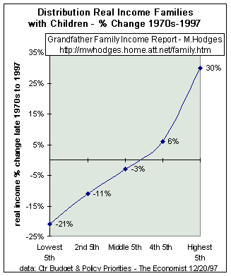
DISTRIBUTION of FAMILY INCOME CHANGES - not a pretty picture
 We saw the chart at the top of this page,
showing 2 ½ decades of stagnant real median family incomes since 1970, proving that a
rising economy over that period did not 'lift most boats' - - although prior to 1970 most
boats rose very nicely, even with one wage-earner per family.
We saw the chart at the top of this page,
showing 2 ½ decades of stagnant real median family incomes since 1970, proving that a
rising economy over that period did not 'lift most boats' - - although prior to 1970 most
boats rose very nicely, even with one wage-earner per family.
So, if inflation-adjusted incomes did not increase for the median family, then obviously some families did better than others. Some up, some down.
The left chart shows the percentage change in inflation-adjusted incomes of families with children for the lowest 5th of families to those in the top 5th of family incomes - - from the late 1970s to 1996/97.
Looking at the chart, it can be seen that for the lowest 5th of families real incomes fell 21% during past 2 decades, while incomes for the highest 5th increased 30%. That's a big difference.
Further, the chart shows for the middle 5th of family incomes their current inflation-adjusted income is about 3% less than 2 decades before. That's stagnation - pure and simple! No wonder family saving fell while household debt ratios soared.
Look again at this chart. Some may say, 'my goodness, the top family earners increased income 30% above inflation in those 2 decades - - isn't that great for them?' But, if you recognize that 30% real income growth over 2 decades is but 1.16% average per year compounded above inflation, its not that great - - especially compared to ALL median family incomes increasing at an annual rate of 3-4% above inflation prior to 1970, most with one wage-earner per family - as proven by the median income chart top of page. In other words, this chart suggest that the top family earners since the 1970s made out worse than did all median family incomes prior to 1970. Of course the poorest 5th saw their real family income drop 21% past 21 years - - or about 1.12% per year below inflation rates. This shows how dramatic long-term implications can be - - just 2% per year separating top and lower earners - and how much poorer is total family income performance now compared to before.
Keep in mind that this chart understates the situation, as it is for gross family incomes prior to taxes. If we factored in the dramatic increase in tax rates (federal plus state & local) since 1970 (compared to before) we would see the data points on this chart lowered significantly. (see Tax Report for comparisons).
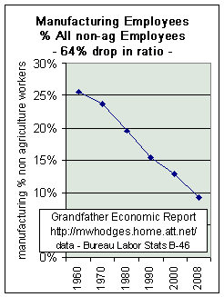 MANUFACTURING DECLINE
Some of the best paying jobs in America, with the best benefits, used to be in the manufacturing sector - - a period when America produced more than it consumed, exporting to the world with positive trade balances. No longer!!
The left chart, from the Family Income Report chapter about stagnant income growth, shows the trend of the number of manufacturing workers as a percentage of all U.S. employees (non-agriculture) - - from 26% in 1960 to 9% in 2008, a 64% drop in the manufacturing ratio.
On a GDP basis the trend is the same negative > the U.S. manufacturing base declined from 30.4% of GDP in 1953 (when we had a trade surplus) to 11.7% in 2007 - also a 62% drop in the manufacturing share of GDP - and more of the remaining manufacturing base is foreign-owned than before. (Bureau Economic Analysis table b-12, Economic Report of President, appendix table)
As shown by the merchandise trade chart, whereas in 1960 U.S. goods manufacturing produced a $5 billion trade surplus (a $33 billion surplus in 2008 dollars), 2008 recorded a $821 billion deficit in merchandise trade. A powerful negative swing.
Bottom-line > manufacturing base shrinkage is a major negative regarding trade balance, and a major negative impact on U.S. economic and national security independence and future living standards.
Note the down-sloping trend of this chart far pre-dates the opening of China as
a major world manufacturer. According to the Chinese Statistical Yearbook and
economist Steve Roach of Morgan Stanley (4/05), the average Chinese manufacturing
worker made 12,496 yuan in 2003, which translates into about US$29 per week. By contrast, average weekly earnings of US manufacturing
workers amounted to $636 per week in 2003. With
Chinese manufacturing wage levels only 4.5% of their
IMPACT OF TAX RATES, COMPARED TO PAST
The above chart shows stagnant to falling inflation-adjusted median family incomes for 25 years. That's before subtracting taxes. The Grandfather Tax Report contains several charts showing the tremendous increase in tax load on today's working citizens, compared to prior generations. The average citizen had to work 5.3 months of the year just to pay all his share of combined federal and state/local government taxes - compared to but 1.4 months required of workers several generations ago. That's a 400% increase in tax-work load - - consuming 43% of an average worker's entire working time each year.
Additionally, the Inflation Report shows many wage earners have been protected from inflation by mandated built-in COLAs - - especially government employees, whereas the majority of families do not have such built-in protection from inflation. The State & Local Government Report shows said employee head-counts have grown many times faster than the general population, thereby providing this group an 'unequal' bonus compared to the general population - - thereby placing this exploding group well above the zero % level in the above chart. It is the author's view there should be zero mandated COLAs for any government employees, unless mandated for all families in the private sector. The fairest and most equitable remedy is to discontinue all government employee COLAs, as well as others paid from tax & social security revenue. And, the next page to this family income report (link at bottom) shows today's family tax rates and home mortgage interest rates are well above that of the 1950s to early 1960s.
Recognizing that often those receiving the best education quality in high school and college have the best chance at higher incomes, the need to significantly restructure public schools for much improved education quality is mandatory, to overcome the negative trends shown in the Education Report. With lower SAT scores than prior generations, and with 60% or more of college freshmen requiring remedial courses today due to inadequate high school quality achievement, the challenge is great. Despite supposedly more receiving high school and college diplomas since 1970 than before, the above chart shows such actually resulted in income stagnation - - not improvement.
With America more and more dependent on global trade, and with accelerated competition by others (see Trade Report), future incomes may show even more dramatic impacts on families.
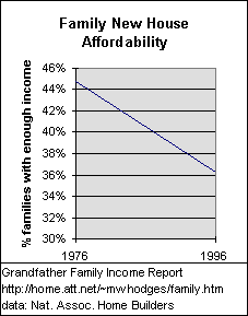 HOUSING
AFFORDABILITY FOR FAMILIES HOUSING
AFFORDABILITY FOR FAMILIES Less than 2 decades ago - despite lower interest rates "Affordability has worsened over the past 20 years for families trying to purchase a home because incomes have not kept up with rising housing prices. In 1976, almost half of all families could afford to buy a median-priced new home; in 1996, just more than one-third of families have enough income to make purchase." (source: National Association of Home Builders) NOTE: this decline was despite the drop in average fixed 30-year mortgage interest rates - from 8.9% in 1976 to 7.7% in 1996 - - and, despite the increase in working wives. NAHB data is for a median priced new home ($136,000 in 1996 vs. $44,200 in 1976), 10% down-payment, 30-year fixed mortgage, monthly costs of principal, interest, taxes, insurance and 16% added for other. 2006 Record Low Affordability - and, even lower in 2007 Here's a 2006 update using a different affordability index
measurement than in the above chart. Nov. 30, 2007 - Only 24 percent of households could afford to buy an entry-level home in California in the third quarter of 2007, the same level as a year ago, according to a report by the California Association of Realtors. To buy an entry-level home in California at $482,910 in the third quarter of 2007, buyers would need a household income of $99,590, based on an adjustable interest rate of 6.56 percent and assuming 10 percent down. The monthly payment including taxes and insurance would come out to about $3,320. Note - this record low affordability occurred during a period of the lowest interest
rates in the past decade, proving that the problem is lack of income inflation-adjusted
income growth - - as per the top two charts on this page. AND - 2006 interest rates were 31% higher than rates in 1960 for the same size, 30-year mortgage - - see Inflation Report. So, to promote even more debt on families government cheered the Federal Reserve to reduce interest rates and nearly eliminate down payments and qualification standards 2005-2007, resulting in soaring prices and debts, only to find the bubble prices collapasing rapidly thereafter - - leaving millions of families under-water on their homes and even deeper in debt - - without any income growh (as shown above) to handle. Bottom-line > a major downshift in living quality for so many. As prices try to retreat to levels in historic relation to income so new buyers (especially young buyers) can have their own home, the government again manipulates trying to prop up prices to protect the bank's inflated loans thereby undermining new buyers as well as the ability of existing owners to recover. |
Even students are learning how to go into debt up to their necks. The federal General Accounting Office, according to AP's Martha Irvin in January 2002, says college students are graduating with an average of $19,400 in student loans. Additionally, average student credit card debt rose 46% from 1998 to 2000, according to the student loan agency Nellie Mae. Meanwhile, universities promote credit cards issued by agencies who kick-back to them. In the past college students graduated with zero debt to themselves and families, because most worked their way through school and minimized consumptive spending.
SEVERAL MEASURES OF SUCCESS HAVE BEEN ANSWERED IN THE NEGATIVE |
| Our economy has not provided for long periods of rapidly rising real median
family incomes, especially for one wage-earner families. Our economy has not
provided for steadily rising rates of savings for families. Our economy has not provided for rising living standards with less debt. Our economy has not made it easier for families to make a choice for mother to
stay home, if she wants. |
YOU HAVE JUST REVIEWED PAGE #1 OF THE 2-PAGE FAMILY INCOME REPORT
WHERE DO YOU GO FROM HERE?
HOW ABOUT TO PAGE #2 OF COMPARATIVE FAMILY TAX AND MORTGAGE INTEREST
RATES?
CLICK THIS > THE Final
FAMILY INCOME PAGE with pictures plus summary > >
OR, Return to Home Page of
GRANDFATHER ECONOMIC REPORTS for the listing of other related reports, comparing
today's trends for families and youth vs. prior generations.
Exchange information with Michael Hodges via
E-mail
| Home & Contents | Summary | Feedback | What's New | Eye-opener | Must See |
Copyright © 2011 Michael W. Hodges. The Grandfather Economic Report series is the intellectual property of its author; all rights reserved under Copyright Conventions. Permission to redistribute all or part of this series for non commercial purposes is granted by the author, provided the associated web page address (URL) is included and full credit given to the Grandfather Economic Report and the author, Michael Hodges. Notice appreciated via email.
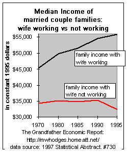 The upper curve in this chart shows that married-couple families with the
wives in the labor force increased their inflation-adjusted family incomes during the past
25 years.
The upper curve in this chart shows that married-couple families with the
wives in the labor force increased their inflation-adjusted family incomes during the past
25 years.