Grandfather Economic Report series
| Home & Contents | Summary | Feedback | What's New | Eye-opener | Must See |
Grandfather Federal Government Debt Report
- full report - page 1 of 2 -
(page 1 with 5 pictures, page 2 with 4 pictures & debt summary table)
(updated Sept. 2016)
by Michael Hodges - email
- a chapter of the Grandfather Economic Reports -
|
In the late 1990s and up to Fiscal Year 2001
the federal government falsely claimed a budget surplus - yet debt increased each year faster than before -
- and for 2002 thru 2015 debt surged $13 trillion higher -
85% of ALL federal government debt created since 1990
dramatic pictures tell the story
The Grandfather Economic Reports is a series of picture reports of threats to the economic future of families and their children, compared to prior generations. You are now at the chapter on Federal Government Debt trends. Welcome. We hope your visit will find useful information to help you and your loved ones. (see report at https://grandfather-economic-report.com/ ).
- This is page 1 of a 2-page mini-report about the high dependence of the economy on government debt, impacting families and the young, presented in an easy-to-understand format with 8 color pictures. (GIVE it a CHANCE to LOAD those neat color graphics)
- Our younger generation is being loaded with a historic debt burden, caused by run-away consumptive social spending 1965 to present - with zero plan by the generation that created it to take the responsibility of paying it off.
- Our generation has allowed a federal 'government credit card' to be used in a run-away manner, to avoid paying for the social spending excesses we allowed government to make - - and we intend to leave the credit card bill to our children and grandchildren to pay off - - lowering their future living standards compared to what it could and should be.
- More than half of all federal debt was created in the 1990s, more & more owed internationally, on top of the 2 largest tax increases in history.
- IFederal Government Debt ending year 2015 was $18.9 trillion and climbing
That's $800 Billion higher than last year,
and $2.5 Trillion increase past 3 years.
- Also, how could they claim a surplus in the late 1990s and early 2000s and that they were paying down debt, when total debt increased every one of those years?
- "I place economy among the first and most important of republic virtues, and public debt as the greatest of the dangers to be feared." -Thomas Jefferson to William Plumer, 1816.
- You will see color graphics on debt dollars, debt per child, debt ratios, and a graphic showing the culprit - along with a short summary. Other graphics on page 2 will show interest costs, foreign ownership, international debt, a summary table of all national debt and a debt reduction plan.
8 QUESTIONS
DO OUR CHILDREN (and grandchildren) DESERVE to inherit an economy loaded with debt, as follows:
- Which is the World's largest debtor nation, PLUS an internal federal government debt of $47,771 per child, (much of which occurred just in the 1990's,despite two record tax increases) - plus an additional $10,000 per child of international and state & local government debt?
- Where federal debt in 1998, for example, was 80% of national income - - higher than 40 years previously when we were completing the World War II debt pay-off plus covering the Korean War, yet there were zero hot or cold wars in 1998?
- Where today's federal debt ratio is TRIPLE that achieved 20 years ago (meaning excess debt as of 2011 of $10.2 trillion).
- Where the federal government continually siphons-off all social security and federal employee pension surplus and other trust funds ($4.6 trillion to date) to spend on non-pension items (an illegal practice in all states for private pensions) - - which annually creates more debt pile-up on the back of our young generation, while hastening the day when even more debt (and reduced benefits) is required to cover retirement payments?
- Loaded with debt, or be free-clear of $14 Trillion in federal government debt not created by themselves?
- Where consumer debt payments as a percentage of disposable income are at an all-time high?
- Where international debt is expanding at $800 billion annually, due to decades of negative trade performance, and foreign interests now own 47% (or $4.5 trillion) of our outstanding treasury bonds and notes - - double the amount owed just 4 years ago?
- AND, is it fair to pass to them an economy where combined nation-wide government plus private sector debt ratio is triple as much as in 1957 (a $37 trillion debt excess to 1957 ratios)?
Does this make us proud ?
Shouldn't we fix it, instead of passing it on to our children ?
For summary information to these questions, read on
NOTE: 'America's Total Debt' is composed of different types of debt: debt by federal government (the report on this page), and state & local governments, international debt, and house-hold, business, and financial sector debt - - plus un-funded social security, Medicare and government pension contingent liabilities. This first series of reports will address federal government debt only - plus short look at international debt. Later in this report is a table summarizing debt, by type. But first, take a look at the following trends of federal government debt build-up over time - shown by 3 different pictures - - and then, to the CULPRIT.
80-YEAR TREND OF FEDERAL GOVERNMENT DEBT
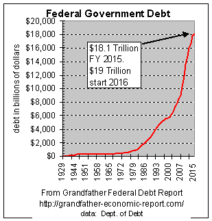 This chart shows the 86-year trend of federal government debt, in current dollars without any adjustments. One thing most interesting about this chart is that none of the data is adjusted for inflation or growth of the economy, so the plot is free of distorting adjustments, and therefore lays bare revealing information. In this period it started at $16 Billion. By 2015 it was 1200 times larger, rising exponentially to $18.9 Trillion.
Looking at the left side of the chart you will see the jump in the early 1940s, due to World War II. From that point forward, the curve remains relatively flat (at a low level of about $250 billion) for the next 20 years, despite growth of the economy. This was a period of strong real growth in median family incomes, a period when for most families only one wage-earner per household was needed to expand living standards. Starting late 1960s, an upward trend emerged, then accelerating in the early 1970s. [it is interesting that since the start of the rise in debt, the Family Income Report shows incomes (adjusted for inflation) ceased rising (for the next 2 ½ decades)- and real incomes fell for full-time employed male workers.]
From 1970, debt continued to accelerate - straight up - - the cause of which, as later shown in this report, was due to socialization of the economy, as consumptive social spending as a share of the economy sky-rocketed upward. The catalyst for such expansion, therefore, is clearly laid at the doorstep of the birth of the 'Great Society' of the President Johnson era - from which it continued to expand forever upward.
By the end of fiscal year 2011 debt exceeded $14.8 Trillion, 60% of which occurred just in the past 10 years's despite the added revenue from 2 record tax increases in the 1990s.
Is the debt going down? Nope!! In fiscal year 2011 (ending 9/30/11) federl debt increased $1.2 trillion, which was an increase of $4,000 per many, woman and child - or $16,000 per family of 4 after increasing about the same huge amount the prior year - - another in a long string of new records.
In the 1990s alone the federal government created $2.9 trillion of new debt, more than created in the nation's entire history prior to 1990. Since the terrorists attacks of 9/11/2001 government debt increased an additional $9 trillion($4.6 trillion of which was created just the past 3 years).
FEDERAL Government DEBT $43,925 PER CHILD - record high
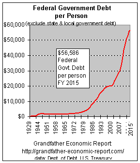 The left chart shows another view of this build up - debt per man, woman and child..
The left side of the chart shows the jump for World War II. But, after the war and until the mid-1960s debt per capita actually trended downward - and, families were doing great with their own economic advancement - as the Family Income Report showed real median family incomes moving up smartly each year, even with only one worker per family.
But, the chart clearly shows the downward trend reversing course to the upside, starting mid-1960s. From there, the direction pointed upward and upward - and, gathering speed to the up-side - -
- - until it, too, is rising exponentially.
By the end of fiscal year 2015 federal debt was $56,586 per child; a family of four shared $236,344 of federal government debt to impact their future standards of living, even before the kids enter kindergarten.
Of the debt at end of 2015 of $19 Trillion, 85% of all debt in America's entire history was created since 1990.
Is it fair to pass on this debt to the young generation?
And, that's just the $18.9 Trillion published part of the federal debt. If one adds the contingent liabilities, off-budget borrowing, and un-funded government pension, social security and Medicare contingent liabilities, some report that the above figure should be increased 3 to 4 times. (see Debt Summary Report)
State & local government debt and international debt is on top of this.
Some say, hey, how about adjusting for economic growth? Well, look at the steady $2,000 per child from 1945 to 1970 - despite good economic growth PLUS the debt from WW II and Korea.
If we could hold debt per person at $2,000 for 25 years of strong economic growth with rising real median family incomes, without playing the 'adjust for inflation justification games', then why not $2,000 per child today - -
- - instead of 19 times higher -
- - AND depressed inflation-adjusted family incomes for the past 25 years?
In other words, why isn't today's federal debt just $500 billion instead of 24 times higher at $14 Trillion? There can be no justification, in the interest of our young - - or, out of respect for the wisdom of America's founding fathers.
The above chart demonstrates the trends of actual federal debt per person (or per child).
When you get to page 2 of this report (link at bottom of page) you will see that other government debt plus un-funded liabilities can increase the above $47,771 per man, woman and child to more than $508,117 (debt summary page)
.Question: Since debt increased each year, how could officials claim they had a budget surplus in the late 1990s and 2000?
Answer: the general federal government did not have a surplus. In fact, they ran a huge deficit each and every year, as shown by the above mentioned debt increases. The Deficit-Trust Report shows the general government spent more than its general revenues, but they covered up the over-spending deficit by siphoning-off all surpluses from all trust funds, including spending every penny remaining in the social security trust fund on non-pension items - - while creating even more debt IOUs to 'paper-over' their actions - - and, at the same time they claim they want to 'save social security'. (If a private firm did that to its employee pension fund its officers would go to jail.). See the 1999-2000 data report.
Question 2: Where's the government plan to pay-off the total federal debt? Answer: No such plan exists, other than continuing to take surpluses from trust funds which they cover with non-marketable IOUs which does not reduce debt. Recognizing that over this period there has been a growth in the population, some people prefer to view debt on a per capita basis. Such a chart follows, called Debt Per child.
To acquire another, very informative view of debt, we will now look at the trend of debt ratios - - with 2 graphics.
|
FEDERAL DEBT AS PERCENT OF GROSS DOMESTIC PRODUCT - a 78-year view
double what it should be, with 2 missed chances to have had zero debt by now -
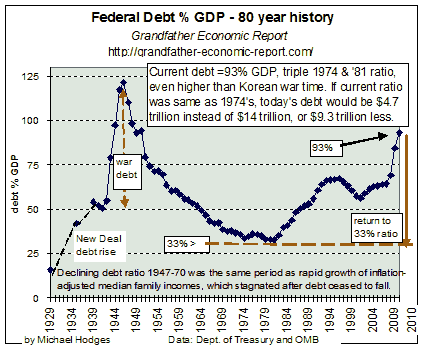 This chart shows 81-years of debt history as a percentage of gross domestic product (GDP). Study it from left to right to 'get the picture.' This chart shows 81-years of debt history as a percentage of gross domestic product (GDP). Study it from left to right to 'get the picture.'
In the late 1920's, an era of economic expansion, national debt was 16% of GDP. Following the depression in the early 1930s (slow GDP), the 'New Deal' of massive social programs was created. These 'New Deal' social programs were financed by 3 times higher exploding debt, from 16% GDP to 50% prior to the war. We can conclude that the 'New Deal' more than doubled the debt ratio.
In the 1940s, as a result of World War II, debt increased to 122% GDP, up from 50% GDP prior to the war (1940). Here we can conclude that the war effort added debt equivalent to 72% of GDP. It was hoped, however, that at war's end this war debt would be budgeted for fast pay-off - - as was the intention of our founding forefathers regarding war debt.
Following the war, the debt ratio was falling rapidly which, according to this chart, was aimed at returning the debt ratio to its pre-war 50% GDP ratio within 10 years (about 1956), and aimed toward ZERO debt by 1965. (that move to liquidate debt sounds like Alexander Hamilton and Thomas Jefferson were still calling the plays. But, we will see that some others got in the way, finding new ways to spend).
The debt down-trend started slowing in the mid-1950s, and only reached its 50% pre-war ratio in 1964, instead of by 1956 (8 years late), delayed perhaps by Korea and Vietnam, and due to the fact government social spending was growing much faster than the economy. It could be said the war debt had been 'paid-off' by 1964 (since the debt ratio dropped to its pre-war level of 50%), and defense spending percent economy was on a downward trend thereafter - - despite the continuing cold war with the Soviet Union.
In the 1970s the downward debt ratio trend slowed, and slowed, and slowed - - until the downward trend stopped, cold about 1974 at 32% of GDP. After oscillating at this level, it then rose steadily to 67% of GDP in 1994-96 - - more than double the prior 32% ratio (red dotted line). As the economy GDP appeared pumped up on debt-out-of-thin-air-steroids the govt. debt ratio fell to 58% even as debt dollars soared to new records. By 2010 (Right side of this chart) a debt ratio of 121% GDP was recorded. The ratio is now rising again with a slower economy and higher spending and even higher new debt levels. We will explore this further in the following graphic, using national income instead of GDP.
|
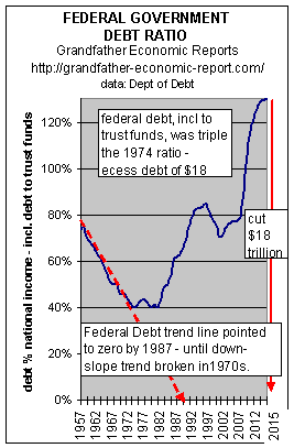 This chart shows the trend of federal government debt (Dept. of Treasury data) 1957 to 2010, expressed as a percent of national income (instead of % GDP). (The national income measure is considered 'cleaner' than GDP)
Off the chart to the left, war-time debt had reached a peak in 1947 at 132% of national income. On the left part of the chart it shows the debt ratio was still heading down from 1957 to 1974, although slower than previously. Had that slower down-trend of this debt ratio continued, the red dash-line shows there would be zero debt by about 1987.
But, the slope of the downward trend slowed in the late 1960's, and by 1974 ceased to drop - - oscillated for 10 years - - and then rocketed upward to historic peace-time record highs.
The reason for the declining debt ratio to stop falling is quite clear. It was due to the fact that new social spending (the 'Great Society') was soaring many, many times faster than growth of the economy's national income - as seen in the Grandfather Federal Government Spending Report.
Note the right edge of the chart - - the downward pointing red arrow. That means - - if today's debt ratio had been 40% of national income (as it was in 1974), instead of 2010's actual ratio of 121% - - today's debt would be a whopping $9 Trillion less than is the case.
It may be worth noting, that much of that $9 trillion excess debt was money siphoned out of various trust funds (such as from Social Security), and spent on non-pension activities - - without even accounting for this in the budget deficit calculations. As the federal government siphoned off all trust fund surpluses, it left behind non-marketable IOUs, which even the Federal Reserve does not record as market debt - but, the Treasury Dept. properly records it as seen in the data chart.
Additionally, the federal government does not even pay cash interest on that 'borrowing' - it just sends over a few more IOUs. All this makes the social security trust fund more vulnerable to disaster - - as the demographic bulge of the baby boom looms very near. Federal budgets do not call this trust fund siphoning (and IOUs) as deficit spending, although it is.
And, they do not budget one penny to repay that already siphoned-off - - yet, hardly a day does not go by that politicians don't moan about the looming social security crisis - - that they created. Complete discussion and data charts of this is in the Grandfather Trust Fund Report.
How often it is heard from politicians that all debt was created in the 1980s. The facts are that half all debt dollars were created in the 1990s - - and, the 1990s (as seen in the chart) have not only rising debt ratio but the highest seen in peace-time - - despite receiving revenue from the 2 largest tax increases in U.S. history in the 1990s.
If some politicians want to camouflage the debt situation and blame it on the 1980s, then they should be willing to reduce today's debt back to the ratios prior to the 1980s - - say the ratios in the mid-1970s. As seen at the right edge of the chart, the red downward arrow shows all they have to do is to budget spending reductions totaling $4.7 Trillion - - which is more than the entire federal budget. That's how far we have come.
Another point concerning the late 1990s: the debt ratio in this chart seems to have peaked and turned down. But we must recognize that this is after a period of the longest economic expansion which increased GDP faster than before, yet still today's debt ratio is nearly twice the size of the early 1970s. This points out that should this economic expansion falter, just a bit, such could drive debt ratios to new all-time highs.
Additionally, regarding the apparent peak recently and slight down-turn, the reader should recognize that government during recent years changed how they measure GDP and national income. The new measure 'pumps-up' GDP and national income and 'reduces' the debt ratio measurements - - we are measuring 'oranges' vs. 'apples' of the past. Many are concerned that the new measurement criteria over-states economy size as it understates inflation and other measures, which is covered in the STATISTICAL REVISIONISM AND WIZARDRY Report.
Regarding use of national income instead of GDP to measure economy size, Economists insist that national income is the more proper method of measuring economy size, since it takes into account proper accounting for capital consumption, eliminates double counting and includes net factor income from and to the international community.
NOTE: those periods of declining debt ratios after World War II were the same periods that real median family incomes were rising smartly. But, after debt ratios stopped falling in the early 1970s, inflation-adjusted median family income growth stopped cold for the next 2 ½ decades. BOTTOM-LINE: 2 missed periods to zero out our federal debt, and then on to record peace-time debt ratios and stagnant family incomes.
Here's a National Security game you can play:
from the above charts note that World War II required surge borrowing of an extra 72% of GDP (above the prior 50% debt ratio) to meet the surge production and economic shifts necessary to meet our war needs. Now, that really was not all that difficult, since the private sector's share of the economy's national income at that time was itself 80% of the economic pie, as shown in the Government Spending Report. But now the private sector's share has been shrunk to 57% of the economic pie, leaving much less capacity for a surge to war-time needs. Now, today's debt is 93% GDP (or, 120% of national income). Can you imagine trying to add another 72% on top to meet an equivalent war in the future, considering the smaller relative private sector? Who are we going to shift from peace-time production to war-time production - - our higher ratio of seniors and state & local government employees and welfare recipients? And who will loan us the additional trillions, since we are already tapped out with record domestic and foreign borrowings today?
This challenge is covered in the chapter National Security Report - - with dramatic pictures.
Are you honestly going to look your kids in the eye and just tell them they don't need the same level of national security surge protection capacity in their economy as we inherited from our elders? Think about this.
A debt reduction of $9 Trillion (64% less) is required as a minimum first step, to at least return to the 40% National Income debt ratio and to the 32% GDP ratio of the early 1970's when family incomes stopped rising as documented in the Family Income Report.
And then an additional plan is needed to re-start the downward trend heading toward zero debt that was interrupted previously in the mid-1960s.
Regardless of which of the 3 above charts you prefer one cannot be proud of what we are passing on to our younger generation.
KEY COMPONENTS of federal spending since the War
(as a percent of the economy)
- a POWERFUL PICTURE
showing debt caused by un-funded run-away social spending
- the CULPRIT
The following 'tell-it-all' chart (from the Federal Spending Report) provides some clues as to the main components of federal spending that caused our federal debt. We saw from the above charts that old war debt was paid-off between 1956 and 1964. It can be seen that the cause of current debt must be laid at the doorstep of run-away, consumptive social spending that our generation did not pay for - - which has increased much faster than growth of the economy.
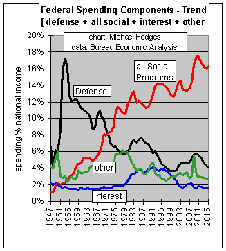 This is a powerful chart. Look closely at which lines go up and which go down.
This chart shows the trends of total federal spending as a share of the economy (measured by national income) over the past 50 years, with the total broken down into 4 components: Defense, Social (sum social security, Medicare, Medicaid/health, welfare income) and net Debt Interest, and Other (meaning all items not covered in the first 3 components, which is balance of spending, incl. such items as Dept. of Energy, IRS, State Dept., etc.).
The declining black trend line is the defense spending ratio, which is now at 5% of the economy, well below its 1947 level - following a 4-decade downward slope.
AND, the BIG CULPRIT (rising red line) is rapidly rising Social spending, growing 18 times faster than the economy, more than eating up the decline in defense ratios (and has now reached a historic new high). (If it had been growing in dollar terms only at the rate of growth of the total economy, then that red line would have been flat on the chart. The fact the red line rises means said spending was growing much, much faster than the economy.)
Look closely at that red line on social spending. Note 3 points: (1)the acceleration starting mid-1960s, (2) this stopped rising (and declined) in the 1980s for the first time in 4 decades, (3)only to rise again thereafter to a record high in the 1990s.]
This chart almost looks as if increased spending on defense in the mid-1950's was a cover for the beginning of a socialization expansion never seen before in history. At the very least, social spending ratios were expanded 'under cover' of declining defense ratios. Social engineers certainly knew what they were doing - finding a way to camouflage their agenda. Since defense has declined to its post WW II ratios, the 'chickens are coming home to roost' - because defense reductions will no longer camouflage social spending, as occurred during the past 4-decades.
Interest (blue line) takes up an added 2% of the economy. But, it can only decline if the debt principal causing the interest is paid-down. However, debt principal is rising.
Since all war debt was satisfied by 1964, and defense spending % economy declined steadily since 1952, our nation's debt build-up must be considered non-defense - - predominately social spending growing much faster than the economy. Therefore, the interest curve (blue line) on our chart since the 1960s must be attributed also to social spending.
Anyone looking at this chart cannot escape the clear signal of the key trend that must be reversed - - its SOCIAL SPENDING! (the red line).
NOTE: For the period of the 1980s, as mentioned the 40-year up-trend in social spending was halted, and temporarily reversed. And, the rise in defense in the early 80s to complete the wrap-up of the Soviet Union (which was covered by an identical decrease in the social spending ratios). The defense ratio was then reversed to end 1980s about where it started. Today's debt totals must be laid squarely at the doorstep of long-term consumptive social spending, that still continues.
Social spending increases can no longer be camouflaged by defense reductions, and therefore must be planned to a downward slope. A political challenge considering the number of beneficiaries of such spending, but of vital necessity if we are to be equitable to our younger generation. After all, few would disagree that today's young families are paying a significantly higher % of their income for social & Medicare spending, and higher total taxes, than did their grandparents, AND they will never see even the same level of benefits.
Summary - Inter-generational inequity?
In summary: we know from the Government Growth Report that all government spending (federal plus state/local) has increased from 12% of the economy to 51% of same, in the past 7 decades. Further, we know from the Federal Government Spending Report that the federal component of total government spending has grown from 3% of the economy to 32% of same - - an 900% increase in its share of the economy. And, the above chart identifies the prime culprit of run-away federal government spending - - social spending, growing 14 times faster than the economy. Further, we have shown that since the social spending ratio is the only rapidly rising component of the federal budget, all the current interest paid on the debt is just another form of social spending. Thus, we have identified the item of spending that has distorted our economic situation - - and is the cause of mountains of debt. Debt spent on items that have been consumed - gone - history - disappeared. AND, we are passing this on to the next generation, with zero benefit to our children and grandchildren. I don't like that!!
Copyright © 1997-2016 Michael W. Hodges. The Grandfather Economic Report series is the intellectual property of its author; all rights reserved under Copyright Conventions. Permission to redistribute all or part of this series for non commercial purposes is granted by the author, provided the associated web page address is included and full credit given to the Grandfather Economic Report and the author, Michael Hodges. Notice appreciated via email.
Bottom of Grandfather Debt Report, debt.htm at: https://grandfather-economic-report.com/debt.html