SOCIAL SECURITY REPORT
|
Grandfather Economic Report series
| Home & Contents
| Summary | Feedback | What's New | Eye-opener | Must See | Email
SOCIAL SECURITY REPORT
|
- inequitable drain on working families and their
children,
with less offered in return compared to their elders -
The Grandfather Economic Report is a series examining economic conditions facing families and youth, compared to prior generations. This is the chapter on Social Security with many data graphics)
QUESTIONS: Should we bequeath to our youth an economy where median family incomes barely move, household debt ratios are at historic highs while saving rates are contracting to record lows, while social security & Medicare costs per man, woman and child sky-rocketed upward, yet today's youth will not receive anywhere near the same benefit buying power as today's seniors?
Is it fair that young families already pay up to 2,100% higher real social security/Medicare taxes than seniors did in their working years, while accepting that today's seniors consume twice as much as a typical 30 year old does compared to 35 years ago while receiving much higher benefits than today's young when they retire?
Is it fair that young workers must protect senior pensions from inflation by granting them guaranteed cost of living adjustments, when many working people have zero inflation-protection guarantees for their own earnings?
Is it fair that young workers must pay increased Medicare and income tax rates to pay for health insurance increased costs of seniors, when many working people must also pay the increased premiums out of their own pockets for their own medical insurance coverage?
Is it fair that they also pay even higher FICA taxes than required to support existing senior pensions in order to build a future surplus when every penny of paid-in surplus has been siphoned-off as fast as it arrived for non-pension spending of the general government - - which causes the Trust Fund to run out of cash earlier, disguise budget deficits and increase the debt load on our youth?
Is it fair that today's working families, where both mother and father must work, have a 233% higher load to cover senior pensions than in 1950 when only 1 wage earner per family was required to make ends meet - - and this is headed higher, much higher?
Here's another confirmation of the inter-generational problem: The Advisory Council to the Secretary of Health and Human Services, in consultation with the Commissioner of Social Security, published in 1997: "From now on young workers and workers of future generations under present law will be paying over their working lifetimes employee and employer taxes that add to considerably more than the present value of their anticipated benefits." The report further confirms: "Polling data suggest younger people have unprecedentedly low levels of confidence that Social Security benefits 'will be there' for them when they retire."
Is it fair there is still no solution? From the Advisory Council above: "All Council members agree that the pay-as-you-go approach should be changed. But despite its best efforts, the Council was not able to agree on one single plan for dealing with Social Security's financial difficulties."
The Special Summary Report shows the Federalist Papers of 1787 documented the four principle reasons for government in our Constitution - - and, national defense was number 1. Social spending was not one of those principal reasons for government. Yet today the sum of social security and Medicare spending is twice as much as defense spending, while defense spending ratios are now lower than before World War II.
The above inequities are as of today. Since the senior population is growing much faster than the young population, these inequities are but the tip of the iceberg of that yet to come. The inter-generational inequities involved are huge. Does this make us proud?
The following pictures tell the story.
To Help You Navigate this page, scroll to see all chart-pictures in sequence -
- or click the quick link of your choice, read and then click your back-button.
Here are a few quick-links: worker payment load, workers per retiree, costs per person, share of economy, approaching time-bomb, Medicare projected. intergenerational consumption comparison, summary-status, some recommendations.
YOUNG WORKING PEOPLE PAY From 1950 to today - - watch how 5-times higher social security tax rates, combine with a 4 times higher maximum on taxable income, to produce a 1,700% increase in taxes paid - adjusted for inflation. |
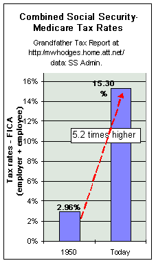 Social Security & Medicare tax rates 520%
higher than before. Social Security & Medicare tax rates 520%
higher than before. This chart shows the increase in tax rates for employee & employer combined (such being the total such tax on the employee income) - - for 1950 vs. today. Combined S.S. tax rates grew from a 2.96% rate in 1950 to today's 15.3% rate. This tax rate is FIVE TIMES larger than today's seniors were paying out in 1950. (on top, income tax rates also rose dramatically as seen in links below). It is generally agreed today's young will not receive anywhere near the buying power benefits when they retire compared to today's seniors, even though they pay 5 times higher tax rates on more of their income than before. A break-down of today's 15.3%: 10.6% social security, 1.8% disability, and 2.9% Medicare. |
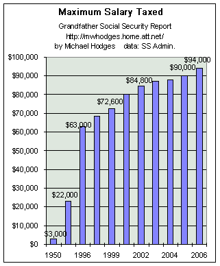 Maximum salary that is taxed is now 310% higher than in 1950 Maximum salary that is taxed is now 310% higher than in 1950 This picture shows the further drain on families compared to what our seniors paid in their working years. This chart shows the maximum salary that is taxed has dramatically escalated over the years - from $3,000 on 1950 earnings to $94,000 today - - plus income taxes on same. This in an increase of 310 percent in constant dollars. The first 2 left-side bars in the graphic are for 1950 (the first bar of $3,000 was for 1950 in actual dollars and the second bar of $22,000 is 1950 restated for inflation in 2003 dollars). The taxable salary today (right-hand bar) is every dollar from zero to $160,000 in earnings - an increase of 4 times in inflation adjusted dollars. Is that equitable?? Of course not. We seniors cannot be very proud of the sacrifice we ask our young to make for us, compared to what we paid for seniors in our young working years. SO - - the amount that can be taxed has increased by a factor of 29 in constant dollars, and 4 times faster than inflation, depending on how you wish to measure. Question - - Did the government need to collect 28 times more FICA taxes to support seniors in retirement? Sure we have more seniors today, but not 27 times more seniors. The answer to our Question is NO !!!! Because - - we know from the Trust Fund Report and its in-depth companion that $1.6 trillion dollars in hard cash was collected from workers in excess of that needed to cover pay-outs to seniors, and this extra intake surplus was siphoned-off from the trust fund by the general federal government and spent on non-pension stuff - - leaving non-marketable IOUs instead of marketable assets to support future retirees. In essence this means a big part of this FICA tax has not been for used or saved for pensions, as intended, but was consumed to support general government spending. This trust fund siphon was an equivalent extra hidden income tax that camouflaged general government budget deficits - - since they did not count this siphoned cash in their budget reports - - a government-supported ponzi scheme and fraud a million times larger than Enron. (The worthlessness of the trust fund has been confirmed by Secretary of Treasury O-Neill in 2001 and by President Bush in 2005.) And - young workers are now told their FICA tax payments will result in a negative return regarding expected benefits. Fair?? Equitable?? Honest?? |
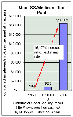 BOTTOM-LINE is not just tax rates, or the maximum income
taxed, but the amount of tax one pays that impacts working families - and, determines the
equality question. BOTTOM-LINE is not just tax rates, or the maximum income
taxed, but the amount of tax one pays that impacts working families - and, determines the
equality question. Combining the tax rate and maximum income from the above 2 charts for 1950 vs. today, results in this chart - which shows taxes paid by employee and employer today compared to 1950, at the maximum income cap for each year. This chart shows how much FICA taxes today's worker and his boss pay for employees at
the maximum cap - - at $14,382. That's up 15,196% in constant dollars, or up 1,931% in 2003 dollars. In 1950, the maximum tax was $89 for those making $3,000 or more. Today's FICA tax is $14,382 for the worker and his boss on $94,000 of pay. That's a tax increase of $14,293 per year in maximum FICA and Medicare taxes per worker, compared to the 1950 worker's maximum. This shows the relative impact of what many of today's seniors were paying when they were in the workforce to support seniors of their day, compared to today's workers. SO, the bottom-line of tax paid was 20-155 times higher, depending on how you measure. |
| Take another look at those 3 charts. From such huge differences one would think our younger generation would be guaranteed to receive much higher benefits and buying power, than today's seniors - - instead of much less! Should there be more fairness in this equation? |
LOAD CARRIED BY EACH WORKING PERSON - another view - a 400% increase in load per working family, |
|
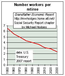 The left chart shows in 1950 about 7 workers
shared the burden of supporting each retiree; The left chart shows in 1950 about 7 workers
shared the burden of supporting each retiree; in 1990 there were only 4 workers to carry each retiree - a 40% reduction. (the Trustee's Report projects a future reduction to 2 workers per retiree). The load continues to increase dramatically. (per U.S. Treasury in 2007 there were 3.3 workers per retiree.) |
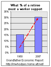 The left chart restates this from a different
perspective. The left chart restates this from a different
perspective. In 1950 each worker supported 15% of one retiree (the first bar on the chart). Now each worker must support 33% of one retiree - that's 120% more load per working individual. |
And - this huge increase in the load per-worker load is understated. Why? Because when today's retirees worked in 1950 they supported much less generous benefits for retirees of those days - nor did they have to support a penny of Medicare for retirees, since Medicare did not exist prior to 1968. One is not arguing here against Medicare, but the increased load on today's workers certainly far surpasses that on today's seniors when they were young workers.
Interesting point: In 1950 there were very few woman in the workforce, and only one wage earner was needed to support a family. Yet today, with more and more mothers sucked into the workforce to help make ends meet, counting the numbers of all these woman the load per worker to support seniors still doubled.
In 1950 a family needing only one wage earner (the man) supported only 15% of a retiree. But today in most families both husband and wife are working, and that family is supporting 50% of a retiree (25% by the man + 25% by the working wife) - - a 233% increase in family load. Today's young worker can expect the ratio of workers per retiree to drop to two, meaning this 2-wage earner family must support one retiree all by themselves. That would be a 567% increase per family load over 1950 - - and, as stated above, this understates the generational comparison given the fact 1950 workers supported much less generous benefits (and zero medicare) for retirees of those days.
This is another generational gap. Not only do seniors do better today, but in their early working years more mothers had the choice to stay home to raise the children to be good citizens. But, today's mothers must not only leave their children to daycare by others and go to work, but she and dad have a tremendous load to cover the better-off seniors, than ever in history - - with very dim prospects concerning their relative retirement benefit buying power.
On a relative generational basis, it is lose-lose for today's families. Less choice for mothers to stay home to raise their children, resulting in erosion of family values and child-control/education, significantly increased per family load to support seniors with inflation-protected income and medical benefits, stagnant real median family incomes despite more 2-worker families (see Family Income Report), and less prospect for equality in buying power at retirement from the very social security system into which they are paying significantly higher rates. Not Fair !!
One can also make the case that rising pension and medical costs on
the backs of working families also has contributed to the fact household debt (percent
national income) is the highest ratio in history - - and the personal savings ratio the
lowest in history - - both occurring despite a so-called 'booming' economy in the
1990s. (see America's
Total Debt Report and Family
Savings Report).
3 More Charts SHOW NATIONAL IMPLICATIONS - - with the threat accelerating |
6,200% increase in real per capita outlays and a 800% increase in the share of the total economy consumed and - that's before the approaching explosion of those born after 1945 entering retirement years |
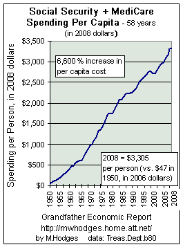 The left chart shows the sum of social security and Medicare
spending per person, in inflation-adjusted 2008 dollars. The left chart shows the sum of social security and Medicare
spending per person, in inflation-adjusted 2008 dollars. In 58 years 1950-2008, inflation adjusted outlays for social security & medicare have risen from $47 per person to $3,305 per person (including those in diapers), all in inflation-adjusted dollars. Equivalent to inflation-adjusted spending outlays up 7,032% per man, woman and child in America. That should help make clear the impact of what today's workers are paying, compared to what today's seniors paid during their working careers to support their parents and grandparents. Look at the chart for the late 1960s - where the curve accelerated upward at a faster pace - - that was when Medicare was born. Since 1970, while real median family incomes were stagnant to falling and mothers were sucked into the workforce trying to help make ends meet, real per capita outlays to support seniors rose $2,886 per man, woman and child. (this figure would be even higher, if we subtracted the senior population from the calculation - - as seniors are certainly not paying FICA taxes). For a family of 4, that is an increase of $11,544 right out of their standard of living and saving potential for their own future since 1970. No wonder family savings are low, and their debt ratios are at a historic sky high. Further, families are paying to protect seniors from inflation, while families have no such protection for their own income. |
Social Security & Medicare Grow faster than entire Economy
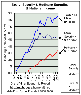 The chart at the left shows social security & Medicare
spending as a percentage of the economy's net national income. The blue line is the sum of
social security and Medicare spending ratios; the black line is for social security
ratios, the red medicare.
The chart at the left shows social security & Medicare
spending as a percentage of the economy's net national income. The blue line is the sum of
social security and Medicare spending ratios; the black line is for social security
ratios, the red medicare.
Let's first concentrate on the blue line - - representing the sum of social security and medicare spending ratios.
Had total spending (blue line) not grown faster than the growth of the economy over this period, its curve would have been flat - - not rising.
But, as you see from the chart, the blue line has soared upward - - 8 times faster than growth of the total economy- as it grew from less than 1% of national income to an 8.4% share.
Today's dollar amount of that spending ratio is shown to the right of the blue line - - a record $1 trillion - - which is 60% more than spent the for the founding forefather's prime reasons for having a federal government > > national defense. Had this spending ratio to economy size been the same as it was in 1970 today's spending would have been $534 billion less than occurred, which is more than enough to fund 86% of the entire defense budget. (The Federal Spending Report shows since 1970 the continuing decline of defense spending ratios 'camouflaged' rapidly rising social spending ratios. Now that defense ratios are at peace-time lows, the camouflage has evaporated - and the 'chickens are home to roost.')
Now let's look at the components of the total:
- - the black line is for Social Security spending - - moving from less than 1% of
the economy to a 5.4% share - - meaning it has increased 5 times faster than growth of the
entire economy - - reaching $617 billion.
- - the red line is Medicare spending. Starting in the
late 1960s it has zoomed up to 3.4% of the economy and $391 billion. And, as the chart
shows, in the late 1980s and 1990s as the economy grew faster - - medicare grew even
faster, never slowing down while eating more share of the economy. The Federal Reserve
Bank of Cleveland (5/01) projects Medicare to double its share of the economy during
the next 20 years - - not counting the impact of any prescription drug programs.
(http://www.clev.frb.org/Research/Et2001/0101/html/budpro.htm)
Higher economic growth in the 1990s, coupled with dramatic upward revisions in criteria for measuring national income starting 1995 plus revisions to the CPI inflation index in order to reduce cost of living increases to seniors, slowed the advance on this chart for the Social Security component black line and the total blue line - but despite such the total is near its record high. This chart also proves that even faster than normal economic growth cannot push down the spending ratios but just slow them down. In periods of downturn these ratios will again move upward - - and even faster with the prescription drug program. There is no free lunch.
THE ABOVE INEQUITIES ARE AS OF NOW - - WHAT IS ON THE HORIZON??
Answer: AN APPROACHING TIME-BOMB - EXPLOSION OF AGE 65 AND OVER AS PERCENTAGE OF TOTAL POPULATION -
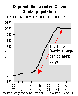 Were you born after 1945? If so, this chart is for you. (From 'The Economist,' October 3, 1997, pg. 70 and Census Bureau.)
Approaching Time-Bomb Note the rising trend line starting 2005. That steep slope means a higher and higher percentage of the total national population will be age 65 or older (from 12% of the total to 20% - - a 70% increase) - - meaning the pressure on workers during any part of that period may have even higher demands on their living standards to fund the explosion of the senior population, but not for their own - - and there are not enough workers to even do it, without pushing them into poverty.
Find your own retirement period on the chart. The higher up the curve, the greater the threat to meaningful benefits. And, if you are a working person during that rise, watch out.
And, if you are a working person during that period, you can sense the tremendous approaching impact on your living standards, and on the economy, to pay for the rising part of this chart. (If you want to make that demographic bulge disappear, you will have to convince the Census Bureau - - the data source).
There can be little doubt from this chart that social security as we know it is nearing DEATH.
How do you like that chart? A bit scary?
To hit home hard: The Economic Report to Congress of 2/98 shows that in 1997, despite general population growth, there were actually 344,000 fewer citizens under age 5 than 40 years ago (1957), yet there are now 19 million more aged 65 and over than then. What a burden those children now under 5 face for the next 60 years - - unless we completely reconstruct government's role in senior pensions and medical care.
And, the house budget committee's executive summary of the FY99 budget states: 'Starting in 2008, members of the 76-million "baby boomer" generation - those born between 1946 and 1964 - will begin to retire. This will start a substantial shift in the population, such that there will be far more senior citizens for every working person. By 2030, the number of people 65 and older will have risen by 96 percent, from 35 million today to 68 million then. But the number of workers - the people paying in to the Social Security system - will have grown by only 13 percent, from 148 million today to 167 million then. Unless we act soon, the system will be bankrupt, and the retirement security of millions of Americans will be placed in jeopardy.'
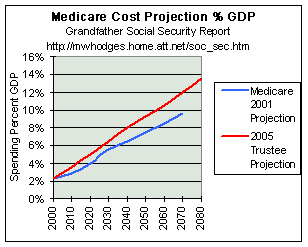 MEDICARE - - soaring into the future, faster and faster -
In the 1990s, social security spending increased at 6% per year (double inflation), while Medicare continued at over 11% growth per year (3-4 times faster than inflation).
The left chart shows the Trustee's projection for Medicare spending (as a share of the economy's GDP) into the future using benefit criteria current law. Note how the red plot from the 2005 Trustee's report projects a more dangerous trend than the 2001 projection.
The chart shows the red line starts at 2.3% of GDP. As it moves to the right the upward slope shows such spending eating up larger and larger shares of the entire economy.
Note this chart does not take into account much elevated ratios that will result from adding prescription drug benefits. The 2005 Trustee's report projects 12% of GDP by 2070, higher than the 10% of this chart.
See the Health Care Report for pictures of U.S. health care spending relative to other nations, whereby already the U.S. consumes 82% more of its economy on health care than others - yet, the U.S. has lower life expectancy than many other nations.
WARNING: These trends must be reversed to the downside - - at least cap at today's 2.5% of GDP.
Several possible outcomes: (1) economic collapse if attempts are made to maintain current benefit levels during the rising period, (2) provide equal benefits to all seniors, but at less than one-half current buying power, or (3) no benefits for any senior at some point, except those at the poverty level - - meaning means-testing and converting retirement programs to welfare. The longer we wait to choose the course, the more likely outcome #1, and the more abrupt the hardship. And, in the meantime, the next page this report shows to date $600 billion of incoming FICA surpluses have been siphoned off and spent on non-pension stuff, and an additional $2.5 trillion is planned to be siphoned off in the future - - leaving future seniors and their children and grandchildren at the mercy of politicians to issue to the public another $3 trillion in debt in the future.
Bottom-Line: people had better start saving big-time for their own retirement - - and not count on the government, regardless of what you hear
DRAMATIC TRENDS
"There are 2 dramatic trends: the elderly now hold a much bigger share of total wealth than a generation ago due to government entitlement programs which tax the young & future generations and pay benefits more than before - and the elderly spend more of this money than they used to relative to the young.
The trend to more generous government transfers to the elderly has altered their behavior in two ways: (1) Social Security benefits function like annuities, thereby reducing the fear of running our of money (2) Medicare, by paying benefits 'in kind', reduces the incentive to be frugal in order to bequeath. This explains much of the plunging savings rate, and pessimistic - believing that intergenerational redistribution will continue which may push savings rate even lower - thus the rate of domestic investment & growth in labor productivity and real wages could become even more anemic. There is a need for generational accounting and balance, and a worry about the possibility of an inflationary spiral to partly resolve the problem ahead.
The U.S. is headed for a 'train wreck' with no commonly acceptable solution to the problem in sight" L. Kotlikoff, Boston U., to the Nat. Assoc. of Business Economists, in NABE NEWS #119 of Nov. 1996.
INTERGENERATION CONSUMPTION: seniors gained - 30-year olds lost |
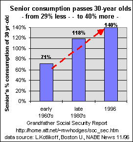 The left chart shows the change in consumptive spending ability of
seniors compared to typical 30-year olds - for 3 time periods - 1960s, 1980s and 1996. The left chart shows the change in consumptive spending ability of
seniors compared to typical 30-year olds - for 3 time periods - 1960s, 1980s and 1996.
In the 1960's, the typical 70 year old consumed 71% of that consumed by the typical 30 year old. In the late 1980's, this ratio jumped to 118% - - and TODAY is close to 140% - meaning seniors have significantly gained over 30-year olds in the capacity to consume. The increase in absolute & relative consumption by the elderly results from receipt of more resources (SS, medicare, etc) transferred from 30-year olds to seniors. Data source: National Association of Business Economists News #119, L.Kotlikoff, Boston University 11/96 An earlier report by MIT Economist, Lester Thurow (Future of Capitalism, pg 98), offers similar results: "Adjusting for household size, capital gains, taxes (state & federal), non-cash benefits such as health insurance, and imputed returns on equity in owner-occupied housing, the elderly have a per capita income a WHOPPING 67% above that of the population as a whole. Looking at cash income alone in the 1960s, the average 70-year old was spending only 60% as much as a 30-year old; today, that 70-year old is spending 20% more than the 30-year old." This widening gap may get worse, as evidenced by the fact Medicare is growing 3 times faster than the total economy - and the decrease in workers per retiree. This study shows while today's seniors have it much better than did those in the early 1960s, this has come at a price of today's typical 30-year old having it relatively worse. This is a typical chart of income re-distribution. There are no 'free lunches'. Someone wins, at the expense of another. Should actions be taken to rebalance this? |
As documented in the Tax Report: Not only must working people pay a larger percentage of their incomes than prior generations to support today's seniors, but they pay higher federal income taxes than today's seniors earning the same amount. Dr. Lester Thurow, MIT Economist, reports that a couple with one child earning $30,000 pays $2,449 in federal income taxes, while an elderly couple needing to support only two with an equal income of $30,000 pays only $791 in taxes. Should a working family pay more income taxes than seniors earning the same income, on top of paying higher social security/medicare tax rates than seniors ever paid?
Much of the growing generational gap in incomes shown above may have been contributed by the fact many seniors are protected from inflation by government mandates - - not so for working families of non-government, non-union employees - - as documented in the Grandfather Inflation Report. This is in-equality.
To gain a perspective concerning how social costs impact 56% of the federal budget, see the Federal Budget Report.
Page 2 of this report (link bottom of page) will show:
[ two (2) important, revealing articles about the status and scam-practices of the trust fund, are on the next page of this report ] |
SUMMARY of Cross-Generation In-equality
In summary: a pyramid-scam-scheme, slanted against our young. A intergenerational
inequity of huge proportions. Its unfair and its unethical.
ACTIONS RECOMMENDED TO REDUCE CROSS-GENERATION IN-EQUALITY:
THE AUTHOR OF THIS PAGE IS A GRANDFATHER |
|
THANKS FOR VISITING |
Recommend the reader go to a fast-reading page
2 of 2 of the Social Security Report, for discussion of 'Where are the
trust funds - and why were they spent on non-pension stuff, without any pay-back budget
plus causing even more debt?' and more extensive recommendations.
Or, return to the HOME PAGE of the Grandfather Economic Report series, with its listing of other reports which review economic conditions facing the young, compared to prior generations.
| Home & Contents | Summary | Feedback | What's New | Link Index | Eye-opener | Must See |