- comparing technical data vs. political data -
 This chart looks at World Oil Reserves, comparing technical
data with what some call 'political data.'
This chart looks at World Oil Reserves, comparing technical
data with what some call 'political data.' Grandfather Economic
Report series
Home & Contents | Summary | Feedback | What's New
Economic Energy Report's |
This is the WORLD Page of the Energy Report Home Page - -
Quick Links internal to this World page > > World Oil
Reserves - - Oil Reserves Middle East vs.
Other Sources - - World Oil Production - - Technical Data vs. 'Political Data' - - World
Gas Reserves & Consumption - - Gasoline Taxes per nation -
- Oil Sands - Canada and U.S. shale - - Top Oil
Exporters & Importers - - Data Manipulation - - and Author Comments
Other pages: Page 1 - USA page
- - Page 3 with conclusions/actions, related articles - - Table of Contents all sections this Energy Report, incl. link list
and authors - - Energy Report
Home Page
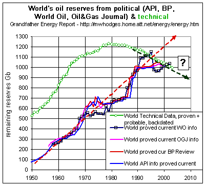
The upper green curve represents TECHNICAL DATA regarding world reserves proven and probable, backdated to the year of discovery, collected by Jean Laherrère " from the individual estimates of every field in the world outside the US (about 20,000 fields) and the USGS revised estimates of past US annual discoveries (about 30 000 fields). I have in my computer all 20,000 fields outside the US and the 400 US major oil fields (over 100 Mb)."
The other lines (4 bunched together) represent current releases from the World Oil journal (WO), Oil & Gas Journal (OGJ), BP Review, and the American Petroleum Institute (API). These 4 sources are here called 'political data', as explained below.
NOTICE the major difference between the upper green line for technical data (a smooth up and over bell curve) compared to the other 4 lines (almost always rising, and bunched together, intersecting in 1990, then ceasing their upward march - - and more recently getting 'religion' as discussed below).
The green line for technical data shows world oil reserve increases (from new discovery data catch-up minus production) started slowing down in the mid-1960s. World reserves of record then peaked in the late 1970s per this chart at about 1,200 Gb (1.2 trillion barrels) and continuously trended down since then to less than 1,000 Gb (1 trillion barrels) due to production depletion.
On the other hand - - The 4 'political data' curves appear most suspect. Their plots act as if true reserves were, for some reason, understated from 1950 to 1990 when compared to the technical data curve. Additionally, these 4 curves show constantly growing reserves over this period, acting as if new oil discovery volume potentials were far exceeding world oil production from 1950-1985 - - and then magically zooming upward in the 3-year period 1985-88 at the fastest pace in history. The next apparent anomaly was in the early 1990s when the chart shows an abrupt departure - - from zooming upward trends of the past to a sudden dead stop!!
This abruptness of change (and the other points raised) of all 'political data' curves appears most unrealistic - - and it further calls into question the accuracy of data prior to the mid-1990s. The data unrealistically appears to try and convince an observer that, all of a sudden, huge new discoveries were magically found 'under the rug' causing soaring world oil reserves and then, again all of a sudden, that stopped dead. Could this be true, or were 'reserve inflation' games being played? (the answer is below on Data Manipulation Games).
It appears as if the 'political data' curves were understated in prior years, then over-stated about 1990 - - BUT now are showing signs of coming closer to the green technical data curve - - as they level off and drop. (it is not the purpose of this report to question why such political data was presented to the public).
This chart also shows a past 'follow-the-crowd' approach to world oil reserves, as one looks at the unrealistic way by which all 4 'political data' sources bunched together for 50 years. This indicates that perhaps none of those 4 sources have been producing their own data independent of the others. It's as if the 4 'political data' sources subscribed to the same source, and just copy.
However, the chart shows that the black curve from the World Oil (WO) publication , with its major adjustment in the latter part of the 1990s, and therefore, for the first time, it is coming closer to the technical data curve and departing from the other 3 sources).
The chart shows those 4 sources seem to be getting a little 'religion' in the last
several years as steep increases in reserves reported in the past all of a sudden seem
to have evaporated.
Summary:
This graphic makes a strong argument in favor of accepting the technical
data green curve as more accurate regarding World Oil Reserves than blindly
accepting the other 'political data' sources, past or
projected.
AND - - World Oil reserves peaked 20 years ago and are now declining at an accelerating rate. Chart by Michael Hodges, data provided by Jean Laherrère
In the end, TECHNICAL DATA MUST PREVAIL!!- - A chart coming up next will help clarify the above with a break-down of this World reserve chart, into Persian Gulf and non-Persian Gulf Reserves - -
 -
as we consider this chart keep in mind - -
-
as we consider this chart keep in mind - -
- - the Middle East region (the bulk of OPEC) does NOT (up to now) produce at its
full capacity
- - regions outside the Persian Gulf generally DO produce at near full capacity.
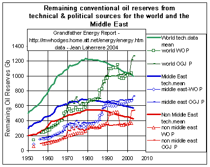
The chart above showed world reserves by technical vs. political data.
The chart at the left divides the world's total oil reserves (solid green curve) from all producers in 2003 of about 1,000 Gb (1 trillion barrels) into two parts:
1. Middle East producers (solid blue curve) (the majority of OPEC) have reserves of about 570 Gb (57% of the world's reserves)
2. Non- Middle East producers (solid red curve), meaning the rest of the world's producers of about 430 Gb (43% of world reserves).
- - each plotted with technical data (solid curves) vs. some political data as reported
by World Oil (WO) and Oil & Gas Journal (OGJ).
(don't be afraid of a chart with many curves, it will be explained).
(Note - Middle East producers, sometimes referred to as the 'swing producers' because they restrain their production, are Saudi Arabia, Kuwait, Iran, Iraq and Abu Dhabi)
The bold solid green, blue and red curves represent reserves from technical data of reliable sources:
- (1) The top green curve represents World Reserves from technical data, the same
curve as shown at the top of the first chart above, where world oil reserves peaked about
1980, thereafter trending down faster and faster. (a typically expected bell-shape
curve).
- (2) The middle solid blue curve is
for Middle East reserves from technical data, peaking
late 1970s, and thereafter declining faster and faster. (it is expected in the future that
this curve will also form the downward slope of the typical bell-shape). (Persian Gulf
nations up to now have NOT produced at full capacity - - thereby conserving their reserves).
- (3) The solid red curve is technical data for
reserves of the non-Middle East regions of the world -
- being the rest of the world in total such as the USA, Russia, Venezuela, Canada, Mexico
and others, peaking early1980s, leveling-out to late 1980s and thereafter rapidly
declining - - along a typically expected bell-shape curve (These nations generally
produce at full capacity, thereby more rapidly expending their reserves).
The other (non bold) lines represent reserves by the Oil & Gas Journal (OGJ) and
WO, which we refer to as 'political data:'
- (a) the green WO and OGJ data for world reserves show erratic behavior with large jumps
then large drops - - indicating inconsistency. Note the 44% jump in late 1980s, as if
there were huge new discoveries. Thereafter, erratic reporting from both sources despite
record production and consumption and no new significant discoveries. This is discussed in
(b) and (c) below and in Data Manipulation Games).
- (b) the blue data plots for OGJ & WO data for Middle East reserves show most erratic behavior. OGJ and WO data plots jump 57% by 1986-1989, as if 57% of all middle east reserves were just discovered in those 3 years - - after which basically flat reserves despite large production and no further discoveries were made in the next 11 years. That graphic jump, of course, makes prior data appear most suspect. And, of course, there are some political reasons for such data - - such as OPEC's production quota games for a given country member are partly based on that nation's reserves, so since most members want to maximize production revenue they have an incentive to cheat by inflating what they call their reserves - - which did occur in that period - - thereby inflating middle east reserve total above technical fact.
- (c) the red data plots for OGJ & WO data outside the Middle east called non-Middle East (determined as World minus the middle east) - - show reserve levels, measured by political data, remained nearly flat for the past 3 decades - - as if new discoveries were sufficient to cover all production and then all of a sudden this was not the case. Looking at red data on graph for WO data plots shows a 32% jump in 1991 and then a 32% drop 5 years later in 1996. Additionally, OGJ data plots jump up 50% from 2001 to 2002 as if non-middle east reserves increased 50% in one year. All of this significantly conflicts with the technical data red curve which shows a reserve peak in 1980 and rapidly declining thereafter.. ('The only thing that kept other curve relatively flat the past 20 years was that in late 1987 Venezuela 'jumped' their reserves 124%, from 25 Gb to 56 Gb, whereas all other nations outside the Persian Gulf cannot play 'reserve number games' since they have been producing all they can, which is at capacity').
The technical data curves include all known data, including Iran's claim to new discovery at the South Pars gas field which was really a tap into Qatar's North Field, and also includes new discoveries in deep waters, Caspian Kashagan and other places
Summary: as with the first chart on world reserve trends, this 2nd chart for reserves of Middle East vs. other regions shows the power of the technical data over 'political data', and over financial data as well. And, this chart not only further confirms the world's necessary increased reliance in the future on Middle East oil, but that some political data attempts to say the Middle East has more reserves than proven by technical data.
- - and, these charts also reconfirm the suspicion raised with regard to the earlier
charts on production projections from 'political data.'
- - and, this brings up the question: Do our political leaders have good grasp on the
total energy supply situation looking-forward because of poor data, or are they
(hopefully) relying only on technical data?
Lastly - - considering the wide use of 'political data' sources and the power represented thereby it would not be surprising to hear many justifications why technical data vs. political data presentations here should be thrown out the door - - because the messenger is non-traditional.
But - This Energy Report's objective is to bring forward the information collected and hopefully thereby encourage more realistic use of technical data of high quality by more adequately-trained people. Challenges are welcome, since fact (not money or prestige) is the objective.
Chart by Michael Hodges, data provided by Jean Laherrère
World Production - crude oil - - OPEC moving into major control
As stated in the second graphic on the Oil Production - USA page, Oil discovery peaked in the U.S. during the 1930's, and production peaked 40 years later in 1971. For the world as a whole, discovery peaked in the 1960's and the chart below shows the projection for the peak of world oil production.
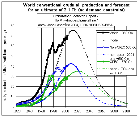 Analysts divide the oil producing world into two halves: OPEC and the rest.
There is broad agreement that non-OPEC oil production will peak or at least plateau by
about 2010. ExxonMobil chief executive Rex Tillerson said in 2007 that non-OPEC production
growth would be all over in "two to three years".
Analysts divide the oil producing world into two halves: OPEC and the rest.
There is broad agreement that non-OPEC oil production will peak or at least plateau by
about 2010. ExxonMobil chief executive Rex Tillerson said in 2007 that non-OPEC production
growth would be all over in "two to three years".
This chart shows two things - - (1) total world crude oil production of all producers per year in the past (solid lines), and (2) projected production in the future - - with production data plots for total oil, OPEC only and Non-OPEC.
First look at the actual production 1920-2003 - -
The upper black line shows the history 1920-2003 for World
Crude Oil Production of all producers - - now about 70 million barrels per day
(as it is crude oil only, contrary to the demand in liquids which is about 76 Mb/d
including natural gas liquids, synthetic oils mainly from unconventional oils, refinery
gains and withdrawal).
The blue line is Non-OPEC (USA, Russia, Canada,
Mexico, North Sea, etc.) crude production for 1920-2003 (last year about 40
million barrels/day - - 60% of the world total).
The green line is the OPEC crude production
history (last year about 30 million barrels/day - - 40% of world total).
Several key points from this chart >
1. The non-OPEC producers (blue line), with
less reserves, are going trough their oil faster than OPEC producers. For 2003, non-OPEC
nations produced 60% of the world's total, yet they have remaining much fewer reserves
than OPEC (according to the reserves chart up this
page).
2. For some perspective > current production of the non-OPEC nations is shown as about
40 million barrels per day. Of this, Russia produces about 8 million barrels and the USA
about 5.7 million. So far Russia has been unable to produce to a late 1980 production peak
of 11 million per day, and we have already shown that USA oil production has been in
decline for years.
3. Production of non-OPEC nations (blue curve)
is projected to peak out in 2008 (just 4 years from now) and decline thereafter. We saw
from the US Production chart that USA production peaked many years ago with production now
below 1950 levels.
4. For the OPEC nations (green curve) of
about 30 million barrels per day of production last year, Saudi Arabia's share was about
10 million barrels, and Iraq, at best, at 2.5 million barrels.
For the year 2003, the chart shows total world oil production (black curve) was 69.4 Mb/d (million barrels per day), which over the 365 days of 2003 resulted in total production of about 25.3 Gb (billion barrels) that year. The chart also shows for 2003 Non-OPEC's production portion (blue curve) was 41.4 Mb/day (15.1 Gb for the year) or 60% of the total and OPEC's production portion (green curve) was 28 Mb/day (about 10.2 Gb for the year) or 40% of total world production that year.
So, we can see on this chart that OPEC's 2003 production was about 40% of the world total production last year, yet the the reserves chart further up this page shows the middle east alone (which does not include OPEC member Venezuela) has 57% of world oil reserves. This means that as the non-middle east producers produce at near maximum output they are running out of their smaller reserves much faster than the Middle East.
Looking at the forecast (the dotted lines after 2003) one will notice that total world crude oil production is forecast to peak by 2011 - - about 7 years from now - - thereafter following rapid decreasing production levels. Non-OPEC production is forecast to peak in 2008 with OPEC's production to peak about 12 years later in 2020.
If we were to total all production in the past up to and including 2003, then total crude oil production to date was about 930 Gb (billion barrels) - - of which Non-OPEC's portion to date was about 560 Gb and OPEC's portion to date about 370 Gb.
Note the dip in the OPEC green line for the early 1980s. Next note OPEC's increased production since then has been less steep than in the past and has not yet even reached its peak production of the mid 1970s. (perhaps OPEC was then (and still is) conserving reserves while non-OPEC producers were expending theirs as fast as they can pump. As Jean Laherrère states, 'There is a strong difference between the swing producers, i.e. the Persian Gulf (Saudi Arabia, Iran, Iraq, Kuwait and Abu Dhabi) which produce less than their capacity and the rest of the world (non-swinger) which produce at full capacity.')
Meanwhile, the non-OPEC blue line (which includes production of the U.S., Canada, Mexico, Russia, Norway and some others) increased up until late 1980s and then relatively flat production in the past 15 years. (We noted in the first chart in the USA Energy section of this Energy Report that U.S. oil production peaked in 1970 and since then has a declining trend. Additionally, in comments with the import trend chart (in the USA section) we read about declining reserves for several other non-OPEC nations, Canada and Mexico).
Now comes the interesting part - - Crude Oil production forecasts for the future. This production graph also includes forecast projections for crude oil production for total, non-OPEC and for OPEC - shown by the dotted data curves after 2003. This future production forecast for total crude oil (the top curve on the graph) is based on our model (a simple Hubbert cycle) taking into account total remaining reserves at end of 2003 of about 1,000 Gb (see remaining reserve chart above) to which we add 200 Gb for estimated future discovery - - which means maximum future production is 1,200 Gb (or 1.2 Tb) of crude oil distributed per year as shown. The same treatment is done by forecast curves for Non-OPEC (totaling 500 Gb from 2004 until exhausted, 42% of the total) and OPEC (totaling 700 Gb, 58 % of the total), where we take their remaining reserves at end of 2003 and add their proportional part of estimated future discovery. Notice the shift compared to the past, since compared to the past when non-OPEC produced most of the oil looking forward OPEC must account for most of future oil production since it has more reserves - - provided, of course, world politics or war does not upset that possibility.
Jean says, 'It is most important to recognize the "no demand constraint" in the chart's title. The model (a simple Hubbert cycle) is showing what the supply may likely deliver if oil demand can use it but in the likely case of economic constraint, as in 1979 with high price and most important high belief that oil price would triple in the next 20 years economy savings led to a peak in 1979. I believe there will not be a peak but a bumpy plateau instead, and future production will be below my simple curve. But the area below production from 2004 to the end will remain the same (being the remaining ultimate of 1.2 Tb). Adding the remaining 1.2 Tb to the approx. 930 Gb (0.9 Tb) production in the past gives the total from day one to exhaustion of 2.1 Tb (trillion barrels), as also stated in the title.
Commenting additionally on oil production, link #30 states: U.S. production peaked in 1970, Russia in 1986, North Sea production may have peaked in 2002, China in 2005-2006 (already importing more and more, now the world's 2nd largest importer), Mexico in 2007, and Canadian production could reach its peak towards the end of this decade. According to the above chart, OPEC production is predicted to peak between about 2020, and non-OPEC supply will peak about 12 years earlier in 2008.
Note - the above chart is for crude oil only (excluding NGL, natural gas plant liquids, refinery gain, and other liquid fuels).
Says Jean >
Some of Jean Laherrère's above chart data: History: Energy Information Administration - (EIA), International Petroleum Monthly, DOE/EIA-0520(99/12) (Washington, DC, December 1999), Table 1.4.- - Projections: EIA, World Energy Projection System (2000) - breakdown between OPEC and Non-OPEC: - DOE/EIA-0484(2000) International Energy Outlook 2000 - March 2000 - Energy Information Administration. This publication is on the WEB at: link #16
A few more data graphics add to the big picture of World Oil Production - - Growth and Peak > |
|
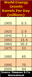 Growth
> This table shows total world oil production (in million barrels per day) between 1905
and estimated 2005. Growth
> This table shows total world oil production (in million barrels per day) between 1905
and estimated 2005.According to energy investment banker, Mathew Simmons, 20 percent of the world consumes 60 percent of the oil and the other 80 percent are just getting addicted. (recall our opening grapic and statement that the USA alone, with 5% of the world's
population consumes 26% of the world's oil production.) |
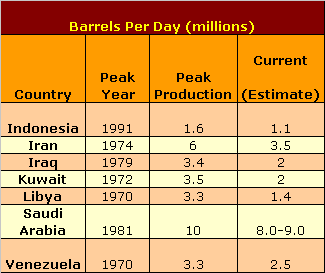 Peak
> This table (from Simmons & Co.) shows that, in general, the largest OPEC
producers may already have reached peak producdtion. Peak
> This table (from Simmons & Co.) shows that, in general, the largest OPEC
producers may already have reached peak producdtion.Peak oil is reached when 50% of
known supplies have been used up. From that point forward supplies begin to decline. The
geologists believe that “peak oil” will arrive in this decade. We will know that
it has arrived only though hindsight. What we do know is that there have been no major oil
discoveries in the last 30 years. The last big discoveries were in Alaska in the late
60’s and the North Sea in the early 70’s. Both of these discoveries are now in
decline. |
For a more comprehensive 2001 Study of World Reserves by Jean Laherrère - paper at IIASA International energy workshop June 19-21, 2001 at http://www.iiasa.ac.at/Research/ECS/IEW2001/pdffiles/Papers/Laherrere-short.pdf (to Link #28)
TECHNICAL DATA vs. 'POLITICAL' DATA vs. 'Financial' data
"Technical data is from the individual estimates of every field in the world outside the US and the USGS revised estimates of past annual discoveries."
'Political data' is called such "because they result from an inquiry upon the national companies. The most used is from Oil & Gas Journal as it is the first published, giving the estimates at the end of the year one or two weeks before the end of the year. It could be only a political answer as the analytic study is not yet carried out by the experts. Furthermore OGJ does not revise their estimates later on as World Oil does. It takes several months for the DOE to get the data and the 1999 USDOE annual report was published on September 2000. Most serious governmental agencies do not answer (as Canada and France in 1999) and on the last estimates on the remaining reserves for end 2000 published by OGJ December 18, 2000 out of the 105 countries 84 countries (representing 586 Gb out of the total oil world 1028 Gb and 4025 Tcf out of the total gas world 5278 Tcf) are reported as no change as if the new discoveries have equaled exactly the production, China has exactly 24 Gb every year since 1990 : it is a joke ! Furthermore OGJ estimates are supposed to get accurate up to thousands barrels, the reported world total being 1 028 457 585 kb ! As I am used to say, in the oil industry the accuracy is about 10% and any author giving more than 3 significant digits shows his incompetence on the subject and that the first digit is likely to be wrong (in fact it could 9 or 8 instead of 1).
Another factor for an increase is that it is proved reserves, very conservative estimate which leads to strong revisions. The technical curve in our chart is the present estimate of proven + probable reserves, backdated to the year of discovery, more truly representing reality than the poor current reports of other sources. The best curve should be to backdate to the year of development but the data is not complete enough to do so and undeveloped reserves will disappear."
'Financial data' - - "I feel we should also mention the financial aspect of
the US data to indicate that the SEC (Security Exchange Commission), to please the
bankers, is upsetting the reporting by obliging the oil companies listed on the US stock
market to report only proved reserves, when in the rest of the world the national agencies
report proven + probable reserves. The US practice of reporting only proved reserves is a
poor practice leading to strong revisions of the reserves of old fields, as 90% of the
oil additions are from revisions of old fields. The resulting reserve 'growth' from
this poor practice is in fact used to claim that the increase is due to progress in
technology, when it is mainly poor reporting. Oil companies like this, since they
can show 'growth' without having to find any new discovery."
Jean Laherrère
To better understand these issues, including recent reserve downgrade by Shell BP, a 2004 article by Jean regarding reserves is at http://www.oilcrisis.com/laherrere/ShellDecline2004.pd
 WORLD RESERVES - -
NATURAL GAS
WORLD RESERVES - -
NATURAL GAS
- comparing technical data vs. political data -
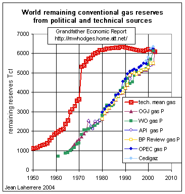
In the graphics above we have covered world oil reserves, consumption and production, a very sobering view regarding transportation and plastic uses. Now to a challenger of coal and nuclear for electricity generation and heating - - natural gas. This graphic shows World reserves of natural gas, with the red line representing technical data - at 6.000 Tcf remaining reserves as of 2003.
Again it is important to distinguish estimates based on technical data from that reported (published) for political, commercial or financial purposes.
There has indeed been growth in reported reserves, but the technical estimates are little changed, as shown in the graph for conventional gas remaining reserves. Technical reserves (red line on chart) are estimated as the mean values (called proven + probable or 2P) and backdated to the year of discovery. The world's remaining technical reserves have been substantially flat since 1980 at about 6 000 Tcf (Tcf Å EJ), but the reported so-called Proved Reserves (current P) have grown from 3000 Tcf in 1980 to 5200 Tcf in 2000.
I cannot identify the claimed recent findings that are said to have drastically changed the perspectives. South Pars in Iran is reported as a 1991 find, but it is the extension of North Field in Qatar found in 1971. So the whole field has to be attributed to 1971 (being the world's largest gas field by far) especially as the extension into Iran was evident at an early stage. Much of what it attributed to new discovery is in fact nothing more than the correction of poor initial estimates (constantly revised), termed Proved.
The technical estimates of the world's conventional natural gas have been flattening since 1980 as shown in the above graph (red line on chart). It is estimated OECD countries together hold only 9% of proven reserves, whereas the Middle East holds 41% and Russia alone 26%.
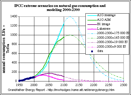 This graphic shows the extremes of approx. 40 different scenarios regarding
the world's future natural gas consumption/production.
This graphic shows the extremes of approx. 40 different scenarios regarding
the world's future natural gas consumption/production.
The data points 1950 to 2000 represent actual consumption. Beyond 2000 are projections to 2100 by different authors, with modeling.
Note that the slope of the two upper extreme curves (AIG message and AIM) appear to ignore actual past hard data of consumption, and are still zooming upward in 2100. These scenarios imply that the amount of gas produced from 2000 to 2300 would be twenty times the most likely technical estimate of the conventional and unconventional gas combined, making them utterly implausible. The present world's gas production is not showing any drastic change!
The lowest projection based on technical data (pink line - Laherre) shows a consumption peak in 2030, declining thereafter - - and to the 2000 level by 2050. Only the lowest (B1) scenario shows a reasonable fit with the past, with its peak 20 years later, in 2050.
In the oil projections (charts above) we have seen the tendency of many 'experts' to make 'political data' projections well beyond that supported by more sobering technical data. This tendency to do the same regarding natural gas is quite apparent, thereby rendering IPCC conclusions a dangerously misleading impression. It is evident that too many have assumed a huge potential for gas supply which is not supported by the data, having been misled by public data reported for political and financial purposes by international and national oil companies.
Iran has what are estimated to be the world's second largest reserves of natural gas after Russia. Iran is a place of enormous strategic importance to China, to Japan, to Russia, to the European Union, and for all these reasons, to Washington as well. (link #45 - Dec. 2005)
INDICATED CONCLUSIONS REGARDING GAS:
1. Natural gas world reserves are not increasing, despite massive search investments.
2. Government and private sectors must develop more reliable data regarding the future
based on hard technical data, AND stop assuming the 'sky is the limit.'
3. Based on actual historic consumption data of gas, and the past record of over-stating
reserves and potential new finds regarding oil, it must be concluded that projections for
future production/consumption should rely more on the technical data showing a decline
starting 2030 - - instead of relying on zooming, 'forever' gas.
4. Regarding electricity generation, those nations with large domestic coal reserves and
nuclear potential should not put all their electric generation investments and hopes into
natural gas - - unless, perhaps, they think they can beat each other to whatever natural
gas there is and when exhausted return to their domestic coal and nuclear.
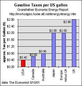 Gasoline Taxes
One last chart, showing comparative gasoline taxes in various nations. As of 2001.
USA gasoline tax is 40 cents per gallon. Here's the breakdown for one state, Florida: federal tax 18.4 cents, state tax 14.3 cents, county tax 7 cents - - total 39.7 cents. Another example: Texas totals 38.4 cents in taxes.
Note European taxation is 5 times the USA rate. (adjusting this chart for the appreciation of the Euro vs. the US dollar up to 2004 the European tax on this chart would be about $2.80, 7 times higher than the US tax. and the UK tax about $3.92, nearly 10 times the US tax rate.)
However, it must be pointed out that government as a share of the economy is also higher in Europe than the USA.
And, Europe and Japan have no oil reserves of their own - - therefore their import ratios are also significantly higher than the USA.
See Government Spending International Comparison Report for long-term comparative trends in government spending ratio of USA vs. OECD nations.
Oil Sands in Canada - some point to so-called oil sand deposits in Canada, believing such can help meet USA oil needs in coming years right next door. The following statement points out oil sands offer nil to no relief (same goes for oil shale in the U.S.):
"The bad news is that oil derived from these oil sands is extremely financially and energetically intensive to extract and thus suffers from a horribly slow extraction rate. Whereas conventional oil has enjoyed a rate of "energy return on energy invested" - "EROEI" for short - of about 30 to 1, the oil sands rate of return hovers around 1.5 to 1. This means that we would have to spend 15 times as much money to generate the same amount of oil from the oil sands as we do from conventional sources of oil. Where to find such a huge amount of capital is largely a moot point because, even with massive improvements in extraction technology, the oil sands in Canada are projected to only produce a paltry 2.2 million barrels per day by 2015. That's not much oil considering we currently need 83.5 million barrels per day, are projected to need 120 million barrels per day by 2020." (see link #43 by Matt Savinar)
Regarding oil shale in the U.S.'s Colorado plateau, geologist Dr. Walter Youngquist points out all attempts to get "oil" out of shale have failed economically and due to the large amounts of water required in a water-short region. One problem is there is no oil in oil shale. It is a material called kerogen. The shale has to be mined, transported, heated to about 900 degrees F, and have hydrogen added to the kerogen to make it flow. The shale pops like popcorn when heated so the resulting volume of shale after the kerogen is taken out is larger than when it was first mined. The disposal problem is large. Oil may be recoverable from shale but the net energy recovered may not equal the energy used to recover it. If oil is "recovered" but at a net energy loss, the operation is a failure. http://egj.lib.uidaho.edu/index.php/egj/article/view/2728/0
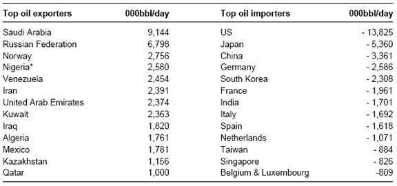 TOP OIL EXPORTERS AND IMORTERS
The left chart shows the top oil exporters vs. the top oil importers for 2005 (all forms of oil).
Source: BP, INGNote the U.S. imports more oil than the next 4 nations combined (Japan, China, Germany, S. Korea).
Note also the U.S. imports 52% more oil than all Saudi Arabia exports.
DATA MANIPULATION GAMES
Game Playing Explained: "The simple reason for the huge reserve 'increase' from 1985 to 1988 is that OPEC countries 'jumped' their reserve estimates in order to get a higher quota, since quotas are established from the reserve numbers. It is funny to see an OGJ report showing Kuwait increasing their reserves by 50% (64 Gb to 90 Gb) end 1984 and Saudi Arabia also jumping by about 50% (170 Gb to 255 Gb) end 1989, whereas the Neutral Zone, owned half by both Kuwait and Saudi Arabia, did not increase at all (staying at 5 Gb) since the two countries could not agree about the timing of the increase."
"As indicated above, the reason for the jump was the kind of cheating between OPEC
countries to get the most quotas by inflating their reserves, base of the computation of
the quotas (as population and population number are also manipulated, even more than
reserves)
By the way the UN estimated in 1990 Nigeria population at 122 millions as because the
fight between the different provinces everyone claimed to be big. The first census in 1991
showed only 88 millions : the estimate was wrong by 30%."
"Another more recent example is the South Pars gas field in Iran, which now reports it has 18 Gb of condensate (it was 6 Gb last time). It is reported discovered in 1991 but everyone knows that it is the extension towards Iran of the North Field in Qatar discovered in 1971, and it was drilled only in 1991 on the Iranian side because the lack of market for gas. I corrected the date of discovery from 1991 to 1971." Jean Laherrère ).
The western world lives in a culture of growth and everyone hopes to see their children having more in the future than they had in the past, but for the first time we are not sure. Everyone would like to see the growth continue without obstruction, and hate to speak about decline.
Politicians promise that growth will solve the present problems on welfare and retirement, and they love to see the growing curve. They purposely do not want tell the public about any data curve which displays a decline. In the interest of working families and their children, politicians MUST fully reveal these truths and uncertainties - - and never evade or 'wish away' bad news, as in the past. They must stop promising 'a free lunch' of ever-expanding economic growth fueled by cheap and ever-plentiful energy. The truth cannot hurt!!!
Certainly all data on the pages of this Energy Report, starting with its home page, unquestionably reveal very serious and most troubling problems regarding energy supply to all nations that do not produce more than they consume. Few can doubt that consumption must slow, and the only effective mechanism for achieving this is that each importing nation should not impose regulations which in any way restrain end user consumer prices.
Globalization Challenge to Energy - - Increased threats to U.S. supply will be caused by increased competition for energy due to more rapid economic development of those nations formerly controlled by the former soviet union - - the first being east European nations affiliating with the European Union, as they consume more energy per capita. The same goes for South East Asian and Latin American nations, Turkey, India, Pakistan and the Balkans, and eventually African nations. China, already the world's third largest consumer of oil, is experiencing significant economic growth by its low cost, high export-driven manufacturing actions, causing it to become a net importer of oil (up 18% in 2002). According to a January 2003 Chinese Academy of Geological Science report, by 2020 China may be importing 70% of its oil (including two-thirds of all oil shipped from the Persian Gulf, according to the Dept. of Energy) and 50% of its natural gas consumption. With land access to oil from Russia and the Middle East, China is rapidly developing its military forces AND collaborating with Russia. The 2nd and 3rd largest industrial nations, Japan and Germany, now import nearly 100% of their needed oil. Together all mentioned nations represent a huge percentage of the world's population claiming their need for increased energy consumption and living standards for their own people.
The U.S., with 5% of the world's population consumes 6 times more oil per capita than the world at large, should take immediate steps to fully deregulate prices. A full, free-market approach must be assured, subject only to monopoly laws. As a part of this, all environmental regulations which hinder supply must be reassessed to assure each is fully justified on both economic impacts as well as environmental ones. Such deregulation will not only slow consumption by causing consumers and businesses to adjust their ways, but will spur alternative energy types.
Not to take said actions promptly can place a nation's economic and national security status in jeopardy regarding current and future generations.
As the French writer (and pilot) Antoine de Saint Exupery wrote : " We do no inherit from our parents, we borrow to our children " Oil reserves are not unlimited and we should be prepared for the decline of oil, and leave the maximum to our children by trying to save energy as much as we can.
Governments must not grasp this energy challenge as an excuse to cause higher prices through taxation (any more than with food) and thereby create unnatural distortions while growing government in general. Limited instead of expansive government, with individual responsibility, was the prime principle of America's very wise founding fathers.
Lastly, we here repeat a statement made earlier in this report: 'We believe OPEC's middle east nations should not be cast as villains, since it's their oil in their lands and they have a perfect right to manage their reserves, pick their markets and maximize revenue just like any business. It's up to large energy-deficit-consuming nations, which are rapidly depleting their own reserves with their insatiable and unsustainable appetites, to be responsible for their own 'dead-in' actions, respect producer rights and not feel entitled to a 'free lunch' from resources owned by others.'
See other comments regarding USA.
.
LINKS section to other information from this Energy Report
Readers of this report are invited to submit suggested corrections
and additions
to Michael Hodges by email
or to Jean Laherrère
THREE PLACES TO GO
GO TO THE LAST
PAGE OF THE ENERGY REPORT
with Conclusions/actions, Links & references, About Authors, California, Alaska, Other
Articles
Or - - To the Table of Contents for listing of sub-sections of this Energy Report and its Link index.
Or - - Return to USA Section
or, Return to the Energy Report Home Page - - or,
RETURN TO THE HOME PAGE OF THE GRANDFATHER ECONOMIC REPORT, to learn about other major trends
facing our young families and children compared to prior periods - -
- - via graphic presentations on: family income, debt, savings, government spending and
size, trust funds, education quality, social security, regulations, taxes, inflation,
productivity, foreign trade and exchange, voter turnout, trust, celebration, national
security, energy, and health care/life expectancy.
The authors of the Grandfather Economic Energy Report, a
chapter of the Grandfather Economic Report, are Michael Hodges (USA) and Jean
Laherrère (FRANCE). Jean Laherrère (jean.laherrere@wanadoo.fr), a retired French
oil and gas explorer and geologist-geophysicist, has published extensively regarding
international energy resource and depletion research.
Michael Hodges (email), a retired business
executive and physicist, has developed extensive research regarding American long term
economic trends as author of the Grandfather
Economic Report. The authors have concerns regarding freedom and economic conditions
facing the generation of their children and grandchildren.
| Grandfather Economic Report series Home & Contents | Summary | Feedback | What's New |