HOME - Florida Report - Florida summary - E-mail author - Grandfather Economic Report - Email
Florida Government Spending Report FLORIDA PRIVATE SECTOR SECTION - a chapter of the Grandfather Economic Reports - |
QUESTION:
|
A dramatic series of color charts will show how the State's private sector has been diminished over time since government at all levels has grown faster than the general economy, thereby eating a larger and larger share. [Note: the following charts are plotted for the 44-year period 1947-91. Although data for 1992 and 1993 is now available, such did not much change the 1991 plot point to justify redoing the charts. State & local data availability always significantly lags federal data, or these charts would be updated to 1995]. |
Government increases its share of the Florida economy causing the Private Sector's share to decline |
A breakdown of the components |
|
|
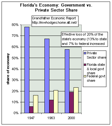
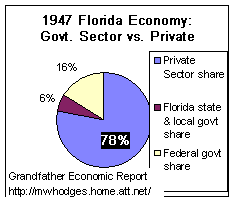
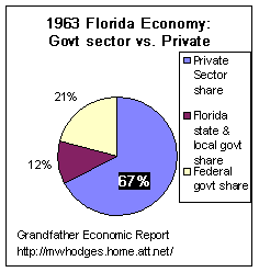
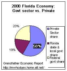
This bar chart shows for each of the three years (1947, 1963, 2000) the share of
Florida's economy represented by federal spending (yellow bar), vs. Florida state &
local spending (brown bar), and the remainder left to the private sector (blue bar) For 1947, state & local spending was 6% of the economy, federal spending (national. average) was 16%, leaving 78% of the economy left to the private sector (blue line) The blue line for the private sector drops each year due to expansion of federal and state & local government spending, faster than growth of the economy. For 2000, state & local spending was 19% of the economy, federal spending (national. average) was 23%, leaving just 58% of the economy left to the private sector (blue line). That's a huge 20 point drop in the private sector's share. |
The above data includes actual state & local spending for Florida from the spending section of this report for 1963-2000, with the 1947 plot being the national state & local government average. The federal spending component of this chart is the national average. It is not known to the author if Florida consumes a higher percentage of total federal spending than the national average. If so, the red line above would be steeper than shown, and the private sector would reach a lower total. |
Showing Florida's Economy as a Pie Chart Three dramatic charts follow. They will show that the state's private sector has been reduced in its share of the economic pie from 78% of the total to a 51% share. This drop is because Florida's state & local spending zoomed from a 6% share of the economy in 1947 to over 20% by 1991 - - a 233% increase in said share. And, drop is also because federal spending share of the economy increased from a 16% share to a 29% share. |
|
|
The chart at the left is the economic pie for 1947, showing the private sector's total
share was 78% of the economy - the blue slice of the pie. It also shows the government sectors control the other 22% of the economy: 1. federal government's share of 16%, and As we progress to the next two charts, note how the private sector's blue slice becomes smaller and smaller - - due to expansion of all government sectors. |
|
This chart is the economic pie for 1963. Here the private sector is 67% of the economic pie, down from its 78% share in the first chart. That's a 11 point drop in share from the above 1947 chart.. Because the Florida state & local government share is 12%, compared to its 6% share in the first chart - - a doubling of its share of the economy And, because the federal spending sector in 1963 is 21%, compared to 16% in the first chart. |
|
This last chart is the economic pie for 2000. Here the blue slice, the private sector's share of the economic pie, has been reduced to 58% - - a drop of an additional 12 points from 1963 chart ). 2000 vs. 1963 shows Florida's state and local government share increased from 12% to 19%, a 58% increase. In this 37 year period, Florida governments dramatically increased their share of the economy . Also shown is the federal government share increased to 23% of the economy From chart 1947 to chart 2000, the private sector's share dropped 20 points, as the state's spending share zoomed upward 13 points for a 216% increase in its share - - and, the federal share jumped 7 points for an 44% increase in share. (note > 2003 federal govt. share now at 26% of the economy, up another 3 points). Interesting that the rate of increase of state & local government growing faster than the economy out-stripped the expansion of the federal share during this period. |
Here's one more look at two of the charts Note how the blue slice shrinks for the private sector |
|
In summary, for the period 1947-2000, the combined government sector increased its share of the economy from 22% to 42% which is a growth rate double the general economic growth, reducing the private sector's share from 78% down to 58%. This effective squeeze does not include the private sector's absorbed costs for mandated government regulatory compliance additions in that period. which always increases with increased government. | |
The larger the government share of an economy, the smaller the relative share for the private sector, and therefore for the capacity of said sector to generate efficient productivity and investment to maximize family income, living standard and savings rate growth - - and job security. | |
REGULATORY COMPLIANCE COST IMPACT In addition to the above decrease in the free-market private sector of Florida due to the combination of federal and state & local government spending at rates faster than growth of the economy - - the private sector's remaining share of the economy is further diminished under the onslaught of increased mandated regulatory compliance costs imposed by both the federal, and state & local government sectors. For an in-depth study, see the Grandfather Regulatory Compliance Cost Report |
(note: some technicians may argue they would not combine GSP with national income for the above chart, in which case the author requests their method and data for this series. The Florida state & local spending data, included in the above charts from 1963-2000, is actual data gathered from the Census Bureau, and the 1947 plot point is the national average that year. The federal component is the national average )
Go to next section, Florida Spending vs. other states
or - RETURN TO Home Page of the Grandfather Florida Government Spending Report