Economic Energy Report's |
Grandfather Economic
Report series
Home & Contents | Summary | Feedback | What's New
Economic Energy Report's |
- First - - a repeat of the quick Start Summary Page, and then the Proof and Pictures -
 ENERGY CHALLENGE, MORE
THAN EVER - -
ENERGY CHALLENGE, MORE
THAN EVER - -
The world oil market daily produces and consumes 76 million barrels.
The United States, with 5% of the world's population, daily consumes 20.7 million barrels (869 million gallons) - - or 25% of world consumption. U.S. consumption is at a record high - -
while U.S. oil production is at a 50-year low and declining, covering just 25% of our consumption needs - - a 75% gap, and reserves are declining,
Causing rising imports from other nations - a record high - - while reserves of prime import sources decline. Additionally, U.S. natural gas reserves are falling and imports rising.
The U.S. is more vulnerable than ever before.
Not a nice bequest to our young generation.
- 7 color pictures tell the story, because a picture is worth a thousand words -
A THREAT
"Our society and civilization are built upon the availability of cheap oil for transportation, for food production, for warmth, for trade and commerce. Approaching must be one of the biggest events in history: the end of cheap, readily available oil. Yet, with the exception of a few responsible oil geologists and scientists, almost no one is talking about this impending catastrophe." Marner, 11/00 (link # 11 below)
U.S. Energy Secretary Spencer Abraham said, "The country is facing the most serious energy shortages since the 1970s. Without a solution the energy crisis will threaten prosperity and national security and change the way Americans live." 3/19/01 (link # 4 below)
This is the USA Page of the Energy Report Home Page - -
Quick Links internal to this USA page > > Summary USA - - Production Oil - - Production Natural Gas - - Reserves - - Production Model - Hubbert - -
Production Projected via Discovery - - Imports Oil - - Inventory Oil - - Import Deficit all Goods - USA - - Energy
Inefficiency - - electricity: coal vs. nuclear - - coal production - - Oil Price - - Author
Comment - the challenge
Page 2 - World page for trends of reserves, production; Page 3 for conclusions/actions, related articles; Table of Contents all sections this Energy Report, incl. link list, about authors; and Energy Report Home Page
 Let's first repeat the USA summary chart - - then 7
pictures for the story
Let's first repeat the USA summary chart - - then 7
pictures for the story
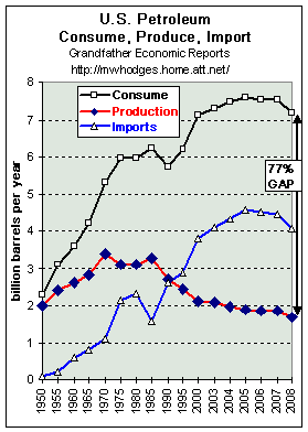
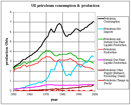
U.S. PETROLEUM OIL
CONSUMPTION - PRODUCTION - IMPORTS
CONSUMPTION - (upper black line) - - UP, UP AND AWAY - - to a record HIGH.
U.S. PRODUCTION - (red line) - DOWN, DOWN - - back to the level of a half-century ago (1950) when there were 150 million fewer people.
IMPORTS FROM ABROAD - (blue line) - UP, UP AND AWAY - - to 4 billion barrels (averaging 11 million barrels per day)
This chart shows U.S. oil consumption (black line) a new record of 7.2 billion barrels per annum (equivalent to an average of 20 million barrels per day).
This chart also shows production (red line) below 2 billion barrels per year, or about 4.6 million barrels per day - - lower than 57 years ago and 41% below 1971 - - covering only 23% of our consumption needs.
The difference between production and consumption is a 77% deficit gap of 5.5 billion barrels per year (15.1 million barrels per day) - - which must be provided by rising imports (blue line) and by drawing down crude oil inventory levels to record lows that trend down. The chart also shows in the past higher prices dramatically reduced consumption (and therefore cut imports), but higher prices did not raise internal production - - reasons covered later. (inventory trends, not shown on chart, covered later).
Look at the chart's black consumption line in the late 1970s and early 1980s. Note the
consumption decline, which was caused by higher consumer prices resulting when OPEC
significantly reduced production levels. This proves lower consumption, by consumer
self-imposed conservation, ONLY results from higher prices. But higher prices
did NOT raise U.S. production, which is indicative of internal constraints such as
inability to rapidly respond to overseas challenges, declining reserves and regulatory
pressure.
It also indicates the influence power of OPEC looking forward may become
significantly greater than in the past, as we will show later. But, we believe OPEC's Middle
East nations should not be cast as 'villains' - - it's their oil and consumers must pay
for their own insatiable and unsustainable appetites as discussed in comments below. Chart by M. Hodges, data by Jean
Laherrère and http://www.economagic.com/em-cgi/data.exe/doeme/ (also see the larger, more comprehensive chart by Jean, then click your
back button.)
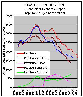 ANOTHER LOOK AT U.S. OIL PRODUCTION -
-
ANOTHER LOOK AT U.S. OIL PRODUCTION -
-
As in the prior chart, the upper red line is U.S.
oil production. While U.S. oil discovery peaked in the 1930s, the red line shows production
peaked in 1971
and today's production is 51% lower - yet U.S. population increased 95 million.
This Oil Production red line is broken down in the chart into 2 components:
a. Production in the lower 48 states (blue line) - - trend
down - - 53% less than 1971
b. Production in Alaska (pink line) - - trend
down. - - 51% less since 1988
Total Oil Production is also broken down into 2 additional components:
1. On-shore Production (brown line) - - trend down -
51% below 1971
2. Off-shore Production (light green line) - -
oscillating trend since 1971
Not shown on the chart are other data showing the declining trend in output per oil well (called oil well productivity) - - down 39% since early 1970s. (This is close to 10 barrels per day (b/d) which is in fact the upper limit of productivity of a stripper wells; it means the majority of US producing wells are stripper wells producing less than 10b/d/w). This could mean that most of the larger more productive wells in the past were pumped out first, leaving smaller, less productive wells to service future production needs.
Oil discovery peaked in the U.S. during the 1930's, and the chart's red line shows production peaked 40 years later in 1971.
As we will show in a later graphic, for the world as a whole discovery peaked in the 1960's while production peaked outside the Middle East in 1997. Middle East production is expected to have peaked by 2005 before production begins to decline.
Chart by M. Hodges, data provided by Jean Laherrère
U.S. PRODUCTION - - Natural Gas - - Consumption vs. Production
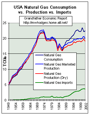 CONSUMPTION (upper black line) - - trend up - faster than PRODUCTION
(red line).
CONSUMPTION (upper black line) - - trend up - faster than PRODUCTION
(red line).
Production is less than 35 years ago, and the trend has flattened despite a doubling of new gas wells in the 1990s (now falling in quantity).
The U.S. is fed more and more by increased imports (green line) - mostly from Canada, which is depleting its easy-to-produce sources. Therefore- - natural gas consumption is above production, causing more imports - - Just like oil!!! Chart by M. Hodges, data provided by Jean Laherrère
Additionally, like oil, price has a dramatic impact on natural gas consumption - - more so than anything else - - as seen by the declining consumption and production curves on this chart from mid-1970s to mid-1980s.
"It is obvious that US and Canada's (Mexico being a gas importer) natural gas production will not be able to meet the forecasted demand for 2010.
BOTTOM LINE
From where does America get natural gas in the future?
Possible answer: first from the Arctic and then from the Middle East,
but lots of LNG facilities and tankers will be needed - - soon!
- - and, its price & security may not be cheap.
AND - - U.S. natural gas independence, longer term, is history !!
RESERVES in the U.S.A. - - Oil & Natural Gas
 OIL RESERVES - - DECLINING (green line)
- down about 42% in 30 years to about 20 billion barrels, while the population increased
70 million.
OIL RESERVES - - DECLINING (green line)
- down about 42% in 30 years to about 20 billion barrels, while the population increased
70 million.
NATURAL GAS RESERVES - - DECLINING (red line) - - down 36%. to about 30 x 6 = 180 trillion cubic feet. (note the red curve for natural gas is in Tcf divided by 6 so it would fit on the chart with oil.. Tcf = trillion cubic feet)
- A dismal picture looking forward.
Comparing Natural Gas reserves remaining of about (30 x 6 = 180 Tcf) shown on the chart with the chart above showing 20 Tcf production per year indicates that if one could get at every single cubic foot US natural gas reserves would be depleted in 9 years.
OIL PRODUCTION MODELS - - USA - actual past production and projections
The next chart shows the model by the most recognized expert (Dr. M. King Hubbert) regarding predicting oil discovery, depletion and production looking forward into the future.
This model shows Oil Production - - for the LOWER 48 STATES - - ACTUAL PAST HISTORY data (green squares), AND PROJECTED future data (green curve for Hubbert curve and dark green curve for the Gauss or " normal " curve), and for ALASKA (blue line).
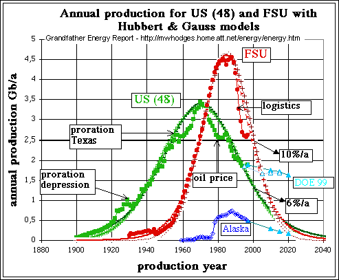 Note declining production actual production for both lines up to the year
2000 - - and declining projections beyond.
Note declining production actual production for both lines up to the year
2000 - - and declining projections beyond.
And, note the original prediction of Dr. Hubbert for the lower 48 states, which is the
black dotted line just under the green.
Also note actual data departs from the model when a drastic political or economical event occurs (depression, high oil price, etc.), but quickly data return towards the curve.
Although we are primarily interested in USA data, the chart also includes a red FSU line for the Former Soviet Union.
It's interesting to note the accuracy of Dr. Hubbert's modeling approach when applied also for the Soviet Union, since actual FSU production has and is following amazingly close to his model predictions (which are the underlying red X's).
Dr.Hubbert's prediction in 1956 that U.S. oil production would peak in about 1970 and decline thereafter was scoffed at then but his analysis has since proved to be remarkably accurate. Note: The late Dr. Hubbert, American geophysicist working at the Shell Oil research laboratory in Houston, developed sophisticated models regarding world oil discovery, depletion and production - - this analyses is an amazing technical achievement.
His well-renown models, which were originally developed for U.S. and World oil as a single cycle, are widely accepted by nearly all serious technical experts in the world - - and can be applied with several cycles to all regions which are producing at full capacity. Countries of the Persian Gulf not producing to full capacity (swing producers) cannot be modeled with such a curve since actual production is not led by geology and physics, but by politics. Above Chart provided by Jean Laherrère
ONE MORE MODEL TO FURTHER CONVINCE YOU OF CONTINUED U.S. OIL PRODUCTION DECLINE
The following graphic is most important.
The black (up and down) lines are data of actual oil discovery, with 30-year forward shift
(discussed below) - - using all currently known discovery data.The
key curve here is the trend line of that data, which represents projected production each year (green trend curve)
calculated by past discovery data
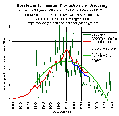 Note that the bell-shape of the curve
predicting oil production is most similar to the above Hubbert curve - - with its production
peak in 1970 - - and declining thereafter.
Note that the bell-shape of the curve
predicting oil production is most similar to the above Hubbert curve - - with its production
peak in 1970 - - and declining thereafter.
This confirms the thrust of the Hubbert model above, while using the latest available information for actual discovery and actual production.
Also shown on the graphic is a data curve for actual oil production (red curve), which you will note has closely followed the green prediction curve - -and data for the portion of actual crude oil only (blue line).
Note regarding this chart: Dr. King Hubbert rightly said that before producing oil you
must find (discover) it and the production pattern follows the discovery pattern. Instead
of using mathematical modeling (such as starting with a bell-shaped curve) it is better to
use the shift between the discovery curve and the production curve. All that is necessary
is to have a real discovery curve (from proved + probable data values at the time of
discovery or at start of production) and to fit discovery data plots to the production
data plots by moving along the time scale up to the best fit. In the case of the lower 48
states the best fit is about 30 years, and the result is the above chart.
Chart data submitted by Jean Laherrère, graphic by Michael Hodges.
THE EVIDENCE FOR CONTINUED DECLINE IN U.S. OIL PRODUCTION IS CONVINCING
- - DANGEROUSLY leading to increasing dependence on imports from other nations
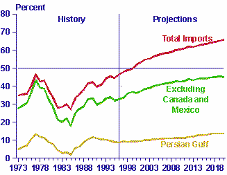
U.S. OIL IMPORT PERCENTAGE TREND - up, up and away.
 Each day the world oil market consumes 76 million
barrels. The United States consumes 20 million barrels per day" (Link # 7) -
Each day the world oil market consumes 76 million
barrels. The United States consumes 20 million barrels per day" (Link # 7) -
- yet U.S. production and reserves are declining, as consumption climbs, as seen above. Huge, rising import ratios make up the difference.
The left chart (DOE 1998 report) shows the rising import ratio - - with a projection forward that understates actual fact as known today.
The first chart on this page shows the U.S. now has a consumption vs. production gap of 74% (in 2004)- - the highest ever - - and well above DOE's 1998 projection here.
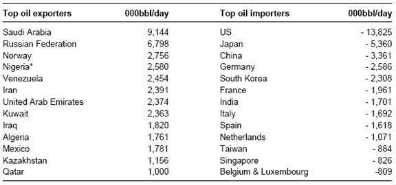
In 2005 the U.S. imported approximately 4.5 billion barrels (averaging 12.3 million barrels per day). Considering all forms of oil, the U.S. imported more oil than the next 4 nations combined (Japan, China, Germany, S. Korea). Additionally, the U.S. imported 52% more oil than all Saudi Arabia exports. (data graphic)
Top six sources of U.S. oil imports > 80% of U.S. oil imports (in 2008) were supplied by 6 countries (Canada 21%, Saudi Arabia 15%, Mexico 16%, Venezuela 11%, Nigeria 12% and Iraq 5%). 4 of these 6 nations representing 43% of imports (Saudi Arabia, Venezeula, Nigeria and Iraq), cannot be considered reliable energy supplers - - and, Mexico's ability to supply may end within 6 years (2014). http://www.eia.doe.gov/pub/oil_gas/petroleum/data_publications/company_level_imports/current/import.html
Technical data (as separate from political data) shows reserves for Canada and Mexico are declining - - with Canada's reported reserves (now about 5 billion barrels) down 40% since mid-1970s - - according to Jean Laherrère, "For me, American reports on Canada (as for the rest of the world) are political (or rather for Canada financial to follow the SEC rules) proved data quite different from technical " mean " (proven plus probable) data."
And Mexico's corrected reserves (now about 28 billion barrels) are down 26% since 1980. (for natural gas, as reported above, their gas exports to the U.S. in 2000 dropped near zero). However, as the graphic shows, excluding Canada and Mexico the U.S. is experiencing a growing import-dependence outside North America. Some looking at Mexico's '05, '06, '07 data state they're basically on track to approach zero net oil exports no later than 2014, thereafter becoming an importer instead of an exporter of oil. No replacement for this loss of supply to the U.S. is known.
Whereas the US imports over half of its needed oil, industrialized countries such as Japan and Germany have import dependency levels of 90-100 percent.'(DOE basics - Link #16). Therefore, they represent major competitors to US imports - - and the squeeze is on.
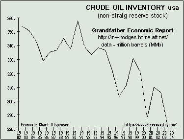
U.S. Crude Oil Inventories
- - - at record low and trending down - - a sign of vulnerability
The following chart shows crude oil inventory levels 1982 to 2004 (excluding stocks in the strategic petroleum reserve) - plunging to record low levels - - during a period when the U.S. population increased by 60 million and SUVs became popular as U.S. oil production fell.
Oil inventories are like a family's savings account - - when you consume it you have less buffer to meet the future. That's what is happening with oil. Declining oil inventories are a sign of weakness especially when you depend on imports This leads to more potential price and supply volatility in the market, and more vulnerability-dependence to foreign suppliers of imports.
Political dangers > We recall Winter 2000, during the peak of a presidential election, the federal government dipped into its minuscule strategic oil inventory reserves SPR) for consumer heating oil - - a desperate and dangerous act undertaken for obvious political purposes - - sending false signals to consumers that government has the capacity to 'bail them out' - and a dangerous false signal implying the SPR contains enough oil to solve all US oil shortages and price increases Such also is a national security threat. (chart link #26). Thankfully, this 'dangerous game' was not played again in the 2004 election season.
Considering U.S. declining production of oil due to depletion of reserves, and increased reliance on foreign imports, it is clear the U.S. private sector needs to carry higher (not lower) crude inventories - - and consumer prices should reflect that need. (local utility regulators may not be doing the real job they need to do, which is to help assure supply-demand balances). Over-zealously hampering free market capacity to react threatens all). Its one thing to consider a national energy policy regarding crude oil sources but one thing can be done for sure - - have a national oil inventory policy, in addition to the strategic reserve which should be held for national security needs.
Risk and cost transfer to government > It appears in more recent years the private energy (oil) sector has been fostering off more and more of its own prior inventory responsibility and cost to the federal government (to the strategic pertroleom reserve), thereby creating soaring, record private sector oil firm profits as the government books record deficits. Just another example of corporations more and more transferring their costs/risks to government, such as banks transfering nearly all mortgage risks to government sponsored enterprises (Fannie Mae) and insurance companies transfering their costs of coastal flooding and wind storms to federal (FEMA) and state governments.
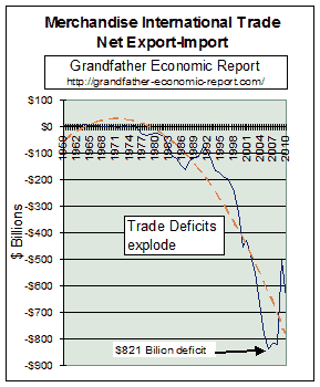
| NOW TO A BIG PICTURE - - AMERICA CANNOT AFFORD SOARING OIL IMPORTS - - AT LEAST NOT FOR LONG.
The next two graphics are from the Grandfather International Trade Report. Like many scary trend pictures in that report, this one shows exploding trade
deficits of ALL goods - - That trade report graphically proves that the sum of all merchandise imports plus all exports now represents approximately 23% of the entire nation's economy, as measured by national income - - - - where U.S. imports represent 15% of the economy and are soaring - - while exports, at less than 8% of the economy, stagnated in the past 20+ years. America, already the world's largest international debtor, explodes trade deficits to a new record of $815 billion in 2007. |
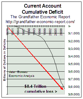 This chart shows the exploding $6.8 trillion cumulative deficit in America's 'Current Account' with the rest of the world, representing the net of trade in goods and services, as well as investment flows. This chart captures it all. A very, very scary picture - - the size and the trend. This imbalance has been driven by record-high ratios of domestic debt creation by the household, business and financial sectors - - and a shrinking manufacturing base (including declining oil production). America's economy is more debt-dependent than ever before. Let's also recognize that services and technology sectors need more, not less energy - - and data shows their demand for energy exceeds that released by declining manufacturing. Shopping malls, healthcare, airlines, SUV vans, computers and the internet do not run on air - - and America's population is growing.. Most astute economists and the new National Trade Deficit Commission confirm this trade imbalance is dangerous and cannot be sustained. It must be firmly stated that the USA's massive record trade deficits for all goods must be brought into balance - - or this may threaten the international buying power of the U.S. dollar to pay for its accelerating need for foreign energy imports. With that bigger picture in mind, let's now get back to our subject - - ENERGY |
America has become less energy efficient -
According to the May 2001 Bush energy council report - - between 1991-2000 America consumed 17% more energy (sum all types) yet domestic production increased only 2.3% - - mostly due to rising coal and nuclear production partly offsetting declining oil production - - and in the next 20 years consumption is expected to increase another 32%. Let's look at recent energy consumption efficiency: Here's some population data: In the 1980s population increased 9.8 %, or 22.4 million (a 10-year increase from 227,726,000 in 1980 to 250,132,000 in 1990). In the 1990s population increased a faster 12.9%, or 32.3 million (a 10-year increase to 282,434,000).
Taken together, these statistics show in the 1990s America consumed more energy per capita than before > 12.9% faster population growth consumed 17% faster energy growth - -
- - This means the nation was less energy efficient during the last 10 years than the prior decade - - despite so-called greater auto fuel efficiency, a declining manufacturing base and importing more goods than ever before which were produced by energy in other nations - - also bringing into question America's exploding illegal immigrant situation.
One could make the argument that as the US becomes more and more a service (non-manufacturing) economy, and imports more and more consumer and other goods, it is becoming less energy efficient, instead of more efficient - - indicating expanding inefficiency.
 ELECTRICITY GENERATION
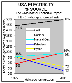
Coal and nuclear provide USA electric self-sufficiency
Although graphics above show America has lost its independence regarding oil (transportation-related and food production uses) and natural gas, this chart shows America is 76% self-sufficient regarding electricity generation from coal, nuclear and hydra power fuels produced on its own lands.
Coal (black line) is the prime generator of electricity covering 50% of total electricity needs (up from a 44% share in 1975) - and nuclear (red line) is No. 2, at 19% (up from 9% share in 1975) - - together generating 69% of America's electricity (compared to 53% in 1975). Both have increased their share as the chart shows.
Natural gas (light blue line) slightly increased its share to 19% of total generation from 16%. Hydro power generates 11% less than 30 years ago, with its share down to 7% from 16% in 1975. Petroleoum generated 61% less electicity than 30 years ago, bringing its share (blue) to 3% from 16%. (not shown are negligible contributions from wind, solar and photo-voltaic).
Nuclear has been out of 'popular favor' since the Three Mile Island accident in 1979, although lucky for America that this chart shows its increase from 9% of electricity generation 30 years ago to a 19% electricity share today. Perhaps this 'shackle of the past' should be taken off, due to nuclear production and safety records in recent years and since it represents domestic-based production for electricity free of foreign dependence.
Despite no new nuclear plants built in the United States in the last two decades with none on the drawing board (due to anti-nuclear protest and waste disposal pressures), nuclear generated electric power production has increased steadily 1973 to the 1990s due to increased efficiencies, but its growth rate is slowing without new facility additions. Today there are about 103 operating nuclear power plants in America.
Considering the huge energy supply challenge facing America for oil and natural gas, nuclear should be reconsidered for prioritized expanded service for electricity generation, cooking, hot water and heating - - to reduce pressure on declining and threatened oil and natural gas reserves (which depend more and more on foreign supply) - - using a hard-nosed, non-political approach only based on hard technical and national security data. De-regulating ALL consumer prices for declining reserve and import-dependent oil and natural gas should make new home-produced nuclear and clean coal facilities more interesting to private investors.
Other nations: It is reported France produces 80% of its electricity from nuclear power (it has nil coal) and is an exporter of electricity, while Germany generates 33% of its electricity from nuclear (although Germany is under activist environmentalist-political pressure to shut all down). Switzerland's nuclear power plants produce 38% of national electricity generation in 2006.
Therefore, the US nuclear/electricity ratio of just 19% nuclear is low in comparison to others, and maybe should take on more of today's 19% natural gas share of electricity generation - - especially imported gas.
(Uranium reserves: Canada has the largest reserves and is the major world producer; 38 percent of the world's accessible uranium reserves are in Australia; Russia at 15%).
This leads us to look at coal production in the next chart, and coal reserves - - a very important fuel.
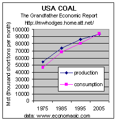 Coal, it is said, is less energy-efficient than oil & natural gas,
but the USA has plenty of coal.
Coal, it is said, is less energy-efficient than oil & natural gas,
but the USA has plenty of coal.
Coal supplies 50% of electricity generated as shown in the chart above - up from
44% share in 1975.
Whereas Saudi Arabia has more than 20 percent of the world's oil reserves, the United States has more than 25 percent of the world's recoverable coal reserves - approximately 270 billion tons. Russia comes in a distant second with 176 billion tons; China has 126 billion tons, and Europe has a paltry 36 billion tons.
The Coal chart at left shows - Production trend is up for all uses of coal - -
2005 was 71% over 1975 (compared to 37% population increase)..
USA produces 28% of world coal production and consumes 26% of world consumption
USA has 25% of world's coal reserves, equal to 249 years (BP data) at current
production rates (double the reserves of Europe which has declining production, and about
same reserve size as former soviet union) (data source:
http://www.bp.com/centres/energy/world_stat_rev).
The USA has more coal reserves than any nation on earth (up to 250 years of reserves at today's production rates), while the Middle East has the most oil & natural gas reserves. It would seem stupid for any national security and energy policy not to recognize and capitalize on this fact.
Although America may need higher coal production rates to make up future projected short fall of oil and natural gas plus flat nuclear output to support electricity needs, The Wall Street Journal (5/10/01) reported 'there is a shortage of miners willing to work following huge coal industry layoffs in the past 30 years due to environmental pressures for cleaner rivals like natural gas and nuclear power' - - and from declining manufacturing - - suggesting much higher coal prices in the future.
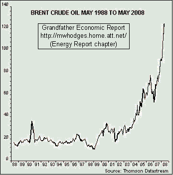 PRICE OF CRUDE OIL - U.S.
The left chart shows 20-year data for the price (in dollars) of a barrel of crude oil.
Note the first 10 years (until 1999) prices remained in a tight $16-20 per barrel range. Thereafter prices soared, reaching a 6x increase to $127 per barrel in mid May 2008.
Following are reasons given for this price surge >
1. It is said the oil price is soaring not only because output has fallen in the US (since 1970) but more recently now falling in many other nations
such as Mexico, the North Sea, some OPEC nations, and Russia - - some claiming 'Peak Oil'
has arrived.
2. It is also said that Chinese demand growth is roaring at 400,000 bpd each year.
3. Others blame the war in Iraq (starting in 2003) and/or due to explosive negative USA trade imbalances since 1998, followed
by the declining international
value of the U.S. dollar.
4. And, many think increased supply from Saudi Arabia would reduce prices - - that is,
provided that nation has the spare capacity AND is willing to supply same.
In May 2008, Chris Skrebowski, Editor of Petroleum Review, said the awful
truth is that Saudi Arabia cannot raise oil output much even if it tries. (http://www.telegraph.co.uk/money/main.jhtml?xml=/money/2008/05/15/bcnoil115.xml)
"The myth of Saudi spare capacity is convenient for everybody: it gives OPEC
leverage, and it gives the West hope. But Saudi reserves are secret. They have never been
verified," he said.
It is the view of this Energy Report author (Michael Hodges) that each of the above four (4) items has contributed to this unprecedented price surge.
Additionally, it is also possible some in OPEC are marking supply such as to increase revenue received via higher prices as a counter to stated U.S. policy to reduce that nation's dependence on imported oil by 75%. Perhaps they either believe such action will provide leverage to cause the U.S. to continue high levels of imports or, failing that, to get as much revenue in as long as possible. Time will show, but meanwhile soaring prices are impacting nearly every nation on earth regarding energy and food costs - and, geopolitical challenges/frictions have dramatically increased.
SUMMATION of all the above:
THE CHALLENGE IS REAL - - AND MOST IMPORTANT
Author comment - the challenge

Let's not follow 'ostrich policy on energy'
The
supply disruptions of the 1970s cost the U.S. economy between $2.3 Trillion and $2.5
Trillion. Today, such an event could carry a price tag as high as $8 Trillion
– a figure equal to 62.5 percent of our annual GDP or nearly $27,000 for every man,
woman and child living in America. But there is more cause for concern over such
an event than just the economic toll. A supply disruption of significant magnitude, such
as would occur should Saudi supplies be interdicted, would also dramatically undermine the
nation’s ability to defend itself. Oil has long been a vital military commodity, but
today has taken on even more critical importance. Several examples illustrate this point:
• A contemporary U.S. Army Heavy Division uses more than twice as much oil on
a daily basis as an entire World War II field army.
• The roughly 582,000 troops dispatched to the Persian Gulf used more than twice as
much oil on a daily basis as the entire 2-million man Allied Expeditionary Force that
liberated Europe in World War II.
• In Operation Iraqi Freedom, the oil requirement for our armed forces was 20 percent
higher than in the first Gulf War, Operation Desert Storm, and now amount to one barrel of
refined petroleum products per day for each deployed service member. Moreover, the
military’s oil requirements will be even higher in the future. Therefore, a shortage
of global oil supplies not only holds the potential to devastate our economy, but could
hamstring our armed forces as well.
THE HIDDEN COST OF IMPORTED OIL While it is broadly acknowledged that our undue dependence on imported oil would pose a threat to the nation’s economic and military security in the event of a supply disruption, less well understood is the enormous economic toll that dependence takes on a daily basis. Studies conclude that the "hidden cost" of imported oil totaled $779.5 billion in 2005. Thus, the "real" price of a gallon of gasoline refined from Persian Gulf oil is $10.86. At these prices the "real" cost of filling up a family sedan is $217.20, and filling up a large SUV $325.80."
THE DANGER FROM DEPENDING ON OIL IMPORTS IS CLEAR
- and, THE USA MUST TAKE ACTION TO ELIMINATE THAT DEPENDENCE
THE ABOVE COMPLETES THE USA ENERGY SECTION OF THIS ENERGY REPORT
for other information from this Energy Report
see the LINKS section (this link takes you to the listing of key energy-related links)
NEXT
GO TO PAGE 2 OF THIS REPORT - -
a very important section - - called,
WORLD OIL
& GAS - - RESERVES & PRODUCTION
- - with picture trend graphics including reserves of the Persian Gulf region vs. rest of
the world.
Or - - To Page
3 of this Energy Report - - for Conclusions/actions, About the Authors and why
this report, articles on California & Alaska and by others.
Or - - To the Table
of Contents for listing of all sub-sections and graphics of this Energy Report
OR - - Return to the Energy
Report Home page - - with its short summary and summary graphic
OR - - RETURN TO THE HOME PAGE OF THE GRANDFATHER ECONOMIC REPORT, to learn
about other major trends facing our young families and children compared to prior
periods - -
- - via graphic presentations on: family income, debt, savings, government spending and
size, trust funds, education quality, social security, regulations, taxes, inflation,
productivity, foreign trade and exchange, voter turnout, trust, celebration, national
security, energy, and health care/life expectancy.
The authors of the Grandfather Economic Energy Report, a
chapter of the Grandfather Economic Report, are Michael Hodges (USA) and Jean
Laherrère (FRANCE) - - all rights reserved. Jean Laherrère (jean.laherrere@wanadoo.fr), a retired French
oil and gas explorer and geologist-geophysicist, has published extensively regarding
international energy resource and depletion research.
Michael Hodges ( email ), a retired business
executive and physicist, has developed extensive research regarding American long term
economic trends as author of the Grandfather
Economic Report. The authors have concerns regarding freedom and economic conditions
facing the generation of their children and grandchildren.
Copyright © 2004-2010 Michael W. Hodges. The Grandfather Economic Report series is the intellectual property of its author; all rights reserved under Copyright Conventions. Permission to redistribute all or part of this series for non commercial purposes is granted by the author, provided the associated web page address is included and full credit given to the Grandfather Economic Report and the author, Michael Hodges. Notice appreciated via email.
Grandfather Economic Report series | Home & Contents | Summary | Feedback | What's New |