 IDENTIFYING THE PRIME DEBT-GROWTH CULPRITS - a most sobering
and scary picture
IDENTIFYING THE PRIME DEBT-GROWTH CULPRITS - a most sobering
and scary picture | Home & Contents | Summary | Feedback | What's New | Link Index | Eye-opener | Must See |
America's Total Debt Report - page 2$ 57 Trillion - - and soaring- household, business, financial and government sectors -by Michael Hodges - email |
This is the 2nd and last page of the chapter called 'America's Total Debt Report', which includes the sum of all government debt and that of the household, business and domestic financial sectors.
IDENTIFYING THE PRIME DEBT-GROWTH CULPRITS - a most sobering
and scary picture The 3 Prime Debt Culprits are: Federal Government - Financial sector -
Household sector
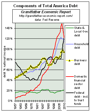
Here, again from the prior page, is the graphic showing the 5 major components of Total Debt.
Below we will explore a few more graphics, showing the three debt components with the most serious growth - each having increased many times faster than general growth of the economy.
FEDERAL GOVERNMENT DEBT (the black line)
FINANCIAL SECTOR DEBT (the red line)
HOUSEHOLD DEBT (the blue line)
BUSINESS DEBT (the yellow line)
STATE & LOCAL GOVERNMENT DEBT (the
green line)
a Mental Exercise >What is a Billion? What is a Trillion?
FEDERAL GOVERNMENT DEBT |
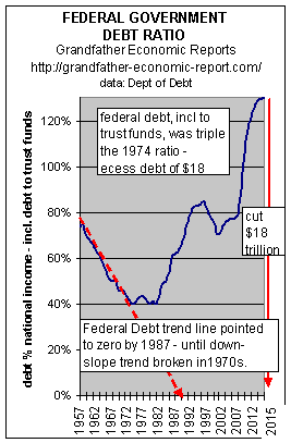 This chart shows the trend of federal government debt (Dept. of Debt
data), as a percent of national income. This chart shows the trend of federal government debt (Dept. of Debt
data), as a percent of national income. Note the left part of the chart shows that the debt ratio was heading down from 1957 to 1974. Had that trend continued, the red dash-line shows there should have been zero debt by about 1987. But, the slope of the downward trend slowed in the late 1960's, and by 1974 ceased to drop - - oscillated for 10 years - - and then rocketed upward to a historic peace-time record high in 1996. The reason for the declining debt ratio to stop falling is quite clear. It was due to the fact social spending was climbing many times faster than the economy - as seen in the Grandfather Federal Government Spending Report. Note the right edge of the chart - - the downward pointing red arrow. That means if today's debt ratio had been 40% (as it was in 1966-84) of national income, instead of today's actual 120% ratio (3 times higher) - - today's debt would be a whopping $9.4 Trillion (67%) less than is the case. It may be worth noting, much of that excess was money siphoned out of the various trust funds (such as from Social Security), and spent on non-pension activities - - without even accounting for this in the budget deficit calculations. As the federal government siphoned off all trust fund surpluses, it left behind non-marketable (worthless) IOUs - - that not even the Federal Reserve counts as market debt - but, the Treasury Dept. properly records it. And, the federal government does not even pay cash interest on that 'borrowing' - it just sends over a few more worthless IOUs. All this makes the social security trust fund more vulnerable to disaster - - as the demographic bulge of the baby boom looms very near. The balanced budget plan does not include additional siphoning off of incoming trust fund surpluses, nor does it budget to repay that already siphoned-off. Complete discussion of this is in the Grandfather Trust Fund Report and its companion report with charts. How often it is heard from politicians that all debt was created in the 1980s. The facts are that half all debt dollars were created in the 1990s - - and, the 1990s (as seen in the chart) have not only rising debt ratio but the highest seen in peace-time - - despite receiving revenue from the 2 largest tax increases in U.S. history. If politicians want to wrongly camouflage the situation and blame it on the 1980s (which is a falsehood), then they should be willing to reduce today's debt back to the ratios prior to the 1980s - - say the ratios in the mid-1970s. As seen at the right edge of the chart, the red downward arrow shows all they have to do is to budget spending reductions totaling $6.2 Trillion - - which is more than TWICE the entire federal budget. That's how far we have come.
NOTE: For full details of federal government debt, with graphics, including interest and debt owed foreigners - |
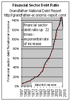 The above charts
revealed the exponential growth of domestic Financial Sector debt. Let's look closer at
that component.
The above charts
revealed the exponential growth of domestic Financial Sector debt. Let's look closer at
that component.
This chart is a blow-up of the trends of the domestic Financial Sector's $17.2 trillion of debt shown as a ratio to national income ratio - which, as can be seen by the red-dash line, are growing exponentially upward.
From 1957 to today, the financial sector debt ratio increased 27 times faster than the economy has grown, including inflation. From 5.6% of the economy's national income in 1957, to a 151% debt ratio today.
It could be said from this chart that the economy is 27 times more sensitive to Financial sector debt than ever before - - indicating a growing danger of total economic instability. Since 1954 this sector's debt soared 828 times while the economy's national income increased only 31 times.
Much of this explosion was due to exploding government supported enterprises, such as Fannie Mae, Freddie Mac, etc. (see below).
The upward zoom is unbelievable - and worse > it is exponentially upward.
It would appear there is no way this trend is sustainable - - suggesting a major upheaval of some type in the near future. This is said with 'tongue in cheek.'
 The author is
most concerned with this financial sector debt picture, although I do not fully understand
its full makeup and ramifications (see comments below).
The author is
most concerned with this financial sector debt picture, although I do not fully understand
its full makeup and ramifications (see comments below).
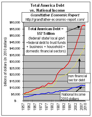
But to place this sector in perspective - - Left is a chart showing the main master chart of this chapter for total debt (red line) vs. national income (blue line), that also adds a yellow line to denote the portion of total debt that excludes domestic financial sector debt. The area between the red and yellow lines represents domestic financial sector debt, per federal reserve data.
Although some domestic financial sector debt may also be included in other debt categories, such as repackaging of mortgages (via Fannie Mae), business receivables, etc., most also agree the business debt category understates its own debt, as evidenced by off-balance sheet debts of the likes of Enron, WorldCom, CitiCorp., etc.- - as areas of hidden debt still coming to light and much of that deeply involves the domestic financial sector and is not on business corporate books as it should be.
For example: Numerous areas of 'hidden' debt continually come to light - such the debt-freezing of markets in 2007-09. The Wall Street Journal reported on 7 Sept. 2007: "Though few investors realize it, banks such as Citigroup Inc. could find themselves burdened by affiliated investment vehicles that issue tens of billions of dollars in short-term debt known as commercial paper. The investment vehicles, known as ‘conduits’ and SIVs, are designed to operate separately from the banks and off their balance sheets. One Citigroup SIV is Centauri Corp., which had $21 billion in outstanding debt as of February 2007, according to a Citigroup research report. There is no mention of Centauri in its 2006 annual filing with the Securities and Exchange Commission." On 5 Sept. 2007 the Financial Times reported: “The dislocation in interbank lending stems not just from distrust of rivals' balance sheets. Banks also have doubts about their own." Bloomberg reported: "Regulators are unable to quantify losses from collateralized debt obligations."
Additionally, the explosion of household debt category does not include increased ratio of auto leases, although such is a form of debt.
Up to and including 1998 the Federal Reserve included the 'domestic financial sector debt' in their totals - - since then, they dropped this from their totals. Why they included that sector before in their totals but then changed, is unknown to me, but I continue to keep data methodology for total debt and said trends consistent with the past practices - - less one distorts trends. Therefore, trends of financial sector debt must be included in determining Total Debt (red line on chart), using Federal Reserve data.
The author requests input from those with more knowledge of this sector regarding above comments.
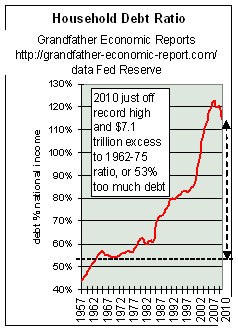
HOUSEHOLD DEBT - soaring to new records - - are many at risk from home equity loans for consumption?Household debt was $13.4 Trillion in 2010, up $7 Trillion over 2000. |
 The left chart shows the trend of household debt
as a share of national income from 1963-today. The left chart shows the trend of household debt
as a share of national income from 1963-today. Note the left side of the chart - - showing the household debt ratio in the 1960s and early 1970s held steady at about 53% of national income - which means household debt was not growing faster than growth of the total economy. We recall from Family Income Report charts that prior to 1970 family incomes were rising year after year - but thereafter (debt ratios started zooming upward per this chart) and then family incomes adjusted for inflation ceased to grow, and instead stagnated for the following 30+ years. Soon after, personal savings peaked and started down. This chart such suggests real equity & savings have not been the driving force of so-called economic growth - - it has been debt driven. The left chart shows thereafter the debt ratio then exploded like a rocket - to today's historic record high debt ratios at 115% of national income (or $13.4 trillion total household debt - a debt increase of 100% since 2000). If today's debt ratio (115% of net national income per this chart) had been the same as in the earlier years on this chart, the chart's curve would be horizontal instead of soaring upwards, and then today's debt in dollars would have been $8.3 Trillion less than it was in 2010. In other words, 2010 household debt would have been $5 Trillion - - not the $13.4 Trillion that did occur. This shows that the economy is more leveraged by household debt than ever before. And, households are even more at the mercy of credit and mortgage rates. |
The next chart records the trend of inflation-adjusted household debt per man, woman and child (in constant 2005 dollars).
Today's level of household debt of $13.8 trillion, up 1 trillion over the prior
year, is equivalent to $46,115 per person - a new record.
Equivalent to $184,460 per family of 4.
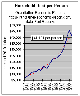 Note the chart's upward slope has become steeper
and steeper during the past 15 years. This chart shows household debt per person, adjusted
for inflation, has increased over 500%.
Note the chart's upward slope has become steeper
and steeper during the past 15 years. This chart shows household debt per person, adjusted
for inflation, has increased over 500%.
Other data shows that the move some years ago to home equity loans to cover consumer consumption on credit may be one of the driving forces of this debt explosion - - whereas prior to that time perhaps the higher interest rates of credit cards more restrained household debt expansion than has home equity loans. This suggests that there may be a nation-wide erosion of household equity in homes.
Other data also shows record family debt payments, as a percentage of disposable income. And - personal savings are the lowest in history. And - home equity lowest in history.
The long-term impact on family incomes, shown in graphic form, is in the Family Income Report.
"The U.S. financial system is dependent to an unprecedented degree upon the greatest
housing-real estate bubble in human history, led by Fannie Mae. Unless corrective measures
are taken, the inevitable collapse and the ensuing devastation will destroy millions of
families."- by Richard Freeman - www.larouchepub.com/other/2002/2924fannie_mae.html
Even students are learning how to go into debt up to their necks. The federal General Accounting Office, according to AP's Martha Irvin in January 2002, says college students are graduating with an average of $19,400 in student loans. Additionally, average student credit card debt rose 46% from 1998 to 2000, according to the student loan agency Nellie Mae. Meanwhile, universities promote credit cards issued by agencies who kick-back to them.
Auto loans > In addition to soaring home equity mortgages which consume owner stakes in their homes, according to USA Today (2/16/04) the average automobile loan today is for 63 months, with some going as high as 80 months, compared with an average of less than 48 months five years ago - - and about 24 months in the 1950s. In 1997, banks financed an average 89% of a new vehicle's price. Last year, it was 101% since consumers borrowed to cover the amount they were upside down on their trade-in. And get this…40% of all trade-ins involve upside-down car loans. (this author recalls when he entered the workforce in the late 1950s normal down payment was on-third cash for a car, with 18 month financing for the balance. Quite a contrast to current times.)
Credit Cards > A massive 42% of Americans are making just minimum payments or no payments on their credit card balances, according to the Cambridge Consumer Credit Index in March 2004. Of those respondents surveyed with revolving balances on their credit cards, 39% made only the minimum payment due and 3% made no payments at all last month. Another 39% paid less than half the balance owed but more than the minimum, while 19% paid more than half their balances.
 BUSINESS DEBT - - SOARING
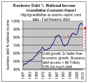
The left chart shows the trend of corporate business debt ratio to national income.
The debt ratio has doubled, from 44% in 1957 to 96% of national income last year.
This means businesses needed more debt per dollar produced than ever before - - more than twice as much.
Consider this > if business debt productivity had remained constant (same ratio) then the black line would be horizontal, not pointing up. If business debt had been more efficient then the black line would be pointing down - - not pointing up. Where is so called business productivity when more debt than before is needed to produce a dollar of national income?
2010 business debt totaled $11.1 trillion. That's $6 trillion more than it should have been had business operated at prior debt ratios and at flat business debt productivity. Had business operated with true increased productivity and efficiency, then this debt ratio would have been falling - - instead of soaring upward. So much for 'productivity'.
Many corporations have been going to the bond market to raise money for the sole purpose of stock buybacks. Imagine going in debt to buy back shares of stocks, having zilch to do with enhancing a firm's future regarding product development and productivity. Increasing debt to buy paper (stocks) instead of reducing debt cannot make a firm stronger. Of course, the reason has to do with executive compensation now, not a firm's future.
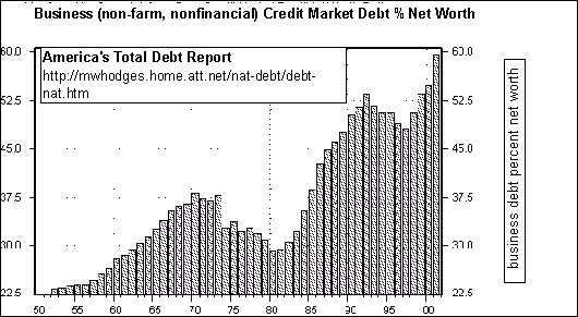
Business Debt to Net Worth soaring >
The left chart shows the trend of business (non farm, non financial) debt as a percentage of business net worth - - another way of looking at business debt.
 Note from
the chart > > the ratio of business debt to net worth tripled - - from 22% of
equity to near 60%, soaring three times higher, to a post war record high as of this
chart's 2002 data point.
Note from
the chart > > the ratio of business debt to net worth tripled - - from 22% of
equity to near 60%, soaring three times higher, to a post war record high as of this
chart's 2002 data point.
At the top of this page is a chart showing the debt ratio to national income trends of various component sectors. It shows business sector debt to national income, doubling its ratio from about 40% of national income in 1957 to over 86% of national income in 2006, a new record high..
Not only is that doubling of the debt to national income ratio scary enough, but the left chart is even more scary since it shows debt growing significantly faster than net worth. The data source for the left graphic is Paul L. Kasriel, Director of Economic Research, Northern Trust, March 2002, www.northerntrust.com/library/econ_research/daily/us/020327.html
Largest borrowers > 'Ford and General Motors are the No. 1 and No. 3 corporate borrowers in the U.S., according to Lehman Brothers Holdings Inc.'s Credit Index.March 2004 General Electric Capital Corp., the captive financial unit of Fairfield, Connecticut-based General Electric Co., is No. 2. GMAC, in addition to financing auto sales is also lending money, writing mortgages and selling securities. If GMAC were an independent company, it would be the eighth- largest U.S. bank. Ford Motor Credit Co., GMAC's counterpart at Ford Motor Co., would be the 10th-largest U.S. bank if it were an independent company. The loans maintained by GMAC and Ford Motor Credit are relatively unprofitable. In the first nine months of 2003, GMAC's automotive lending unit generated a return on managed assets of 0.75 percent and Ford Motor Credit's auto lending unit generated a return of 0.77 percent. Moody's rates General Motors and Ford debt at Baa1, three ranks above junk. Meanwhile, Toyota Motor Credit has a AAA rating from S&P.' 4/23/2004 Bloomberg http://quote.bloomberg.com/apps/news?pid=nifea&&sid=a6tB6.NTMKBk
AND - BUSINESS CREDITWORTHINESS PLUMMETS - JUNK STATUS FOR 49% OF COMPANIES
U.S. corporate credit quality has been on a 25-year decline toward junk status, with almost half of all companies now rated below investment grade, Standard & Poor's said on November 2, 2006. As of September 2006, junk, or speculative-rated issuers, defined as those rated "BB-plus" or below, stood at a record high of 49 percent, up from 28 percent in 1992, S&P said. Downgrades and mergers have taken an even higher toll on U.S. non-financial, or industrial companies, with 61 percent carrying junk ratings. While U.S. junk ratings climbed, the number of top "AAA" ratings dropped. Given the present ratings mix, the default rate could exceed 15 percent, the highest since the Great Depression, if the economy goes into a recession, according to Martin Fridson, publisher of independent research service Leverage World - Nov. 2006. http://today.reuters.com/news/articleinvesting.aspx?type=bondsNews&storyID=2006-11-02T220857Z_01_N02197166_RTRIDST_0_ECONOMY-DOWNGRADES-SANDP.XML
"Hundreds of US companies keep trillions of dollars in debt in off-balance-sheet subsidiaries and partnerships, skirting the consolidation rules of Financial Accounting Standards Board (www.fasb.org/) FASB 94, FASB 125 and FASB 140." Nov. 2007 - 'Off-balance-sheet debt' by Henry CK Liu, http://www.atimes.com/atimes/Global_Economy/IL01Dj02.html
"Foreign interests have more control over the US economy than Americans, leaving the country in a state that is financially imprudent. More and more of our debt is held by foreign countries – some of which are our allies and some are not. The huge holdings of American government debt by countries such as China and Saudi Arabia could leave a powerful financial weapon in the hands of countries that may be hostile to US corporate and diplomatic interests.” David Walker, the US comptroller general. 23 July 2007. http://business.timesonline.co.uk/tol/business/markets/united_states/article2120735.ece
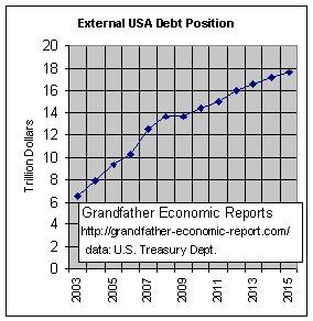 EXTERNAL
U.S. DEBT
EXTERNAL
U.S. DEBTLeft is a data graphic of External U.S. Debt, meaning sum total all debt owed to foreign entities.
From $6.4 trillion of external debt in 2003 to $14.4 trillion in 2010 - over 125% increase in just 7 years of $8 trillion.
Here's a break-down of that $14 Trillion external debt owed at end fiscal
year 2010 >
1. Government
$4.3
Trillion
2. Banks
2.8 Trillion
3. Monetary authorities
$0.4 Trillion (federal reserve)
4. Other sectors of U.S. economy > $5.7 Trillion. (Top 2 foreign holders of
Freddie Mac and Fannie Mae mortgage-backed long-term debt are China and Japan. In total
foreign investors hold over $1.3 trillion in these agency bonds, according to a U.S.
Treasury recent "Report on Foreign Portfolio Holdings of U.S. Securities.")
5. Inter-company direct
$1.1 Trillion
Total above debt > $12.5 Trillion. Treasury
Dept. Data (http://www.ustreas.gov/tic/debta907.html), period ending 30 Sept. 2007.
The 2010 $14 trillion external debt balance owed is $4 trillion higher than 2006.
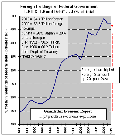 Foreign Ownership of
Federal Government Treasury bonds and bills
Foreign Ownership of
Federal Government Treasury bonds and bills
Over 47% of the total, a near record high
This graphic is from the Grandfather Federal Government Debt Report
It shows the trend of the share of Federal Government public debt, mostly in the form of T-Bills and T-Bonds, that are owned by foreign entities (central banks, investors).
Note the rapid increase. From a 15% foreign share to 46% share today.
Note the slope of the trend. The foreign share increased tripled, and the amount increased more than 10 times.
Note foreign holdings of federal government debt now total $4.4 trillion, as also stated about the break-down of debt regarding the previous chart.
Foreign investors own a larger and larger share of America's debt instruments.
47% of U.S. government Treasury bonds, 27% of corporate bonds and 14% of government agency
debt (Freddie Mac, Fannie Mae) -
Total foreign owned US financial assets about $13.7 trillion in 2010 per Federal Reserve,
and GROWING RAPIDLY.
Debt is like drugs - - one needs more and more and more to 'survive.' America, like a debt-junkie depending on support from others, is less and less in control of its own economic conditions looking forward - - becoming more and more dependent on the willingness of foreign interests to finance the destructive and escalating habit.
If foreign interests have been financing this rising trend of our federal government debt, now at 46% of the total, from where will come the needed additional funds to finance the huge spending plans for entitlement programs, national defense, homeland security and out-dated infrastructure replacements in the future?
In the 12-month period to Feb. 2008 the U.S. had a total merchandise trade deficit of $827 billion, while Japan & Germany produced a cumulative trade surplus of $377 billion ($105+$272). That's a whopping $1.2 trillion worse relative trade performance for the U.S., in JUST ONE YEAR. And, these are not oil-related deficits, since Japan and Germany do not export oil. U.S. trade deficits go on, and on - - to the benefit of foreign entities because the American economy 'refuses' to produce enough of its needs.
| Foreign investors also own a higher percentage of all U.S.
corporate bonds and agencies >. The following 2 charts (bonds and agencies) include data up to 2002. We know from 2 charts above that total external debt surged 100% from $6.4 trillion in 2003 to $13.7 trillion in 2010, and half of that involved the non-bank and non-government sectors. So, the below graphics on bonds and agencies up to 2002 certainly understate the share of all bonds and agencies owned by foreign entities today by a huge amount. These graphics are provided to assist historic perspective. The
foreign investment community was one major support to the corporate capital spending boom
of the late 1990's.
|
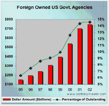 The following is in
addition to the above discussion on soaring domestic financial sector debt - - The following is in
addition to the above discussion on soaring domestic financial sector debt - - Foreign investors financed 14% of Government agency debt, called the GSE's (Freddie Mac, Fannie Mae) - - which is by and far the main driving force in the U.S. home real estate mortgage market. Foreign community has been a key support to the US mortgage market. In essence, a key support to US household confidence. Over the past seven and one half years, foreign ownership of US government agency debt has quintupled. The foreign community now commands ownership of over 14% of the total government agency market. To suggest that foreigners have supported mortgage credit expansion in the US is simply an understatement. Once again, should the foreign community even begin to question the soundness of the US mortgage markets, the impact on mortgage credit creation in the US vis-à-vis a potentially higher interest rate structure would change the game in a big way. If nothing else, it would be lights out for the bulk of mortgage refinance activity. Source: ContraryInvestor.com, July 2002 |
The above 3 charts dramatically show how much foreign interests control the financing of America's source of borrowings for government, corporations and home mortgages. The source of much of this $3 Trillion comes, of course, from America's massive trade deficits - - as graphically covered in chart form in the Grandfather International Trade Report.
The willingness of foreign interest to continue to finance America's deficit spending vs. production is called into question by the above Trade Report and the trends of exchange rates, as shown in the Grandfather Foreign Exchange Report.
STATE & LOCAL GOVERNMENT DEBT |
In 1957 said debt was 14.8% of national income, climbing faster than national income growth to a 21.1% ratio in 2010 - which is plotted as the green line on the first chart at the top of this page. Although this debt increased somewhat faster than economic growth, indicating less productivity by state & local government, this rate of increase has been nowhere near the horrible debt growth rates of the federal government, household, business and the financial sectors shown in charts above. |
 One
can ask > what is a major driving force for unprecedented debt growth in all
sectors?
One
can ask > what is a major driving force for unprecedented debt growth in all
sectors?
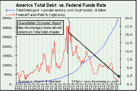
An answer > the financial industry depends and feeds on a nation addicted to more and more debt, which is organized by its agent, the powerful central planning monopoly Federal Reserve. The following 46-year trend chart helps tell that story.
The left chart shows America's Total Debt (blue line, left scale) 1957-2003 plotted vs. the Federal Funds Interest rate (red line, right scale).
(note - this chart's blue line stops at 2003 when total debt was $35 trillion (left axis). From other data in this report we know 2010 debt was $57 trillion ($20 trillion higher. Additionally, the right axis for the fed fund rate for 2010 point would be effectively zero %. So, as federal fund interest rates were pushed dramatically down via the Federal Reserve Zero Interest Rate Policy [ZIRP], total debt in America surged like never, ever before - leading to a major economic collapse).
1. The upward sloping blue line (left scale) is the debt growth curve we have shown before, that of America's Total Debt soaring upward, reaching nearly $35 trillion in this chart as of 2003, which includes debt of government, households, business and the financial sectors, but excludes government trust fund debt (debt was over $37 trillion in 2003 if trust fund debts are included - - and, that total at end of 2007 climbed to $53 trillion as shown at the beginning of this chapter).
2. The red federal funds interest rate data plots (right scale) show a 24-year rising trend toward 19% interest rates in 1981 and thereafter a 22-year declining trend to a mere 1% rate in 2003, and as mentioned above trended to zero % in2008-2010. This is not an interest rate established by a free market - - its a centrally-planned rate created by the Federal Reserve with monopoly power for its own purposes, which we discuss below.
This graphic clearly demonstrates a huge catalyst for exploding debt (blue line) in all sectors since 1980 can be attributed to long-term declining federal fund interest rates (red line) set by the Federal Reserve - - to but 1%, which is not only a negative rate since it is below the inflation rate, but also which is a historic 'give-away, free-lunch, debt-promoting' rate, a historic 'teaser' rate driving more and more debt to fuel more and more consumption including more imports, and less and less savings.
This chart makes the case that the cheaper and cheaper it is to go into debt (interest rates manipulated lower and lower, and then rates remaining low for extended periods to pump more debt) the more people and firms and governments will do just that - go into even more debt. Its the 'free-lunch', wishful thinking syndrome worshipped by those who are driven to consume beyond their own earnings and savings, to which the banking industry loves and the Federal Reserve creates.Why consume less today in order to save for tomorrow when one can so cheaply borrow from tomorrow and consume today - hoping it will always be so? Record low interest rates can cause record indebtedness - - which is the case today. This chart indicates the Federal Reserve, a non-government agency run by un-elected officials, that is beholden to the banking industry - - centrally-plans the climate for huge indebtedness and provides the means and rhetoric to seduce as many as possible.
Previous charts in this America's Total Debt Report chapter proved about 1981 America's Total Debt ratio (to national income) of all sectors started exploding upward. For the 24-year period 1957 to 1981 America's total debt did not grow faster than the economy, as debt oscillated around 186% of national income. This chart shows the federal funds interest rate increased over that period. However > during the next 22 years (1981-2003), as the federal funds interest rate was driven south, the total debt ratio exploded upward many times faster than economic growth - - to today's record high 470% ratio. This is a period we term 'negative debt productivity' which will lead to more and more debt-generated crisis in all sectors and more dependence on foreign entities than ever before.
No matter how cheap adding debt is made to appear it takes an individual to make the decision, for himself or his firm, to go deeper into debt - - increasingly mortgaging his future and his retirement life style. He does not have to fall for the 'free-lunch, debt-debt' commercial to borrow more and more and more from tomorrow to support over-consumption today. He has a choice. But the financial sector is most sophisticated regarding commercials to push more debt, and its success is proven by debt ratios soaring to produce the largest debtor nation in history with record debt ratios. Just as the food industry is sophisticated in promoting fat-free foods when actually what happens is more people consume more than ever and driving the national weight ratio (pounds per capita) to world records (see obesity trend chart).
And, during this period look at what happened to the manufacturing sector (down, and down, and down), and to personal savings (plunging).
America now depends on more and more debt creation to drive a given dollar increase of GDP - - called negative Debt Productivity. Like a druggie, we need more debt each year than the year before. Additionally, as reported in the International Trade Report, the explosion of debt has generated consumption so far beyond the nation's means (own production and savings) that soaring imports created record trade deficits - - creating huge external debts owed to foreign entities threatening economic independence and national security. It is clear GDP has been driven by more and more debt (instead of production and savings) and this debt explosion was facilitated by centrally planned interest rates.
As of late 2003, such rates were at record lows, as shown on the chart - - and, there does not appear anywhere for the Federal Reserve to go from here to further lower interest rates to drive even more debt creation to keep the debt-economy growing. These record low rates were held for a long period, which drove debt-consumption and speculation to unprecedented levels - - including overly inflating housing prices even as home equity ratios plunged.
A look at that chart makes one wonder > with interest rates unable to continue their decline as in the past 2 decades - - what happens now? Most likely its 'game-over' unless powers-to-be have decided to centrally-plan ramping-up inflation to all time highs for the next 2 decades while continuing to change how they measure and report inflation to mis-lead the general public, as discussed in the Inflation Report. Time will show.
Now, in 2010, we know what time will show. It shows that after the above record low rates of 2003 to 2007 which seemed to quicken the economy by driving up speculation and house-buying frenzy by those how had no plans to live in the house and by those who had no savings to put down for a purchase, if only for a short period rates were gradually increased - - but quickly peaking mid-2006 (well below the prior peak), and then as the economy again slowed the federal reserve was off to another round of manipulated downsizing of interest rates in 2008 to 2010 (slashing rates 60% in just 6 months from Sept. 2007 to March 2008 and slashing savor's bank certificates of deposit from about 5-6% to less than 1%, collaapsing savings incomes of seniors 83%.- - trying to prop-up banks (who were rushing abroad to Asia, the Middle East and to Europe trying to find real cash to shore up their insolvency) and over-extended speculators including soaring home foreclosures.
That above chart also shows the period which some call the "financialization" of the economy, being the expansion of the financial sector relative to mining, agriculture, manufacturing, energy, transportation, and retail. The increasing domination of stock market capitalization and economic activity by financial institutions is noted in the recent 25 years of that chart, since during this period financial services companies came to dominate the S&P 500. "From less than 5% of the total S&P index in 1980 (and 13% in 2000), the financial sector accounted for just shy of 22% of the total capitalization based weight of the S&P as of 2004. A financial sector that is ultimately dependent on interest rates and rate spreads for its current profitability and forward growth prospects. Why is this important, this huge growth of the financial sector as a share of all sectors? Well, we know the financial sector does not create food that seniors need like the agriculture sector, or goods like the manufacturing sector, or coal like the mining sector, or transport like the transportation sector, or electric power generation like the utility sector. What then does this exploding financial sector produce to protect and enhance living standards? Regardless of your answer to this we do know the financial sector (like the government sector) is getting larger not smaller while the other mentioned sectors shrink." (from 'Financial Terrorism against Seniors' by Michael Hodges, 20 November 2004)
Additionally, as one of the above charts clearly shows, the domestic financial sector's debt has soared to 131% of net national income, up from 5.6% of national income in 1957. This again shows the powerful "financialization" of the economy, not just by stock market capitalization but more ominously driven by its soaring weight of debt.
"The current weight of financial services is almost double that of industrial company stocks and more than triple that of energy shares. It is also worth noting that the current weight of financial services companies in the S&P is significantly understated because the 82 financial stocks in the index do not include General Electric, General Motors or Ford Motor. All of these companies have big financial operations that have contributed significantly to their earnings in recent years. Financial companies now generate about 30 percent of the profits, after taxes, of United States' companies, [financial economist Andrew] Smithers said. The economic purpose of capital markets is to provide a nexus between savers and borrowers for the financing of productive investment. Financial entrepreneurs, such as venture capitalists, traders, and speculators, are essential in forecasting the best uses of available savings and bearing the risk in an uncertain world. But a society cannot prosper by printing ever-increasing quantities of paper tickets representing claims for real goods and drawing more of the population into trading these tickets back and forth among themselves. We cannot all be day traders: someone must produce the goods that are consumed." Debt & Delusion by Robert Blumen for Ludwig von Mises Institute, Jan. 2005. (http://www.gold-eagle.com/gold_digest_04/blumen081204.html)
Additionally to manipulating interest rates and money creation by the Federal Reserve such produces many other distortions as shown in the Inflation Report and the Productivity Report (which asks the question "What Productivity"). Also most dangerous and most frightening is the accelerating Statistical Revisionism and Wizardry as indicators by government and the financial sector are manipulated to pull the wool over the eyes of the public at large to think debt-debt is wonderful, there is no inflation or danger in being the greatest and growing debtor nation on earth..
Why do you think centrally planned economic policy appears aimed at debt-debt-debt, with debt growing faster than the economy, including exploding trade deficits - - instead of a policy aimed at savings, domestic production and balanced current trade accounts to meet our needs and protect our independence from others, as was the case in our past? Is this debt-drug policy good for America looking forward? Can we argue that, as a clear expression of intent to have free markets unhindered by central planning monopoly control, the Federal Reserve should by law be denied the power to peg the federal funds interest rate - - and thereby remove it from being an obvious major driving force for America's unprecedented debt explosion?
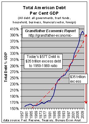 IN CLOSING THIS REPORT > IN CLOSING THIS REPORT >We leave you with this historic debt ratio graphic (this chart stated as debt % GDP), similar to what you have seen elsewhere in this report as debt related to national income. The same trend. A trend clearly UN-SUSTAINABLE !! |
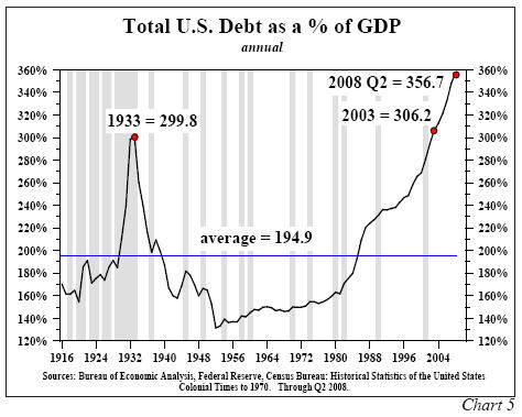 Additionally, we include here one
more trend graphic taking the above data back to 1916. Additionally, we include here one
more trend graphic taking the above data back to 1916.Note this graphic shows the debt explosion in the 1920's leading to the Great Depression of the 1930s. Also note debt bottoming after the end of World War II, which then begin a steady increase in American living standards as evidence by rapid growth in inflation-adjusted median family incomes best ever (see Family Income Report). But, then, in the mid 1980s America started a faster and faster upward debt march also resulting in stagnant to falling real family incomes even with 2-wage earner families compared to one wage earner before and nil savings - - with debt ratios now setting all time new highs. We hope you will keep this picture in mind as you go about your own financial affairs and future planning. We hope this report is helpful in that regard. As we update this America Total Debt Report chapter during 2008 it is clear that the entire financial sector is in disarray. |
It is clear to this observer > |
WHAT IS A BILLION? WHAT IS A TRILLION?
Here's a mental exercise for you >
1. What is a billion?
What Is A Billion? The next time you hear a politician use the word "billion" in a casual manner, think about whether you want the "politicians" spending your tax money.
A billion is a difficult number to comprehend, but one advertising agency did a good job of putting that figure into some perspective in one of its releases. (see
https://www.thefuturestrader.us/)A. A billion seconds prior to 2006 it was 1959.
B. A billion minutes ago Jesus was alive.
C. A billion hours ago our ancestors were living in the Stone Age.
D. A billion days ago no one walked on the earth on two feet.
E. A billion dollars ago was only 8 hours and 20 minutes, at the rate our government is
spending it.
While this thought is still fresh in our brain, let's take a look at New Orleans. It's amazing what you can learn with some simple grammar school long division math. Louisiana Senator, Mary Landrieu (D), asked the Congress for $250 BILLION to rebuild New Orleans. Interesting number, what does it mean?
Well, if you are one of 484,674 residents of New Orleans (every man, woman, child), you each get $516,528.
Or, if you have one of the 188,251 homes in New Orleans, your home gets $1 ,329,787. Or, if you are a family of four, your family gets $2,066,012. Washington, D.C ..****O!!!... Are all your calculators broken??
2. What is a trillion?
How much bigger than a billion is a trillion? One thousand times.
Three zeros bigger. It’s a number so big, it needs to be seen in a human context
before we can really grasp its size. So, we might say: It’s the year 0, the beginning
of the first millennium, and you have a trillion dollars to spend, at the rate of a
million dollars a
day. At just before three years, you’ve reached a billion. You keep spending, and now
you are in the year 2001. You still have 737 years to go, spending a million every day,
before you reach the end of your trillion-dollar pile.
If someone built block after block of $100,000 houses, ten houses to a block, ten blocks to a mile—that's a hundred blocks per square mile—how big would the project be when it reached a trillion dollars in value? It would be 10,000 square miles—that's bigger than the State of Maryland.
If you were to go back to the Miocene Age, when mammals reached their greatest variety (19 millions years ago), spending one dollar every minute, day and night, seven days a week ($526,000 each year) you would just now run through your trillion dollars.
3. Now you know
Now we have the context. This America Total Debt Report shows that the private and
government sectors of the economy have more than $53 Trillion of debt. $53 Trillion !!!!! - - and of that total, the federal government
debt is nearly $9 trillion, AND the portion of the total owed to foreign entities is over
$12 Trillion !!!!!!!!! AND -AND, that debt is going straight up. Right ??
And, these numbers are just the recorded debt - - and do not include future obligations already committed such as social security, many private & government pensions, and Medicare - or tons of off-balance sheet debt of banks, businesses, and households.
What do you think?
The purpose of the Grandfather Economic Reports is to increase public awareness
of major threats facing today's families and youth - compared to prior generations.
KNOWLEDGE IS POWER - IF YOU HAVE IT
THIS IS THE END OF THE REPORT ON AMERICA'S TOTAL DEBT
WHERE DO YOU GO FROM HERE ??
SUGGESTION -
Return to the first page of this chapter, called the America's Total Debt Report.
Or - go to the chapter that extensively and graphically covers only Federal Government Debt.
Or - review a simple one-page summary table of all debt in America.
Or - scan a report (with data trend charts) regarding Trust Fund Debt, displaying the federal government siphoning-off social security trust funds.
OR - Return to the HOME PAGE OF THE GRANDFATHER ECONOMIC REPORT which includes the table of contents of all chapters, including government spending, family incomes, education quality, trade, etc.
| Home & Contents | Summary | Feedback | What's New | Link Index | Eye-opener | Must See |
Copyright © 1997-2011 Michael W. Hodges. The Grandfather Economic Report series is the intellectual property of its author; all rights reserved under Copyright Conventions. Permission to redistribute all or part of this series for non commercial purposes is granted by the author, provided the associated web page address is included and full credit given to the Grandfather Economic Report (including its home page web address https://grandfather-economic-report.com/) and the author, Michael Hodges. Notice appreciated via email.
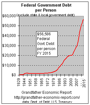 The left chart shows the trend of federal government
debt per man, woman and child - $33,468 per person in of FY2007 - by 2010 federal govt.
debt reached $14 trillion, $43,925 per person - a new record. A HUGE JUMP in just 3
years.
The left chart shows the trend of federal government
debt per man, woman and child - $33,468 per person in of FY2007 - by 2010 federal govt.
debt reached $14 trillion, $43,925 per person - a new record. A HUGE JUMP in just 3
years.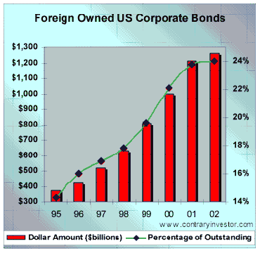 From close to 14% in 1995, the foreign
community as of 2002 owned approximately 24% of total US corporate bond debt (as of 2004
this is up to 27%). Do you think they have a vested interest in the integrity and quality
of US corporate accounting? Just what do you think would happen if foreigners decided to
sell just 25% of their holdings of US corporate debt? Do you really need us or want us to
answer these questions?
From close to 14% in 1995, the foreign
community as of 2002 owned approximately 24% of total US corporate bond debt (as of 2004
this is up to 27%). Do you think they have a vested interest in the integrity and quality
of US corporate accounting? Just what do you think would happen if foreigners decided to
sell just 25% of their holdings of US corporate debt? Do you really need us or want us to
answer these questions?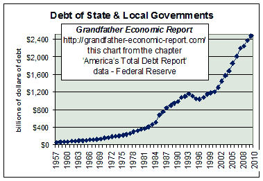 Debt of state and local
governments has climbed from $55 billion in 1957 to $2.5 trillion in 2010.
Debt of state and local
governments has climbed from $55 billion in 1957 to $2.5 trillion in 2010.